

This tutorial demonstrates how to customize the items presentation through custom item templates.
1. Create and initialize a new Silverlight application project
Follow steps 1 through 3 from Tutorial 1: Getting Started.
Set CurrentView to Timetable, Theme to Vista and Date to Jan 1, 2010.
2. Creating the item template
In order to customize the appearance, you need to define a new style with a control template setter for the item presentation, then you need to handle the ItemPresenterCreated event of the Calendar control and assign the key of the newly created style to one of the three ItemPresenter properties - StyleKeyComplex, StyleKeySimpleHorizontal or StyleKeySimpleVertical. For more information on the ItemPresenter and its role in the item presentation, check Item Presenters.
The easiest way to customize the item templates is to create a copy of the default template and modify it. The full code of the default item template can be found here. The default template contains several styles, which determine the item's appearance in different views and in different orientations. For simplicity this tutorial will only customize the appearance of the items in vertical Timetable view.
Copy the style listed below to the App.xaml (Application.xaml in Visual Basic) file in your project.
XAML
 Copy Code Copy Code
|
|---|
<Style x:Key="MyComplex" TargetType="planner:ItemPresenter"> |
The planner namespace is defined in the <Application> tag as follows:
| XAML
Copy Code
|
|---|
xmlns:planner="clr-namespace:MindFusion.Scheduling.Silverlight;assembly=MindFusion.Scheduling.Silverlight" |
The local namespace is set to the namespace of your project (Tutorial5 by default).
Now that the style is defined, it needs to be associated with the newly created timetable items. To do this, handle the ItemPresenterCreated event and assign the style key to the StyleKeyComplex property of the corresponding ItemPresenter. The code below illustrates the handler of the ItemPresenterCreated event:
| C#
Copy Code
|
|---|
private void calendar_ItemPresenterCreated(object sender, ItemPresenterEventArgs e) |
| Visual Basic
Copy Code
|
|---|
Private Sub calendar_ItemPresenterCreated(ByVal sender As Object, ByVal e As ItemPresenterEventArgs) |
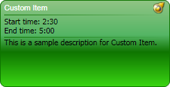
Assigning the style key to StyleKeyComplex associates this style with non all-day items in the Timetable view. The new template is similar to the default one with the following differences:
- The resize bands of the items are not displayed;
- The items now have rounded edges;
- The recurrence and reminder icons are displayed in the item's header, to the right of the item's HeaderText;
- The start time and end time of the item are displayed below the item's header. They are automatically updated whenever the item's StartTime or EndTime change;
Without making any further modifications, run the sample, create a new item and see the newly defined template applied to it. The following image illustrates how an item will look like in the Vista theme.
3. Formatting the start and end time
Looking at the new item presentation you can see that the start and end dates displayed below the item's header are formatted using the default DateTime formatting and are not very readable. Let's define our custom IValueConverter class, which will enable us to display the dates in a custom format during databinding. For this purpose, create a new class - FormattingConverter and implement it as illustrated below.
| C#
Copy Code
|
|---|
public class FormattingConverter : System.Windows.Data.IValueConverter |
| Visual Basic
Copy Code
|
|---|
Public Class FormattingConverter |
The above class takes a string argument and uses this string in order to format the input value. The next step is to create a static resource object of this class. Insert the following line before the <Style> definition in App.xaml (Application.xaml in Visual Basic):
| XAML
Copy Code
|
|---|
<local:FormattingConverter x:Key="formattingConverter" /> |
Now locate the following two lines in the template:
| XAML
Copy Code
|
|---|
<TextBlock Text="{Binding StartTime}" /> |
And modify them as following:
| XAML
Copy Code
|
|---|
<TextBlock Text="{Binding StartTime, Converter={StaticResource formattingConverter}, ConverterParameter='Start time: \{0:H:mm\}'}" /> |
The above code instructs the Text bindings to format their source values using the "Start time: {0:H:mm}" and "{End time: {0:H:mm}" formatting strings respectively.
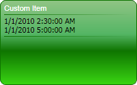
4. Build and run
Compile and run the application. Creating a new item with a Reminder and sample description will yield a result similar to the following: