

There are several ways to customize the appearance of items in PocketPlanner.
You can customize the general appearance of items in a schedule, by setting various properties in Calendar.ItemSettings. This would affect the appearance of all items in the current schedule. To customize the appearance of individual item, adjust its Style and SelectedStyle properties. The particular style that will be used when the item is rendered depends on the state of the item. Style is used when the item is neither selected nor the mouse hovers over it. SelectedStyle is used when the item is selected and the mouse is not over it. The item styles support the cascading paradigm described in Styles and Themes. The most general item styles are defined in the current theme. They cannot be changed by any means except by changing the theme itself. The styles defined in Calendar.ItemSettings are of higher priority and any of their properties that are explicitly specified will be used prior those from the theme. The styles defined in individual items are of highest priority and will always be used first, when present.
The following illustration shows how item appearance is affected by the item settings and style.
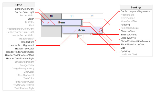
The image shows how to customize item appearance in a single month, month range, day range and week range views. The grayed out properties either does not have effect or does not have noticeable effect on the items in these views.
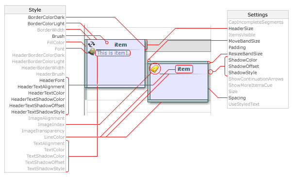
The next image illustrates how settings affect the appearance of items in a timetable view.
You can use custom drawing to perform additional drawing on an item by setting the Calendar.CustomDraw property to CalendarItem, ScheduleItem or ResourceViewItem and handling the Draw event.