

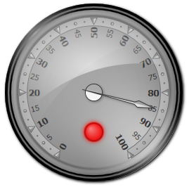
The indicator is a gauge element, which changes its appearance based on its Value property and its defined states. The states of the indicator are specified as CustomInterval objects and are located in the States collection. When the value of the indicator falls within one of its defined states, this state becomes active and its Fill, Stroke and StrokeThickness properties are applied to the indicator automatically. In addition, the attached property ActiveColor is applied as a glow color of the indicator. If the value of the indicator does not fall in any of the defined states, then the DefaultState becomes active.
A common scenario is to bind the Value property of the indicator to the Value of a Pointer object, thus when the value of the pointer is modified, the state of the indicator changes to reflect this.
Usage
The sample code below illustrates how to define and add indicators to a scale in XAML:
XAML
 Copy Code Copy Code
|
|---|
<gauges:OvalGauge> |
The oval gauge defined above will look like this: