The pointers represent needles or similar type of indicators within the scale. They are used to visualize a current measurement within the scale. The most important member of the pointer object is its Value. The pointer is automatically adjusted by its containing scale so that it points to the scale location, corresponding to its value.
The size of the pointer is defined by the PointerWidth and PointerHeight properties. These properties can express the size as relative or absolute value. The location of the pointer can be adjusted through the PointerOffset property and its alignment in a linear scale can be specified through the Alignment property.
The pointer can be made interactive by setting the IsInteractive property to true. Clicking with the mouse within a scale causes all its interactive pointers to be adjusted to the value corresponding to the clicked point. A pointer can be made discrete by setting IsDiscrete to true. The value of a discrete pointer is always integer.
Usage
The sample code below illustrates how to define and add pointers to a linear scale in XAML:
XAML
 Copy Code Copy Code
|
|---|
<gauges:LinearGauge Orientation="Horizontal">
<gauges:LinearScale Orientation="Horizontal">
<gauges:LinearScale.Pointers>
<gauges:Pointer IsInteractive="True" />
</gauges:LinearScale.Pointers>
</gauges:LinearScale>
</gauges:LinearGauge> |
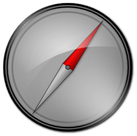
Custom Appearance
The appearance of the pointer can be customized by using a custom ControlTemplate. The following example demonstrates an oval gauge with a compass needle type of pointer:
| XAML
Copy Code
|
|---|
<gauges:OvalGauge>
<gauges:OvalScale Fill="Transparent" Stroke="Transparent" StartAngle="0" EndAngle="360" AnimateThroughSmallerArc="True">
<gauges:OvalScale.Pointers>
<gauges:Pointer PointerWidth="180%" PointerHeight="20%" PointerOffset="80%" IsInteractive="True" IsAnimated="True" Value="75">
<gauges:Pointer.Template>
<ControlTemplate TargetType="gauges:Pointer">
<Grid>
<Grid.RowDefinitions>
<RowDefinition Height="3*" />
<RowDefinition Height="4*" />
<RowDefinition Height="3*" />
</Grid.RowDefinitions>
<Grid.ColumnDefinitions>
<ColumnDefinition Width="48*" />
<ColumnDefinition Width="2*" />
<ColumnDefinition Width="2*" />
<ColumnDefinition Width="48*" />
</Grid.ColumnDefinitions>
<Polygon Grid.Column="2" Grid.ColumnSpan="2" Grid.RowSpan="3" Points="0,0 1,0.5 0,1" Stretch="Fill">
<Polygon.Fill>
<LinearGradientBrush StartPoint="0.5,0" EndPoint="0.5,1">
<GradientStop Offset="0" Color="#990000" />
<GradientStop Offset="0.3" Color="#FF0000" />
<GradientStop Offset="1" Color="#660000" />
</LinearGradientBrush>
</Polygon.Fill>
</Polygon>
<Polygon Grid.ColumnSpan="2" Grid.RowSpan="3" Points="1,0 0,0.5 1,1" Stretch="Fill">
<Polygon.Fill>
<LinearGradientBrush StartPoint="0.5,0" EndPoint="0.5,1">
<GradientStop Offset="0" Color="#999999" />
<GradientStop Offset="0.3" Color="#CCCCCC" />
<GradientStop Offset="1" Color="#666666" />
</LinearGradientBrush>
</Polygon.Fill>
</Polygon>
<Polygon Grid.ColumnSpan="4" Grid.RowSpan="3" Points="0,0.5 0.5,0 1,0.5 0.5,1" Stretch="Fill" Stroke="#202020" />
<Ellipse Grid.Column="1" Grid.ColumnSpan="2" Grid.Row="1" Fill="DimGray" Stroke="Black" StrokeThickness="1" />
</Grid>
</ControlTemplate>
</gauges:Pointer.Template>
</gauges:Pointer>
</gauges:OvalScale.Pointers>
<gauges:OvalScale.MajorTickSettings>
<gauges:MajorTickSettings ShowTicks="False" ShowLabels="False" />
</gauges:OvalScale.MajorTickSettings>
<gauges:OvalScale.MiddleTickSettings>
<gauges:MiddleTickSettings ShowTicks="False" ShowLabels="False" />
</gauges:OvalScale.MiddleTickSettings>
<gauges:OvalScale.MinorTickSettings>
<gauges:MinorTickSettings ShowTicks="False" ShowLabels="False" />
</gauges:OvalScale.MinorTickSettings>
</gauges:OvalScale>
</gauges:OvalGauge> |
The above gauge will look similar to the following image:


