


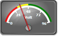
The range is a visual representation of an interval within a gauge. Ranges are commonly used to mark or emphasize specific zones on the scale. Often the end of the scale is a danger zone and a range can be used to indicate this. The following image illustrates an oval gauge with three ranges (red, yellow and green) specifying different zones on the scale.
The range interval is specified through the MinValue and MaxValue properties. The Alignment and Offset properties control the positioning and the StartWidth and EndWidth properties specify the size of the range. The range can be auto-sized to the scale by setting AutoSize to true. To learn more about the different alignment modes check the Ticks and Labels topic.
Appearance
The Fill, Stroke and StrokeThickness properties can be used to specify the appearance of the range. The stroke on the different sides of the range can be turned off by using the CapStart, CapEnd, StrokeInside and StrokeOutside properties.
Usage
The sample code below illustrates how to define and add ranges to a linear scale in XAML:
XAML
 Copy Code Copy Code
|
|---|
<gauges:LinearGauge Orientation="Horizontal"> |
The linear gauge defined above will look like this:
