The list below describes past changes and additions to MvcDiagram:
New in version 4.3.1
Node constraints
The constraints property lets you apply size and direction constraints to a node. It returns a NodeConstraints object with following properties:
- keepRatio: a bool value indicating whether the initial width/height ratio of a node should be preserved.
- maxHeight: the maximum node height allowed.
- maxWidth: the maximum node width allowed.
- minHeight: the minimum node height allowed.
- minWidth: the minimum node width allowed.
- moveDirection: a member of the DirectionConstraint enumeration. Set it to Horizontal or Vertical to let users move a node only in specified direction.
These constraints are considered when a user modifies the node interactively. They are ignored if node placement is changed programmatically by using API methods and properties.
Tag Helpers
The following tag helpers can now be imported from MindFusion.Diagramming.Mvc namespace:
- <mindfusion-diagramview> creates a DiagramView instance.
- <mindfusion-ruler> creates a Ruler instance.
- <mindfusion-zoomcontrol> creates a ZoomControl instance.
- <mindfusion-overview> creates an Overview instance.
- <mindfusion-nodelistview> creates a NodeListView instance.
Razor
 Copy Code Copy Code
|
|---|
@addTagHelper *, MindFusion.Diagramming.Mvc
....
<mindfusion-diagramview
component=(DiagramView)ViewBag.DiagramView
style="width:100%; height:100%;">
</mindfusion-diagramview> |
New in version 4.3
Multi-platform support
Multi-platform System.Drawing support has been deprecated in .NET 8. To allow hosting on non-Windows servers, we have moved server-side diagram code to Microsoft.Maui.Graphics API.
.NET 8 support
Added assemblies and sample projects for .NET 8. Distribution no longer includes assemblies for older .NET versions. If bug fixes are required, we will be patching version 4.2 branch for clients that host on old .NET versions, but no new features will be added to it.
Shape design enhancements
New client-side event system
Event emitter objects are now exposed as properties of Diagram and DiagramView, and you can register handlers by calling their addEventListener method:
| JavaScript
Copy Code
|
|---|
diagram.nodeCreated.addEventListener(
(sender, args) =>
{
if (sender.defaultShape.id == "Rectangle")
args.node.anchorPattern = pattern1;
else
args.node.anchorPattern = pattern2;
}); |
Legacy event handling syntax will remain supported for compatibility with old code.
Collapse and expand table rows
Table rows can be assigned to distinct sections of the table. Each section can be collapsed or expanded, hiding or showing all rows in the section except the header one. To define a section, set the header property of a row. A section consists of all rows after a header row and spans to the next header. Each header row displays a [±] button that allows expanding or collapsing the section interactively. Clicking that button raises the tableSectionCollapsed and tableSectionExpanded events. Sections can be collapsed or expanded programmatically by setting the expanded property of their header rows.
New mouse events
- nodePointed event has been replaced by a set of more specific events: nodePointerEnter and nodePointerLeave are raised when the mouse pointer respectively enters or leaves the boundaries of a node. nodeHovered fires if the pointer rests over a node for hoverDelay milliseconds.
- linkPointed event has been replaced by a set of more specific events: linkPointerEnter and linkPointerLeave are raised when the mouse pointer respectively enters or leaves the boundaries of a link. linkHovered fires if the pointer rests over a link for hoverDelay milliseconds.
Miscellaneous
- dividerStroke properties added to ContainerNode, TableNode and TreeViewNode classes. It lets you customize the appearance of the divider line drawn between a node's caption bar and content area.
- Set the autoDeleteLinks property to false to prevent deleting links along with a node they connect, and disconnect the links instead.
- Enable the autoDeleteChildren property to automatically delete child nodes when a container is deleted.
- Removed an eval call used for creating custom components from CompositeNode Json templates, allowing for stricter Content Security Policy rules. Now custom components must be registered by calling registerComponent method to allow instantiating them from a template.
- linkRouted event raised when links are modified by automatic routing.
API changes
- To allow for stricter Content Security Policy rules, the library no longer loads CSS scripts automatically. If you use components from the Diagramming.Controls package, you must now explicitly link the common-ui.css file from distribution's themes folder.
- linkPointed and nodePointed events replaced by linkHovered and nodeHovered.
.NET API changes
- All properties and method parameters of RectangleF, PointF, SizeF and Color types from System.Drawing namespace have been changed to respective Rect, Point, Size and Color from Microsoft.Maui.Graphics namespace.
- Due to BinaryFormatter deprecation and runtime exceptions in non-desktop applications, binary SaveToFile and LoadFromFile methods have been removed. Remaining serialization methods allow storing diagrams in JSON and XML formats.
- SwfExporter (Adobe Flash format) and WmfExporter (Windows Metafile) classes have been removed.
New in version 4.2
Multiple diagram pages
The DiagramDocument class represents a collection of diagram pages or sheets, represented by DiagramPage objects. New pages can be added to the document and existing pages can be removed and reordered by modifying the Pages collection. The SaveToJsonFile, SaveToXml and SaveToString methods of DiagramDocument save all pages in a single file, and respectively the LoadFromJsonFile, LoadFromXml and LoadFromString methods load all pages from the file.
DiagramPage is derived from Diagram and only adds a few properties, so any code that processes Diagram objects will work with DiagramPage objects too. A diagram document forwards each event raised by its pages, giving you a chance to use the same handler for events raised by different pages. If a page should implement distinct user interaction or validation logic, it is also possible to attach handlers to the Diagram events inherited by DiagramPage.
A single DiagramPage could be assigned to the Diagram property of DiagramView, and that lets you create your own user interface for presenting a list of pages to the user and selecting a current page. The package also includes a TabbedDiagramView that presents all pages of a document in a tabbed user interface where each tab corresponds to a page. The page displayed in the active tab is exposed by the selectedPage property of TabbedDiagramView. The active page can be changed interactively by activating its associated tab. New pages can be added and removed to / from the document through buttons in the tab strip and the pages can be rearranged by dragging their associated tabs with the mouse.
Tabbed diagram view
The TabbedDiagramView control is a view that displays DiagramDocument objects. Individual diagram pages can be activated through the tabs located at the top or at the bottom of the control. The appearance and behavior of the tab strip can be customized using various properties. The location and visibility of the strip is specified through the TabAlignment property. Its height can be changed via the TabsSize property. ShowAddButton and ShowNavigationButtons determine the visibility of the buttons for interactive tab creation and tab navigation respectively. ShowTabCloseButtons specifies whether the tabs can be closed interactively, by clicking on the small 'x' button displayed in each tab. AllowReorder enables interactive tab rearrangement by mouse dragging.
Async serialization
Files can now be saved and loaded asynchronously. Async methods create a copy of the diagram to process it in a worker thread, and custom item classes must implement Clone method or copy constructor in order to serialize them as expected.
Reversed tree layouts
(client side / JavaScript)
The reversedLinks property of TreeLayout, RadialTreeLayout and BorderedTreeLayout lets you arrange trees where links point from child to parent nodes, instead of the default parent to child direction.
Miscellaneous
New in version 4.1.1
Client-side radial layout
The RadialTreeLayout class arranges tree levels in concentric circles around the root. The levelDistance property specifies the distance between adjacent circles. The direction property specifies placement of first child node. Set stretchFactor to a value larger than 1 in order to stretch level circles into ellipses, providing more space for the layout when using wider nodes.
Miscellaneous
New in version 4.1
Multiple labels per node
The NodeLabel class allows multiple captions to be displayed for a single DiagramNode of any type. Node labels provide a set of properties allowing full customization of their display and positioning. Label position is defined by specifying a pin point and offset from it, set through SetCornerPosition, SetEdgePosition, SetCenterPosition methods. In addition, the HorizontalAlign and VerticalAlign properties of NodeLabel specify on which side of pin point to draw the label's caption.
For example, following code adds extra labels to top-left and bottom-right corners of a ShapeNode:
| C#
Copy Code
|
|---|
var node = diagram.Factory.CreateShapeNode(10, 50, 40, 30);
node.Text = "text"; // centered main text
var lb1 = node.AddLabel("label 1");
lb1.SetCornerPosition(0, 0, 0);
lb1.HorizontalAlign = StringAlignment.Near;
lb1.VerticalAlign = StringAlignment.Near;
lb1.Brush = new SolidBrush(Color.Red);
lb1.TextBrush = new SolidBrush(Color.White);
var lb2 = node.AddLabel("label 2");
lb2.SetCornerPosition(2, 0, 0);
lb2.HorizontalAlign = StringAlignment.Far;
lb2.VerticalAlign = StringAlignment.Far;
lb2.Brush = new SolidBrush(Color.Yellow);
lb2.TextBrush = new SolidBrush(Color.Red); |
Multi-touch improvements
Miscellaneous
New in version 4
ES6 classes and properties
(client side / JavaScript)
Client side scripts have been refactored to use ES6 classes, properties and native collections. ArrayList, Dictionary and Set classes from MindFusion.Collections namespace have been removed, and replaced by respective JavaScript native Array, Map and Set. Get/set functions have been replaced by getter/setter properties, which should help using the diagram API with binding expressions of various JS frameworks. You could enable propFunctions in CompatConfig in order to continue using legacy get/set functions during migration.
Diagram view
(client side / JavaScript)
The Diagram JavaScript class has been refactored into separate Diagram and DiagramView classes, matching respective server-side .NET classes that the library already provided in older versions. What remains of Diagram is now just a model class that defines diagram structure and implements serialization. The new DiagramView class deals with rendering and user interaction. You can show the same diagram in several views, each one rendering at different scroll positions and zoom levels. Note that you can no longer call Diagram.find(id) on client-side, but instead call DiagramView.find(id).diagram to access the Diagram object.
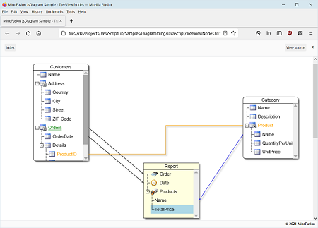
TreeView nodes
The TreeViewNode class represents nodes that can display hierarchical data. The root items displayed in the node can be accessed through the rootItems property. Items can be added and removed individually by using the addItem and removeItem methods, or in bulk by calling the fromObject method, which loads the tree view items from an array of objects.
Print pagination
(client side / JavaScript)
The printPreview and print methods of DiagramView let you export the diagram as a list of smaller images in HTML page. Supported options include printArea (defaults to diagram's content bounds) and pageSize (defaults to DiagramView's viewport). Note that print methods use HTMLCanvasElement.toDataURL() internally, so any limitations it has will apply (such as canvas size and CORS).
.NET 6 support
Added assemblies and sample projects for .NET 6. The distribution still includes assemblies and samples for .NET 4.5+ and .NET Core 3.1.
Multi-touch support
- If MultiTouchZoom property is enabled (default), the view can be zoomed or panned using two-touch pinch / flick gestures.
- If MultiTouchModify property is enabled (default), diagram nodes can be moved, scaled and rotated using two-touch pinch / flick gestures.
- If MultiTouchZoom property is disabled, each touch draws diagram items corresponding to current behavior.
- If MultiTouchModify property is disabled, each touch started from a node draws a diagram link.
- Latter modes can be used for collaborative whiteboarding / classroom scenarios.
Mouse input improvements
- MouseWheelAction property of DiagramView lets you choose between Scroll (default) and Zoom as the default behavior of the control in response of a wheel event.
- The MoveNodes behavior allows grabbing nodes to drag them without using adjustment handles.
- The control now captures mouse events and completes drag / drawing operations even if mouse is released outside the diagram view.
New events
Miscellaneous
- Client side createDiagramLink method now accepts two, three or four arguments, letting you specify row index for origin or destination TableNode, or TreeViewItem for origin or destination TreeViewNode.
- OrthogonalLayout can now be applied on client-side.
- Clipboard methods now use modern Navigator.clipboard API when their systemClipboard argument is enabled.
- Rotation of FreeFormNode instances.
- ImageAlign supports new FitLeft, FitTop, FitRight and FitBottom alignment styles, which resize image to fit node's boundaries and align it to respective border.
- Fix for resizeToFitText not calculating correct size when cells have text padding applied.
- ArrangeAsync method is now available in CoreCLR assemblies (.NET Core 3 and 6 versions).
- The EnumAllPaths method of PathFinder yields each path immediately when found.
JavaScript API changes
- getProperty/setProperty function pairs from client-side API have been replaced by ES6 getters/setters. Set CompatConfig.propFunctions to true in order to continue using legacy get/set functions in your code.
- Diagram.find method has been removed. Call DiagramView.find instead, and get the view's diagram property.
- Client-side scroll and zoom properties moved from Diagram to DiagramView: autoScroll, scrollZoneSize, autoScrollAmount, scrollX, scrollY, viewport, virtualScroll, zoomFactor.
- Client-side input related properties moved from Diagram to DiagramView: allowInplaceEdit, delKeyAction, behavior, tooltipDelay, modificationStart, modifierKeyActions, leftButtonActions, middleButtonActions, rightButtonActions.
- Client-side magnifier properties moved from Diagram to DiagramView: magnifierEnabled, magnifierFactor, magnifierWidth, magnifierHeight, magnifierFrameThickness, magnifierShading, magnifierShape,magnifierFrameColor, magnifierSecondaryFrameColor.
- Client-side methods moved from Diagram class to DiagramView class: create, find, record, stopRecording, replay, clearTooltip, beginEdit, copyToClipboard, pasteFromClipboard, cutToClipboard, scrollTo, zoomToRect, zoomToFit, setZoomFactorPivot.
- MindFusion.AbstractionLayer class has been removed.
- EventArgs and CancelEventArgs classes have been moved to the MindFusion.Controls namespace.
- ArrayList, Dictionary, ObservableCollection, Set classes have been removed from MindFusion.Collections namespace.
- Due to Navigator.clipboard API being asynchronous, pasted items are not available immediately after calling pasteFromClipboard with systemClipboard enabled. You will be able to access them only after nodePasted and linkPasted events are raised.
.NET API changes
New in version 3.3.1
Adjustment handles styling
Appearance of adjustment handles can be customized via ActiveItemHandlesStyle, SelectedItemHandlesStyle and DisabledHandlesStyle properties. The HandlesVisualStyle objects returned by them provide sub-properties corresponding to graphic attributes of the different handle types. Adjustment handles can now be painted not only in solid color but with arbitrary brushes such as LinearGradientBrush.
Miscellaneous
- TopologicalLayout can now be applied on client-side.
- The diagram canvas now automatically expands to fill the area freed up when a scrollbar auto-hides.
- Fix for scroll position serialization in virtual scroll mode.
- ActiveItem reference is now serialized in JSON format.
- Fixed Overview flickering when the tracker rectangle is being dragged near the control's borders.
- Client-side XML serialization fixes.
- Fix for shadow style serialization in .NET Core and .NET 5.
New in version 3.3
.NET 5 support
MindFusion.Diagramming for ASP.NET MVC distribution now includes assemblies for .NET 5. The programming interface is the same as the one of .NET Core Assemblies.
Control nodes
ControlNode objects display custom HTML content, specified via their Template property. A node's DOM structure is created inside the Content div element, which is then rendered on top of the diagram canvas. Note that this prevents ControlNodes drawing in diagram' usual Z order, and they will always appear on top of other diagram items.
By default the diagram intercepts mouse events of all hosted html elements to enable moving nodes or drawing links. You can specify that interactive elements, such as buttons or text boxes, should receive input instead by setting their data-interactive attribute to true.
You can register event handlers for elements in the template by assigning function names to data-event attributes in the form data-event-'eventName'='handlerName'. Alternatively, you can attach event listeners using DOM API once nodeDomCreated is raised to signify that content is available. E.g. access child elements by calling args.getNode().getContent().querySelector(...) and attach handlers via elements' addEventListener method.
ControlNodes create DOM elements from their template only in the main diagram, and render images instead when shown in Overview or NodeListView. Note that in this case image elements in the template will render only if specified in base64 format. The Utils.toDataUrl method helps you convert an image URL to base64 data URL.
Video nodes
VideoNode objects display video streams, along with UI elements to play, pause, seek and change volume. Call node's setVideoLocation method to specify its video URL. Auto-playing is not supported at this time, and the video can be started only by users clicking the play button. VideoNode is built around Video component, which can also be used in CompositeNode templates.
Button components
Composite nodes can now contain buttons. Button components respond to user clicks by calling the JavaScript function whose name is assigned to their clickHandler attribute. A button can show a text label assigned to the text attribute, or an image whose URL is assigned to imageLocation. The following example adds a button to CompositeNode template:
| JavaScript
Copy Code
|
|---|
{
component: "Button",
brush: "#ccc",
text: "Delete",
width: 30,
cornerRadius: 3.5,
clickHandler: "onDeleteClick"
} |
Virtual scroll improvements
- The control now handles mouse wheel events to scroll the diagram when virtual scrolling is enabled.
- DOM elements that implement virtual scroll mode now use CSS grid layout. You might need to adjust page layout to apply size constraints on the diagram div or its parent. For compatibility with older browsers, you can set CompatConfig.gridLayout = false to fall back to the absolute positioning from previous versions.
- VirtualScroll mode is now enabled by default.
Miscellaneous
- Mouse pointer position is now provided as argument to nodeCreated and linkCreated events.
- Visibility property added to CompositeNode components lets you keep invisible components in the template.
- General performance improvements.
- Collapse / expand icon is now drawn correctly for CompositeNode when Expandable is enabled.
- Json deserialization no longer creates undo records.
- Content of CompositeNodes is now clipped by default if Shape in the template is marked with isOutline attribute. To disable that, set ClipToOutline to false.
- Set ExpandButtonAction to RaiseEvents and +/- buttons of Expandable nodes will only raise an expandButtonClicked event instead of expand or collapse the tree under that node. You can use this to implement custom logic for the +/- button.
New in version 3.2.2
.NET Core support
MindFusion.Diagramming for ASP.NET MVC distribution now includes assemblies for .NET Core 2.1 and newer versions. The programming interface is mostly the same, except for a few differences listed in .NET Core Assemblies help topic. Tutorial help topics have been updated for .NET Core as well.
Shape components
The Shape class used to specify ShapeNode geometry can also be used as a component in CompositeNode. When its isOutline attribute is set, the shape will control CompositeNode's geometry too, defining hit test and clip area, and link alignment points along node's border. If isOutline is disabled, the shape will serve mostly as a decorative element. The code below shows a sample fragment from node's template specifying shape component's properties:
| Json template
Copy Code
|
|---|
{
component: "Shape",
id: "Cloud",
autoProperty: true,
name: "OutlineShape",
pen: "gray",
brush: "Transparent",
isOutline: true
}, |
Miscellaneous
- TableNode.resizeToFitText improvements and fixes.
- containerChildAdding event handlers can stop propagation of the event up in the container hierarchy by calling setHandled.
- LayeredLayout now uses stable sorting and should always create same results when applied to same graph.
- For consistency with client side API, the .NET Diagram class now provides Arrange methods that take a layout object as argument.
- Arrange method of .NET ContainerNode arranges the child items inside a container using the specified layout class.
API changes
New in version 3.2.1
Improved performance
Diagram rendering and user interactions are now faster. The control redraws the smallest possible area after diagram changes, and compresses refresh operations into a single batch when possible. Custom node classes that need to draw outside of their Bounds should override the getRepaintBounds method to specify the repaint area.
Custom type registration
Custom item types registry is now stored in the session and is handled by the ItemTypeResolver class. It is no longer required to call the RegisterItemType method
for every DiagramView and NodeListView instance, but instead call RegisterItemType method only once on the first DiagramView control and register the current session by calling its RegisterSession method. Then call the RegisterSession method for any subsequent controls that will use the custom item types. You can access the ItemTypeResolver registered for the current session through the static GetResolver method and unregister it by using the Unregister static method.
Miscellaneous
- The Border component draws frame lines around and background behind other components in CompositeNode templates.
- NodeListView now displays nodes' ToolTip texts when the mouse hovers over an item in the list view.
- Fix for FlowchartLayout creating node overlaps in some situations.
New in version 3.2
Flowchart graph layout
(client side / JavaScript)
FlowchartLayout recognizes program code-like patterns in the graph, such as loops, sequences and if/switch branchings, and arranges them recursively. FlowchartLayout could be used to arrange other types of graphs as well, though with some restrictions. For example it treats all back links as loops in the code, and expects that they are nested - loop links starting closer to the stop node should end closer to the start node. Another similar restriction is that there shouldn't be any cross-links that connect different branches of a decision sub-graph.
Path finding
(client side / JavaScript)
The PathFinder class provides methods that help you find paths and cycles in a graph:
Path objects returned by these methods contain nodes, links and items arrays containing sequences of elements in the path. The new PathFinder sample page included in distribution demonstrates path finding and animations over the found paths.
Embedded hyperlinks
Nodes and Text components with style text enabled can now contain <a> tags to create hyperlinks. When a link is clicked, the control raises hyperlinkClicked event to let you implement navigation:
| JavaScript
Copy Code
|
|---|
// node is a ShapeNode instance
node.setText("test <a='http://mindfusion.eu'>link</a> test");
node.setEnableStyledText(true);
// attach an event listener to the hyperlinkClicked event
diagram.addEventListener(Events.hyperlinkClicked, onHyperlinkClicked);
function onHyperlinkClicked(sender, args)
{
window.open(args.getHyperlink());
} |
Container improvements
- resizeToFitText method and EnableStyledText property added to the ContainerNode class.
- containerChildRemoved event now also raised when dragging multiple selected child nodes out of a container.
- Improved handling of folded containers by automatic layout classes and link routing methods.
Visio2013Exporter improvements
- Visio2013Exporter now does full rendering for table, container and composite nodes.
- Visio2013Exporter renders custom nodes that draw themselves through the IGraphics interface.
- Coordinates of exported link end points are now assigned Visio formulas and follow the borders of resized nodes.
Miscellaneous
- The Text property of nodes and links has been moved to the base DiagramItem class, allowing for easier text search and edit operations in the diagram. The Caption property of container and table nodes now only wraps the base Text property. Map and Visio nodes now render Text too.
- Typescript definitions now available for the Diagramming.Lanes namespace.
- Auto-arranged link labels now can optionally be placed over link segments and containers by setting diagram's AutoArrangeAvoidSegments and AutoArrangeAvoidContainers properties to false.
- The dispose method of Diagram class now removes a focus-proxy DIV element from the page.
- Improved text alignment for DiagramLink texts.
- The serializeTag event lets you save complex Tag and Id objects in XML format.
- Various arrowhead rendering fixes.
API Changes
FromJson methods now require id argument.
New in version 3.1
Composite nodes
The CompositeNode class implements nodes whose appearance can be defined via composition of components and layout containers. The content of a composite node can be created by building a tree of components programmatically, or by loading a JSON template. This initial release includes layout containers such as StackPanel and GridPanel. Objects from the MindFusion.Drawing namespace now double as CompositeNode components (Image, Text, Path, Rect). Future versions will add interactive components like buttons and text editors.
Animated layout
arrangeAnimated methods added to Diagram and ContainerNode classes display movement of items from their original locations to new locations assigned by the layout object. This can be used to create an explode effect by starting new layout from overlapping nodes on same position, or an insertion effect by adding a new node to an existing layout.
Export Excel files
The ExcelExporter class from MindFusion.Diagramming.Export.Excel.dll assembly exports diagrams to Excel Open XML format (XSLX) files. Diagrams are exported as Excel AutoShapes drawings. The Export overload that takes a DiagramDocument parameter creates a sheet for each DiagramPage in the document. The Export(Diagram) overload creates a single Excel sheet.
Overview improvements
- ScaleMode enumeration and properties added to Overview control implement several scaling modes. The FitAll element corresponds to the original behavior where the Overview always fits diagram's contents. FixedScale mode applies the scale specified via overview's ScaleFactor property. CombinedScales mode multiples overview's ScaleFactor by diagram's current ZoomFactor.
- If AllowZoom is enabled, users can zoom the diagram by resizing the overview's viewport tracking rectangle.
- MinVisibleFontSize specifies a threshold value that hides text if scaled font sizes become smaller.
Visio2013Exporter improvements
- Visio2013Exporter processes links' arrowheads.
- Visio2013Exporter preserves the diagram Z order.
- Visio2013Exporter exports links' Text and Labels.
- Visio2013Exporter exports Image of ShapeNode objects.
LayeredLayout improvements
- The KeepLinkShapes property of LayeredLayout lets you preserve initial Shape value of links when LinkType is set to Cascading. The orthogonal path applied by latter property is approximated using respective link shape.
- Fix for wrong link positions when the diagram contains folded containers.
- Fix for unnecessarily large distance between subsequent layers after a long node appears in a layer.
- LinkPadding property added to LayeredLayout specifies how much space to leave between links when LinkType is set to Cascading.
PathFinder improvements
- Speed of FindAllCycles and EnumAllCycles methods improved.
- FindAllCycles and EnumAllCycles no longer report mirrored versions of cycles in undirected mode.
Miscellaneous
New in version 3
User-interaction controllers
All kinds of user interaction are now carried out by controller objects. The startDraw method of BehaviorBase-derived classes that returned an opaque InteractionState instance has been replaced by createController method returning a controller of class specific to the modified item and interaction types. Built-in controllers include CreateNodeController, CreateLinkController, ModifyNodeController, ModifyLinkController, PanController. You can also create custom controllers by deriving and overriding the methods of SinglePointerController:
| JavaScript
Copy Code
|
|---|
SinglePointerController.prototype =
{
start: function (position) {},
move: function (position) {},
validate: function (position) {},
commit: function (position) {},
cancel: function (position) {},
drawInteraction: function (context) {}
} |
Record and replay
The Diagram class provides record, stopRecording and replay methods that can be used to save and replay all user actions with keyboard and mouse. The replay method takes recording, timer and diagramJson parameters. The recording argument is an array of records returned by stopRecording. If the timer argument is set to true, events are replayed from a timer preserving their original timing, otherwise they are replayed immediately. Timer mode can be used to show tutorials played directly in the diagram. Immediate mode could be used to automate user interaction testing where an assertion is checked after replaying series of events. Recorded events could also be replayed as macros if ran on a diagram with items placed on same initial coordinates.
Improved testability
User interaction can now be tested automatically in several ways outlined below.
- Create a MouseInputDispatcher instance and call its methods
| JavaScript
Copy Code
|
|---|
onMouseDown: function (position, button)
onMouseMove: function (position)
onMouseUp: function (position, button) |
where position is a Point instance specifying logical coordinates in the diagram (in current measure unit, not scaled by zoom factor). The results of called mouse methods will depend on diagram's current Behavior, e.g. you could assert that a sequence of down, move and up events creates a ShapeNode when Behavior is set to DrawShapes. - Create an instance of controller class and call its start, move and commit methods. This would not depend on the value of diagram's Behavior, but could be still affected by other behavioral properties such as AllowSelfLoops and AllowUnconnectedLinks.
- Check assertions after replaying a recording on a saved diagram.
Ruler control
The Ruler control provides horizontal and vertical scales that help users measure and align diagram items.
3rd party dependencies now optional
The diagram can now be used without JQuery and Microsoft Ajax libraries. To enable that mode, set ClientSideMode to StandAlone for DiagramView. Stand-alone mode requires relatively modern browsers, the base feature-set against we test it is the one of IE11.
Flip shapes
The shape of a ShapeNode can be flipped horizontally or vertically. Enable the AllowFlip property and the shape flips when an edge is dragged over its opposite edge. You can get or set current flip state using FlipX and FlipY properties.
Revamped item dependency system
Dependencies between diagram items are now expressed by rule objects and applied in sequence by the DiagramMediator class. Built-in dependencies are implemented by ItemFollowsContainerRule, AttachedFollowsMasterRule, LinkFollowsNodesRule, NodeFollowsSelectionRule rules. You can create custom rule objects with following API and add them to DiagramMediator.AllRules array to make items follow other items during user interaction -
| JavaScript
Copy Code
|
|---|
var MyRule =
{
dependencies: function (master) {}, // return array of items that should follow master
dependentUpon: function (dependency) {}, // return array of items that should be followed by dependency
recognize: function (dependency) {}, // return true or false if this rule should be applied on an item
updateFromMasters: function (dependency, originalStates) // set new position or size of dependency
} |
Miscellaneous
- CaptionBackBrush and FoldIconSize properties added to ContainerNode.
- Multiple rotation of nodes improved, now node angles are modified by same rotation delta calculated from mouse position instead of pointing all rotation handles in mouse direction.
- Xml serialization improved.
- LinkSegments property of Diagram specifies initial number of link segments.
New in version 2.8
Fluent API
Extension methods in MindFusion.Diagramming.Fluent and MindFusion.Diagramming.Layout.Fluent namespaces add support for fluent programming style:
| C#
Copy Code
|
|---|
using MindFusion.Diagramming.Fluent;
using MindFusion.Diagramming.Layout.Fluent;
//...
diagram.Factory
.CreateShapeNode(10, 10, 20, 20)
.Brush(Color.LightGray)
.Font("Arial", 12)
.EnableStyledText(true)
.Text("Task <i>1</i>")
.ToolTip("This is the task");
new TreeLayout()
.LevelDistance(20)
.NodeDistance(20)
.LinkStyle(TreeLayoutLinkType.Cascading3)
.Arrange(diagram);
|
DiagramLink improvements
- The component no longer keeps a separate segmentCount field, removing a common source of errors. The SegmentCount property now calculates its value from ControlPoints elements. The UpdateFromPoints(updateGroups, updateSegments) overload has been removed too.
- SegmentCount setter no longer refuses changing number of segments if auto-routing is enabled or the link is a self-loop.
- The HeadPen property lets you customize arrowhead strokes independently of line segments strokes.
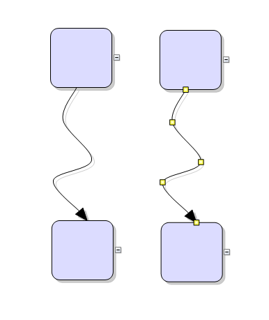
- The new Spline element of LinkShape enumeration draws links as interpolating splines that pass through all of their control points:
Miscellaneous
New in version 2.7
Free-form nodes
A FreeFormNode collects all points from users' mouse or touch input and displays them as node's outline. To let users draw free-form nodes interactively, set Behavior to DrawFreeForms or LinkFreeForms. Use the Points property of FreeFormNode to get or set outline points programmatically. If the Closed property is set, the node is drawn as a closed shape and its interior filled, or otherwise the node is drawn as a poly-line. If the distance between first and last points drawn by user is shorter than AutoCloseDistance, the node's Closed property is automatically set to true. AutoCloseDistance default value is Number.MAX_VALUE, so free-form nodes are always closed.
Convert free-form drawings to ShapeNodes
Additional drawing modes, convenient for touch input, convert FreeFormNode objects drawn by user to ShapeNode objects with matching shapes. To enable them, set Behavior to DrawFreeShapes or LinkFreeShapes. The shapes against which the user's input is matched are set via diagram's FreeFormTargets property. By default it contains Rectangle, Decision and Ellipse shapes.
Miscellaneous
- TypeScript definitions for the Diagramming API are now provided in jsdiag.d.ts file.
- The MaxJsonLength and RecursionLimit static properties of DiagramView class let you configure the corresponding settings of internal JavaScriptSerializer instances.
- PdfExporter now creates page hyperlinks if HyperLink is set to a value in "page://{number}" format, e.g. set "page://1" to open the second PDF page when the item is clicked
- VirtualScroll mode fixed for parent div size specified in percent units.
- Fixed bug where the ExpandOnIncoming property specifying link direction for collapse/expand actions did not work correctly.
- Removed several global variables created inadvertently by the control.
New in version 2.6.1
- NodePastedScript and LinkPastedScript client-side events raised when items are pasted from the clipboard.
- System3D member added to CellFrameStyle enumeration. If it's assigned to the CellFrameStyle property of a TableNode, cell frames are rendered using 3D effect.
- Resize and move interaction cursors now remain visible until the user releases mouse button.
- Fixed bug where auto-handles mouse hint cursor would not match the item type.
- Fixed bug where multiple lines in link's Text were drawn overlapped.
- Fixed bug where BaseShape arrowhead would point in wrong direction for strictly vertical links.
New in version 2.6
Resize table columns and rows
Columns and rows of a TableNode can now be resized interactively if its AllowResizeColumns or AllowResizeRows properties are enabled. In order to resize, move the mouse pointer to the border line on column's right side or row's bottom side until it shows resize cursor and start dragging. The control raises tableColumnResizing and tableRowResizing events to let you validate new size or prevent resizing some elements. The tableColumnResized and tableRowResized events are raised after the operation completes.
Shape libraries
The ShapeLibrary class lets you use custom geometric shapes created using MindFusion ShapeDesigner tool. Call the ShapeLibrary.loadFromXml(url) method to load a library XML file. ShapeLibrary.getShapes() returns an array of the loaded Shape objects. The NodeListView.setShapeLibraryLocation(url) method creates a prototype ShapeNode object for each shape from the specified library. Location of a shape library can also be specified server-side through the DiagramView's ShapeLibraryLocation property.
Miscellaneous
- TextStroke and TextStrokeThickness properties of DiagramItem let you set color and thickness of text outlines;
- Items can now be deleted using Backspace key when running on Mac;
- Caption divider line in TableNode and ContainerNode is now rendered clipped when caption height is smaller than corner radius;
- Diagram.TooltipDelay property specifies the delay in milliseconds before showing tooltips;
- The NodeListView.Orientation property lets you set the view's orientation to Horizontal or Vertical (members of MindFusion.Diagramming.Orientation enum);
- Fixed overlaps in TreeLayout when arranging nodes of different sizes;
- Anchor points indices are now serialized;
- Deserialization of custom item classes now works regardless of whether names contain Node or Link suffix;
New in version 2.5
Appearance improvements
- Set the Shape property of tables and containers to RoundedRectangle to render them with rounded corners.
- Hide the frames of table cells by setting the CellFrameStyle property to None.
- Set the EnableStyledText property of TableNode class to render styled text in tables.
New events
- The control raises cellTextEdited event when users edit the text of table cells.
- The createEditControl event lets you create custom DOM element or fragment to use as in-place text editor.
- NodeListView raises nodeSelected event when the user selects a node.
Miscellaneous
- Width and Height properties and the corresponding setter methods for DiagramView, NodeListView, Overview and ZoomControl are now obsolete. You can use the new helper methods of the controls to pass an HTML attributes object, containing style data.
- Stop the controls from adding references to the client scripts by disabling the AddScriptReferences property.
- the loadFromXml method of Diagram class lets you load XML files from client side.
- fixed setZoomFactorPivot bug in virtual scroll mode.
New in version 2.4
Styled text
The EnableStyledText property of ShapeNode allows using HTML-like formatting tags to apply various attributes to the node's text. At this time the component supports the following formatting tags:
- <b> specifies bold text
- <i> specifies italic text
- <u> specifies underlined text
- <color=value> specifies text color
- <br /> specifies line break
Improved text rendering
- General text rendering quality improved. The component removes scale transformations applied for MeasureUnit and ZoomFactor before drawing text on the canvas, and instead specifies a scaled font size, which helps improve text appearance in Firefox and older versions of Chrome.
- Now items' text can be drawn underlined. To enable this, set the underline attribute of the Font class.
- Font styles can be specified via Style instance by setting its FontStyle property.
License keys
There is no separate trial build of the control assemblies anymore. Instead, set the LicenseKey property to disable the component's evaluation mode and stop displaying trial messages. If your application contains more than one DiagramView instance or other controls by MindFusion, you could call MindFusion.Licensing.LicenseManager.AddLicense(key) to specify the key once instead of setting it per each control. License key strings are listed on the Keys & Downloads page at MindFusion's customer portal.
Miscellaneous
- Items can be rendered using dashed lines in browsers that support the setLineDash function. To enable this, set pen's DashStyle property for DiagramItem or the StrokeDashStyle property of Style.
- Client-side TreeLayout supports organizational charts with assistant nodes as in Microsoft Office diagrams. To mark nodes as assistants, set node.LayoutTraits[TreeLayout.Assistant] to a member of the AssistantType enumeration . Set TreeLayout.enableAssistants = true to arrange assistant nodes in a separate branch between the main node levels.
- Specify if separate connected components of a graph should be arranged horizontally or vertically relatively to each other by setting the multipleGraphsPlacement attribute of layout classes.
- The type of Margin property of LinkLabel has been changed from number to Thickness, letting you specify different margin sizes at each side of the label.
- Masters for Start and Arrow7 shapes added to VisioExporter template file.
- VisioImporter now tries to preserve Shape of ShapeNode objects when importing from files created by VisioExporter.
New in version 2.3
Import diagrams from SVG
The SvgImporter class allows importing Scalable Vector Graphics files (*.svg) into MindFusion.Diagramming. Each top-level SVG group element is imported as a separate SvgNode, whose Content is set to the group's child elements. If the SVG file was exported from Visio or OpenOffice Draw, SvgImporter will create DiagramLink objects for groups it recognizes as connectors in order to recreate the original diagram model, though in this case it will not preserve fully the original appearance of connectors in SVG.
Zoom control
The ZoomControl class lets users change interactively the current zoom level and scroll position of a Diagram. Bind the ZoomControl to the corresponding Diagram by setting its TargetId property. Set the ZoomStep and ScrollStep properties to specify the amount added to diagram's zoom level or scroll position by ZoomControl's buttons. You can customize the control's appearance by setting properties such as Fill, BorderColor, CornerRadius and TickPosition.
Shadow styles
The Diagram.ShadowsStyle property and ShadowsStyle enumeration let you switch shadow rendering order between rendering all shadows in a single background layer (OneLevel) and drawing each shadow close to its node, possibly overlapping other nodes (ZOrder). ShadowsStyle.None lets you disable shadows altogether.
Miscellaneous
- Set the LinkLabel.Brush property to fill the background of link labels.
- Number of link segments can now be set by calling the DiagramLink.setSegmentCount() method.
- The BackgroundImageAlign property specifies the alignment of diagram's BackgroundImage.
- The TextPadding property specifies the padding distance between the borders of a node and its text.
- Nodes of all classes can be rotated.
- VisioExporter export speed has been improved greatly for large diagrams.
- For consistence with MindFusion libraries for other platforms, BackBrush in default diagram style has been changed to white brush.
- Fixed KeepInsideParent constraint for rotated parent nodes.
- Set the AutoGrow property to false to prevent containers from resizing automatically when they would not fit newly added nodes.
- The Brush property of LinkLabel class lets you set background color for link labels.
- Now the NodeModified event is raised after the undo record for that modification has been added to the command history. This makes it easier to merge the ModifyItemCmd with custom commands created from NodeModified handler.
- The ChangeUnit method sets a new MeasureUnit and rescales the coordinates of diagram items to keep them the same size.
- OrthogonalLayout no longer ignores repeating links, and will now place them at a distance specified via RepeatingLinksPadding property.
New in version 2.2
SVG Nodes
The SvgNode class represents nodes that can display SVG drawings. SVG graphics are rendered instead of Image, and on top of the geometry rendered by the base ShapeNode class. The SVG drawing of the node is specified through its SvgUrl property.
jQuery support
Now the control can use jQuery for browser abstraction instead of Microsoft Ajax. To choose between Microsoft Ajax and jQuery support use the ClientSideMode property.
Visio2013Exporter improvements
- Support for multi-segment links
- Bezier links are now exported as NURBS lines
- Support for rotated nodes
- Proper scale for all MeasureUnit values
- Support for semi-transparent colors
Miscellaneous
- Set the BackgroundImageUrl property to draw an image as Diagram's background.
- The TextStyle property of links provides support for several different text position and orientation styles, defined by the LinkTextStyle enumeration.
- Set the AllowUnconnectedLinks property to true to let users draw links without connecting them to nodes.
- OrthogonalLayout no longer ignores repeating links, and will now place them at a distance specified via RepeatingLinksPadding property.
New in version 2.1
Tree map layout
Tree maps represent hierarchies by nesting child nodes within their parents, where the areas of leaf nodes are proportional to their Weight values. Unlike other layout algorithms, TreeMapLayout expects hierarchies to be defined via grouping or containment (see AttachTo method and ContainerNode class), and will ignore any links in the diagram. The diagram area covered by the topmost nodes in a hierarchy is specified via the LayoutArea property. By default, the layout tries to keep the ratio of node sides as close as possible to one. However this could make it hard to distinguish separate levels of the hierarchy. To alleviate that, set Squarify to false, and child nodes will be arranged either as a row or a column inside their parent node, alternating directions for each level. The drawback is that when Weight ratios differ greatly or nodes contain many children, some nodes could end up with very narrow rectangles.
Decision flowchart layout
DecisionLayout arranges simple flowcharts consisting of decision boxes with up to three outgoing links per node and activity boxes with a single outgoing link per node. The nodes are arranged in columns and rows, whose distance depends on the HorizontalPadding and VerticalPadding property values. When links share the same row or column, they are placed at a distance specified via LinkPadding. The layout arranges nodes recursively starting from StartNode. If StartNode is not specified, the algorithm selects the root of the deepest branch of the graph's spanning tree as start node.
Miscellaneous
- Layout algorithms now automatically resize diagram's Bounds if it's not large enough to fit the arranged content. To revert to old behavior and keep fixed Bounds size, set GrowToFit to false.
- Fixed hit-testing offset bug when using version 4 of Microsoft Ajax in Chrome browser.
- Fixed error when using gradient brushes for painting swimlane grid cells.
New in version 2.0
Export Visio 2013 files
The Visio2013Exporter class can export the contents of Diagram and DiagramDocument objects to Visio 2013 VSDX files. In order to use it, add a reference to the MindFusion.Diagramming.Export.Visio.dll assembly. Similarly to the VDX format exporter, Visio2013Exporter relies on a template file, called Visio2013.vxt, containing some boilerplate Visio XML code. The template must be either located in same folder as the application assemblies, or its path must be specified via the TemplatePath property. At this time the exporter supports shapes from Visio basic and flowchart stencils.
Visio2013Importer improvements
- The importer now supports Visio group shapes. Child shapes in groups are no longer lost when importing, and their corresponding diagram nodes are attached to the corresponding group node.
- Visio NURBS curves are now imported as Bezier-style links.
- Fix for importing connectors with applied rotation transform.
- Shapes with a ‘hidden’ attribute in master definition are now imported as invisible items.
Headers and footers in PDF
PdfExporter can now add headers and footers to exported pages. To specify their contents and font, set the HeaderFormat, HeaderFont, FooterFormat and FooterFont properties. Adding a %P placeholder to HeaderFormat or FooterFormat will render the current page number at its position.
Resize multiple nodes
Now it is possible to resize multiple selected nodes simultaneously. To enable that, set the AllowMultipleResize property to true. When enabled, dragging a corner or side adjustment handle of any node resizes all nodes in the selection. The operation will be cancelled for all nodes if any of them does not accept its new size, e.g. if it's smaller than MinimumNodeSize value. The operation can be cancelled on the client side for all nodes by handling the selectionModifying validation event.
Undo / redo support
If the UndoEnabled property is set to true, the Diagram control tracks changes done to its items and allows undoing and redoing them later by calling the undo and redo methods respectively. Multiple changes could be recorded as a single undoable operation by enclosing them between startCompositeOperation and commitCompositeOperation calls. It is also possible to create custom undoable operations by deriving from the Command class and calling executeCommand with the custom command as argument.
Animations
Diagram items can now be animated through the Animation class in the MindFusion.Animations namespace. The class implements several built-in animation and easing types, and allows definition of custom animation functions, to create fluid and pleasing animation effects. The new Animations example demonstrates how to apply several animation types to both nodes and links.
Clipboard support
A single item or a selection of items can be copied or cut to a clipboard maintained by the diagram control. This is done programmatically using the copyToClipboard and cutToClipboard methods. To paste the clipboard contents into the current diagram, call pasteFromClipboard. If running under Internet Explorer, it is also possible to copy to the system clipboard by passing a true argument to clipboard methods.
Swimlanes
The lane grid lets you emphasize the relationship between a group of diagram items by displaying them in a distinct lane or cell within the grid. To display the lane grid, set the ShowLaneGrid property of the Diagram class to true. In order to customize the grid, set the various attributes exposed by the LaneGrid property, which lets you specify the number of rows and columns, add headers, customize the cell appearance, etc. The new Lanes sample page uses the lane grid to let users draw Gantt charts.
Magnifier
The new magnifier tool allows users to interactively zoom in (or out) portions of the diagram by holding down a modifier key or pressing a mouse button. The magnifier's appearance can be customized via properties such as MagnifierShape and MagnifierFrameColor. Its size and magnification can be set via MagnifierWidth, MagnifierHeight and MagnifierFactor properties. The magnifier appears when users press the mouse button mapped to MouseButtonActions.Magnify. It can also be shown programmatically by setting the MagnifierEnabled property.
Intellisense support
The package now includes a MindFusion.Diagramming-vsdoc.js file providing code completion information. To load it in Visual Studio, add e /// <reference path="MindFusion.Diagramming-vsdoc.js" /> tag to the top of your script files. Use the static Diagram.create and Diagram.find methods instead of $create and $find to let Visual Studio infer the type of returned Diagram objects correctly.
Miscellaneous
- Several new shapes added for better compatibility with Visio 2013 basic stencil: RightTriangle, Decagon, Trapezoid, Star4Pointed, Star5Pointed, Star6Pointed, Star7Pointed, Star16Pointed, Star24Pointed, Star32Pointed, Donut, Plaque.
- Set the ModificationStart property to AutoHandles to let users start moving or resizing an item without selecting it first.
- The diagram area can be resized automatically to fit the current diagram items as set through the AutoResize property.
- The AutoScroll property enables automatic scrolling when the mouse is dragged near the diagram edges.
- enterInplaceEditMode and leaveInplaceEditMode events raised when the control shows or hides the in-place edit box.
- linkPointed and nodePointed events raised when the mouse hovers over an item.
- The control displays a scaled-down copy of the node being dragged from the NodeListView control.
- Set Behavior to SelectOnly to let users select existing items but not to modify them or draw new ones.
- Added chainable Set* methods for all DiagramView properties.
API changes
New in version 1.8
Rounded links
Links whose Shape is set to Polyline or Cascading can be rendered with rounded joints between their segments. To enable that, set the diagram's RoundedLinks property to true. The RoundedLinksRadius property lets you specify the radius of joint arcs.
Link crossings
The component can represent the crossing point of two links either as an arc (bridge) drawn for the link with higher Z index, or as a cut in the link with lower Z index. To enable that, set the diagram's LinkCrossings property to either Arcs or Cut member of LinkCrossings enumeration. Set CrossingRadius to specify the radius of crossing arcs.
Visio2013Importer improvements
- The Item argument of ImportItem event handlers is now pre-set to a DiagramItem instance created for the imported Visio shape, letting you avoid parsing some standard data such as Bounds or Text. You can either modify this item's properties, or replace it with a new instance of a different type.
- Fixed a crash when a shape master does not have a name attribute (this happens with custom stencils).
- Fixed a crash when theme1.xml is missing from the imported vsdx archive (this happens with files converted from old Visio versions to 2013 format).
- Fixed a parse exception for some non-English locales.
- Fixed a bug where one-segment connectors were imported at wrong positions.
Miscellaneous
- Node rotation was ignored by link routing algorithm; now links are routed around the rotated node's boundaries.
- The routeAllLinks function pulls apart link segments when they would overlap.
- Set Behavior to Pan to only let users pan the view when dragging the mouse.
- The component now raises clicked event for the diagram when there isn't any item at the click location (which would cause nodeClicked or linkClicked event).
New in version 1.7
Import Visio .vsdx files
The
Visio2013Importer class can import .vsdx files, created by Visio 2013. In order to use it, you must add a reference to the
MindFusion.Diagramming.Import.Visio.dll assembly. Various overloads of the
Import method can be used to import the file into a
DiagramDocument whose pages correspond to the Visio drawing pages, or into a single
Diagram whose content is merged from all imported pages.
Visio2013Importer supports the basic flowchart and data flow Visio stencils. For each node shape from the .vsdx file, the importer creates a
ShapeNode object whose
Shape,
Text,
Brush and
Pen properties are set to values corresponding to the imported Visio shape. For each connector shape, the importer creates a
DiagramLink object whose
Origin and
Destination are set to the corresponding imported nodes, and whose
ControlPoints reflect the geometry of the connector.
Adjustment handle styles
Appearance of nodes' adjustment handles can be customized by setting the HandlesStyle property. Supported styles include round and square handles, dashed and hatched frames, and some combinations. Apart from appearance, the handles style also controls what part of a node can be dragged to move or resize it. It is also possible to render custom handles by handling the drawAdjustmentHandles event, and implement custom hit-testing by handling the hitTestAdjustmentHandles event.
Dynamic links
A dynamic link automatically orients its end segments so that they point to the target nodes' centers while the link's nodes are dragged around. If a node's AnchorPattern is set, link ends will align to the closest anchor point instead. Positions of the link's end points are also updated when the next-to-last control points are being modified. To enable this, set the Dynamic property to true.
ContainerNode enhancements
- Apply layout algorithms to content of a ContainerNode by calling its arrange method.
- Selectively prevent adding or removing child nodes to/from a container by handling the containerChildAdding and containerChildRemoving events.
Miscellaneous
- The Dirty flag is automatically set when a serializable property of an item or the diagram has been modified. It lets you determine where there are any changes that need to be saved.
- The AdjustmentHandlesSize property specifies the size of adjustment handles.
- The ShowDisabledHandles property controls whether disabled adjustment handles are draw on screen.
- Several new predefined shapes available in the Shapes class - RightTriangle, Decagon, Trapezoid, Star4Pointed, Star5Pointed, Star6Pointed, Star7Pointed, Star16Pointed, Star24Pointed, Star32Pointed, Donut and Plaque.
New in version 1.6
Import OpenOffice Draw files
The DrawImporter class can import .odg files, created by the OpenOffice Draw vector graphics editor. In order to use it, you must add a reference to the MindFusion.Diagramming.Import.Draw.dll assembly. Various overloads of the Import method can be used to import the OpenOffice drawing into a DiagramDocument whose pages correspond to the Draw pages, or into a single Diagram whose content is merged from all imported pages. DrawImporter supports shapes from the General and Flowchart shape palettes in Draw. For each node shape from the .odg file, the importer creates a ShapeNode object whose Shape, Text, Brush and Pen properties are set to values corresponding to the imported OpenOffice shape. For each connector shape, the importer creates a DiagramLink object whose Origin and Destination are set to the corresponding imported nodes, and whose ControlPoints reflect the geometry of the connector.
ContainerNode improvements
- Child nodes are now drawn by their containers; when containers overlap, the children of a lower container cannot appear in front of the upper container anymore.
- The ClipChildren property specifies whether to clip child items to container's boundaries.
- The ZIndex property no longer changes automatically when dropping nodes into a container.
- The Visible property of child items no longer changes when folding or unfolding containers; this lets you keep invisible items inside containers.
- When selection including a container and its child node is dropped into another container, the child node now remains in its original container.
PdfExporter improvements
- Improved handling of clip regions in custom drawing code.
- PdfExporter now honors the target Rectangle property of linear gradients.
- PDF shadings now include all colors from a ColorBlend.
- More precise character widths set when text includes both eastern glyphs and Latin characters.
- More precise widths set for Cyrillic characters.
Miscellaneous
- New overloads of the DiagramView, Overview and NodeListView extension methods have been added. The initFunction parameter can be used to set the name of the javascript function, which will contain the initialization code for the corresponding control.
- controlLoaded event is now raised when a control is loaded on the client-side.
- Added support for Diagram.LinkHitDistance, DiagramItem.HyperLink and DiagramNode.EnabledHandles properties.
- Added support for custom node and link types - check the new CustomNodes sample on how to use them.
- Two new measure units - Centimeter and WpfPoint are now available.
New in version 1.5
Server Side
Miscellaneous
Client Side
Node effects
Two visual effects, represented by GlassEffect and AeroEffect classes, can be applied to nodes. To apply an effect, create an instance of the respective class, set up its properties, then add the instance to the Effects collection of a node (or to Diagram.NodeEffects collection to apply it to all nodes). Effects can be added, removed or modified at any time and this will immediately reflect on the diagram. Effects of different types can be applied simultaneously. It is also possible to apply more than one effect of the same type.
Radial gradients
Nodes can be filled using radial gradients by passing objects in following format to setBrush. If the gradient should blend only two colors, they can be specified using color1 and color2 fields instead of colorStops.
| JavaScript
Copy Code
|
|---|
var brush =
{
type: "RadialGradientBrush",
colorStops:
[
{ position: 0, color: "white" },
{ position: 0.5, color: "lightGray" },
{ position: 1, color: "blue" }
],
x1: 20, y1: 20, radius1: 30,
x2: 40, y2: 20, radius2: 80
};
node.setBrush(brush); |
Multiple labels per link
The LinkLabel class allows multiple captions to be displayed for a single DiagramLink object. Link labels provide a set of properties allowing full customization of their display and positioning. Labels can also be arranged automatically to avoid overlapping nodes and other labels by setting LinkLabel.AutoArrange to true.
New events
- nodeSelected and linkSelected events are now raised when an item is selected, either programmatically or by the user.
- nodeDeselected and linkDeselected events are now raised when an item is deselected, either programmatically or by the user.
- nodeDoubleClicked and linkDoubleClicked events raised when the user double clicks an item.
- nodeCreating is now also raised while the user drags a node from the NodeListView control.
Miscellaneous
- Call setVirtualScroll to enable virtual scrolling mode. In this mode, the canvas stays as big as its containing div, and its content is drawn with a translation bound to the div's scrollbar positions. This allow displaying large diagrams in browsers and on mobile devices where the size of HTML canvas elements is limited.
- resizeToFitText method added to ShapeNode.
- Improved support for nested containers.
New in version 1.4
Server side
Styles and themes
The appearance of the items in a diagram can now be modified using styles. The style represents a set of properties, which can be applied to an individual diagram item (by assigning it to the
DiagramItem.Style property) or to all items of a specific type (by using a
Theme).
The theme represents a collection of styles. Each style in the theme is associated with the diagram items of a specific type and affects all items of this type. Themes can be loaded from XML files.
For more information about this new feature, check Styles and Themes.
One-way graph Layout
The OneWayLayout class ensures that links enter into nodes from the same general direction and exit them from the opposite side. If the graph contains cycles, some links bend around the nodes to keep the enter/exit direction consistent. The algorithm aims to minimize the number of such links.
Composite layout improvements
The
CompositeLayout exposes several new properties. The
UseAdditionalPartitioning property can be set to true in order to enable additional partitioning pass after the default partition. This is especially useful when the initial partitioning produces a graph with nodes with many leaf children.
Parallel layouts
The .NET 4 version of
MindFusion.Diagramming takes advantage of the
Task Parallel Library (TPL) to enable parallelism on the different layout algorithms. Set the EnableParallelism property on the
Layout class to true to enable arranging different subgraphs on different threads to possibly improve performance on multiprocessor systems. In addition, the maximum degree of concurrency can be manipulated through the
MaxDegreeOfParallelism property. Note that only independent subgraphs are processed in parallel, so the
SplitGraph property of layout classes that provide it must also be set.
Preserve order in tree layout
The
Balance property of
TreeLayout can be set to
Preserve to keep the original geometric order of child nodes when arranging them under their parent. This can be used to arrange tree branches in a specific order by first positioning them in increasing horizontal or vertical positions.
Export improvements
- RenderOptions property added to PdfExporter, SvgExporter and WmfExporter allows controlling various aspects of exported diagrams.
- Speed of PDF generation by PdfExporter greatly improved.
- VisioExporter.DynamicsOff can be used to disable dynamic link routing in Visio 2010 in order to preserve the position of control points from the exported diagram;
- PdfExporter now creates PDF Bezier objects for Bezier curves in the diagram instead of approximating them with lines;
- If VisioImporter.ApplyVisioUnit is enabled, the diagram's unit will be set to the one from the imported VDX file;
Miscellaneous
- The value of DiagramItem.ZIndex property is no longer required to be unique and smaller than the number of items;
- Diagram item collection types now implement the generic IList interface;
- The last row in a TableNode will now be rendered clipped if it fits only partially inside the node, whereas in previous versions the row would not be rendered at all.
- The AllowAddChildren and AllowRemoveChildren properties of ContainerNode specify whether users are allowed to add or remove child nodes to / from the container.
- The GetNearestBorderPoint method of DiagramNode can be used to find a point from the node's border closest to a specified point.
API changes
- RotationAngle property moved from ShapeNode to base DiagramNode;
- Type of Group.FollowMasterRotation changed from boolean to enum GroupRotation;
- LinkStyle enum renamed to LinkShape;
- DiagramLink.Style property renamed to Shape;
- The type of TextColor and CaptionColor properties have been changed to Brush; the properties have been renamed to TextBrush and CaptionBrush;
- The default value of Pen, Brush and Font properties of items is now null (Nothing in Visual Basic) to allow for inheritance from DiagramItem.Style or Diagram.Theme.
- ZIndex no longer corresponds to the position of items within Diagram.Items collection. Items however still contains the items sorted by Z order, as defined by item's ZIndex;
- Event handler delegates have been removed; events are now defined as generic EventHandler specialized via EventArgs type. For example the type of NodeCreated is now EventHandler<NodeEventArgs>;
- InitializeNodeScript and InitializeLinkScript properties have been added to support initializeNode and initializeLink client-side events.
- NodeListView.AddShapeNode method renamed to AddNode.
Client side
Table Nodes
A
TableNode displays tabular data, and can be used to represent table schemas in database diagrams or classes in class-hierarchies. A table contains cells arranged in a grid, and every cell can display text and/or image. Cells, columns and rows can be customized in various ways - there are properties available for setting their extents, style, image and text alignment. The number of cells in a table's grid can be programmatically changed by calling methods such as
redimTable,
insertRow and
insertColumn. If a table contains many rows, you can let users scroll them up or down by calling the setScrollable method.
Container Nodes
A
ContainerNode can contain other diagram nodes. When a container is moved, its child nodes move too. Containers can be nested one within another to unlimited depth. They can be folded to a smaller size, hiding their child items, and unfolded to show content again. Nodes inside a container can be linked to nodes both inside and outside of it. If a link connects items in the same container, the container is not considered an obstacle by the auto-routing algorithm.
Styles and Themes
An instance of the
Style class can be used to set items' appearance properties as a single unit via the setStyle method. In order for style attributes to be used, the respective local appearance properties of a
DiagramItem objects must have undefined or null values. If an item's Style does not define a value for some attribute, it is looked up in the styling hierarchy, first in the diagram's Style, next in the current Theme, and finally in the set of default styles defined for each item class.
Shadows
Diagram items can now cast shadows. The shadow color is specified via the setShadowColor method and the offset of a shadow from its item is set via setShadowOffsetX and setShadowOffsetY methods. Shadows aren't rendered if getEffectiveShadowColor returns null or undefined value.
Miscellaneous
- The Locked property can be used to disable interaction with a diagram item.
- Improved rendering speed when changing items' appearance properties.
- Call the setTooltip method to associate tooltip text with an item. The tooltip appears when the mouse pointer hovers over an item for a second.
- Specify the line width of item frames via the setStrokeThickness method.
- initializeNode and initializeLink events are raised when users start drawing a node or a link interactively.
- The NodeListView control can now host table and containers. The addBox and selectBox methods have been replaced by addNode and selectItem methods.
- The setStartPoint and setEndPoint methods of links provide shortcuts for setting the first and last points in ControlPoints.
New in version 1.3
Attaching and grouping items
MvcDiagram allows attaching a node to another node, establishing a subordinate - master relationship between them. The easiest way to attach nodes is to call the attachTo method. When a master node is moved, all of its subordinates follow it, so that the initial distance between them stays constant. This happens both when a user moves the master node around, and when the node's position is changed using a method or a property.
Collapse and expand tree branches
If a diagram represents a tree structure, the tree branch starting from a node can be collapsed or expanded again in order to hide or display hierarchy details. To enable this, call the setExpandable method. There is a [±] button displayed beside an expandable node to allow users to collapse or expand the tree branch starting there. By default, pressing that button automatically toggles the Expanded property of the node and raises the TreeExpanded or TreeCollapsed events.
User interaction modes
Call setBehavior with one of the Behavior members as argument to specify how the diagram should handle mouse input.
- DoNothing: the diagram is read-only, but nodeClicked and linkClicked events are still raised.
- Modify: existing diagram items can be selected and modified, but no new items can be created interactively.
- DrawLinks: existing nodes can be linked interactively, but no new nodes can be drawn.
- DrawShapes: drawing with the mouse creates new ShapeNode objects; links cannot be created interactively.
- LinkShapes: this is the default behavior, where drawing over an empty spot of the diagram creates a ShapeNode, and drawing over a node creates a link.
Touch input
When running under the iOS Safari web browser, the control handles one-finger touch events to allow drawing and selecting items interactively. In addition, the hit-test area around adjustment handles is larger to make touch modifications easier. Two-finger gestures are delegated to the browser - they either scroll the canvas when dragging in the same direction or zoom the page when dragging in opposite directions. The preventDefaultTouch flag can be set to false to revert to the default one-finger touch behavior (scroll the whole page).
Miscellaneous
- The Visible property specifies whether an item should be shown on screen.
- Validation events added: NodeCreating, LinkCreating, NodeDeleting, LinkDeleting, NodeModifying and LinkModifying.
- The ScrollX and ScrollY properties and scrollTo method lets you set the diagram's scroll position.
- getViewport returns the currently visible part of the diagram.
- setZoomFactorPivot sets the zoom level in such way that the pivot point's screen position does not change.
- zoomToRect zooms and scrolls the view to fit the specified document rectangle in the Diagram's visible area.
- zoomToFit zooms the view to fit the document contents into the current view size.
- getContentBounds returns the smallest rectangle that bounds all diagram objects.
- keepGroupLayout indicates whether to treat each group of attached nodes as a single vertex in the arranged graph.
- Extension methods are modified to add MVC3 Razor support.
New in version 1.2
Server side
Fractal tree Layout
FractalLayout is a tree layout algorithm that places child nodes symmetrically around their parent node. Nodes at the lowest level are arranged directly in a circle around their parent. At upper levels, the already arranged nodes form branches that are arranged in a circle around the new parent node. The algorithm is recursively repeated till the highest level is reached. If nodes in the tree have uniform number of children, the end result has fractal-like appearance (subsets of the graph look like scaled-down copies of the whole graph). You can choose which node should be displayed at the center of the topmost circle by setting the Root property. If it is not specified, the algorithm automatically selects a root that leads to more balanced distribution of nodes.
LayeredLayout enhancements
- Specify start and end nodes in LayeredLayout via the StartNode and EndNode properties.
- EnforceLinkFlow specifies whether to attempt to force all links to go in the same direction. If the graph being arranged contains cycles, some of the links will still go backward.
Client side
Alignment grid
The alignment grid help users place the diagram items more precisely. To activate the grid, set the AlignToGrid property to true. If the grid is active while an item is being created or modified, the item's control-points are aligned to the nearest grid points. The distance between adjacent grid points is set via the GridSizeX and GridSizeY properties. The grid can be either visible or invisible, depending on whether the ShowGrid value is true or false. If visible, the grid is painted as a matrix of points or as series of crossing lines, as specified by the GridStyle property. GridColor defines the color with which the alignment points or lines are painted.
Bordered tree layout
In contrast to TreeLayout, which centers the parent node above its child nodes, BorderedTreeLayout arranges children in columns at a horizontal offset form their parent. BorderedTreeLayout members control the tree direction, how much space to leave between tree levels, and between nodes on the same level.
Anchor points
The AnchorPattern class represents a set of AnchorPoint objects, which specify the exact locations where links are allowed to connect to nodes. A pattern can be assigned to nodes by calling their setAnchorPattern method. The AnchorPattern class exposes several predefined patterns as static fields: decision2In2Out, decision1In3Out, leftInRightOut, topInBottomOut.


