

Charting for WPF provides two type of gauge controls - oval and linear. The two types of gauges are represented by the OvalGauge and LinearGauge classes respectively. The purpose of the gauge controls is to visualize various quantities in two layouts - circular and linear.
Structure
The most important component of each gauge control are the scales contained within it. The scales are collections of gauge elements such as ticks, labels, pointers, and so on. The scales provide interactivity and animation. The gauges are merely shells, which provide visual decoration to the shells nested within them. The following example demonstrates how to define a simple OvalGauge control with a single oval scale in it in XAML:
XAML
 Copy Code Copy Code
|
|---|
<gauges:OvalGauge> |
The example (and all following examples hereafter) assumes that the gauges namespace is defined as following:
| XAML
Copy Code
|
|---|
xmlns:gauges="http://mindfusion.eu/gauges/wpf" |
Running the example will yield a result similar to the image below:
Removing the scale from the above gauge and running the application again will result in an empty gauge control.
Scales
As previously mentioned the scales can contain ticks, labels, pointers, ranges and other elements. There are two types of scale corresponding to the two types of gauges - OvalScale and LinearScale, which share a common base class - BaseScale. The oval scale distributes its elements in a circle and the linear scale distributes its elements along a horizontal or vertical axis.
Although it is possible to add oval scales to a linear gauge control and linear scales to an oval gauge control, this is not a common scenario. The scales are responsible for arranging their contents. They also provide user interaction and pointer animation.
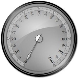
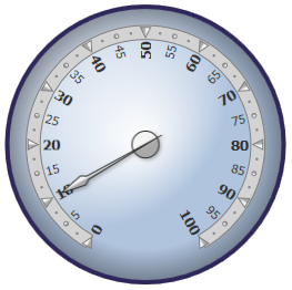
The following example adds a pointer to the gauge defined in the previous section:
| XAML
Copy Code
|
|---|
<gauges:OvalGauge> |
Running the application now will produce the following result:
To learn more about gauge scales, refer to the Scales topic.
Composition
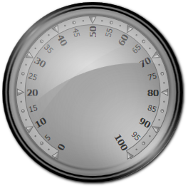
Gauge controls can contain more than just one scale. A common scenario is an oval gauge containing several concentric scales displaying different measures. The following example illustrates an oval gauge control with two concentric scales:
| XAML
Copy Code
|
|---|
<gauges:OvalGauge> |
The second scale in the example has a fixed margin so that it does not overlap the first scale. The following image demonstrates the gauge:
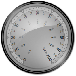
Gauge controls are not limited to the type of scales that can be added to them. Linear scales can be added to oval gauges and oval scales can be added to linear gauges, although this is not common. What is more, any WPF FrameworkElement can be added to a gauge. This can be especially useful for arranging scales within the gauge by employing the appropriate panels. In the example above, increasing the size of the gauge will cause the scales to overlap because the inner scale has a fixed margin. This can be resolved by using a Grid panel as a parent of the inner scale as illustrated by the example below:
| XAML
Copy Code
|
|---|
<gauges:OvalGauge> |
Resizing the gauge now will be consistent.
Custom Gauges
The customization of the gauge controls can be achieved by using custom control templates. A simple control template is provided in the following example.
| XAML
Copy Code
|
|---|
<Style TargetType="gauges:OvalGauge"> |
The above template simply adds to concentric ellipses as a background of the gauge. Applying the template on an oval gauge with a scale and a pointer within it will produce the following result:
Built-in Gauge Templates
There are several built-in templates for quadratic gauges in different orientations. Each built-in template is encapsulated in a separate resource dictionary. In order to use the custom templates, its corresponding resource dictionary needs to be merged in the application. The following table lists the predefined gauge templates and the names of their respective resource dictionaries.
Template | Dictionary Name |
|---|---|
Quadratic North-West | /MindFusion.Gauges.Wpf;component/Themes/OvalGaugeNW.xaml |
Quadratic North-East | /MindFusion.Gauges.Wpf;component/Themes/OvalGaugeNE.xaml |
Quadratic South-East | /MindFusion.Gauges.Wpf;component/Themes/OvalGaugeSW.xaml |
Quadratic South-West | /MindFusion.Gauges.Wpf;component/Themes/OvalGaugeNE.xaml |
Each dictionary contains two styles - one for the gauge control and one for the scales contained in it. The keys of the styles are displayed in the table below:
Template | Gauge Style Key | Scale Style Key |
|---|---|---|
Quadratic North-West | OvalGaugeStyleNW | OvalScaleStyleNW |
Quadratic North-East | OvalGaugeStyleNE | OvalScaleStyleNE |
Quadratic South-East | OvalGaugeStyleSW | OvalScaleStyleSW |
Quadratic South-West | OvalGaugeStyleSE | OvalScaleStyleSE |
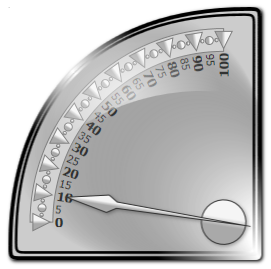
To use the built-in templates, the resource dictionary should be merged within the application. The following example merges the dictionary containing the North-West quadratic gauge templates.
| XAML
Copy Code
|
|---|
<Window.Resources> |
After that the styles in the dictionary can be referenced as static resources:
| XAML
Copy Code
|
|---|
<gauges:OvalGauge Style="{StaticResource OvalGaugeStyleNW}"> |
Running the application will produce the following result: