


As discussed in the Gauges topic, the scales are the most important component of a gauge. The scales display ticks and labels, they arrange and animate pointers and also maintain ranges and other auxiliary elements. There are two types of scales - oval and linear. The oval scale distributes its elements in a circle, the linear scale distributes its element on a vertical or horizontal axis depending on its orientation. The oval and linear scales are represented by the OvalScale and LinearScale classes respectively. These classes share a common base class - BaseScale and apart from the difference in their layout logic they are very similar.
Default Template
The following XAML shows the default template for the scale classes.
XML
 Copy Code Copy Code
|
|---|
<ControlTemplate> |
As can be observed in the template the scales have several named parts. The following table lists them.
Part | Type | Description |
|---|---|---|
ScalePath | Path | A WPF Path object which renders the scale geometry. |
RangeContainer | Grid | A WPF Grid panel which acts as a container of the Range objects added to the scale. |
TickContainer | Grid | A WPF Grid panel which acts as a container of the scale ticks. |
LabelContainer | Grid | A WPF Grid panel which acts as a container of the scale labels. |
PointerContainer | Grid | A WPF Grid panel which acts as a container of the Pointer objects added to the scale. |
The appearance order of the scale elements can be modified by replacing the scale template with another template in which the element containers are rearranged accordingly.
Customization
Geometry
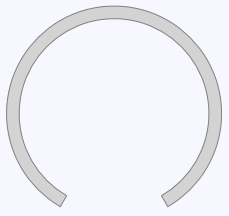
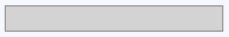
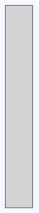
The scales display a geometry according to its type. The elements displayed in the scale are aligned and arranged relative to the scale geometry. The geometry is either circular, for oval scale, or trapezial, for linear scales. The following figures show the geometries of oval and horizontal and vertical linear scales.
Oval | Horizontal Linear | Vertical Linear |
|---|---|---|
|
|
|
The scale geometry can be customized through various properties. The fill and stroke of the geometry are defined by the Fill, Stroke and StrokeThickness properties. The start and end width are specified through the StartWidth and EndWidth properties. These properties are of type Length and can express relative values. See the Metrics section at the end of this topic for additional information regarding this. The start and end angles of the oval geometry can be specified through the StartAngle and EndAngle properties of the OvalScale class respectively. Both properties are expressed in degrees.
Data
The MinValue and MaxValue properties can be used to define the range of values displayed on the scale. The distribution of the values along the scale geometry is determined by the FunctionType property and can be Linear, Logarithmic or Custom. The base of the logarithmic distribution is specified through the LogarithmBase property. The custom value distribution function is supplied through the CustomFunction and ReversedCustomFunction properties.
Scale Elements
Various elements can be added to a scale, including ticks, labels and pointers.
Ticks and Labels
The ticks and labels represent cornerstones along the scale, usually round values. The ticks and labels are created and added to the scales implicitly according to the specified settings. There are three categories of ticks and labels - major, middle and minor. Each category has corresponding settings, exposed respectively by the MajorTickSettings, MiddleTickSettings and MinorTickSettings properties of the BaseScale class. These settings provide properties for specifying the number of ticks along the scale, their alignment and appearance, the format of their associated label, and more. For additional information about ticks and labels refer to the Ticks and Labels topic.
Pointers
The pointers represent needles or similar types of indicators within the scale. They are used to visualize a current measurement within the scale. For example, in a car speedometer the pointers are used to indicate the current speed. Pointers can be added to the scale through the Pointers property. Pointers expose numerous properties that can be used to customize their appearance. For additional information check the Pointers topic.
Ranges
The ranges emphasize portions of the scale which represent particular interest. An example of a range is the red zone of a car cyclometer. Ranges are added to the scale through the Ranges property. For extensive information on how to use and setup ranges, refer to the Ranges topic.
Miscellaneous
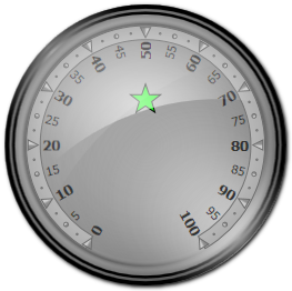
In addition to the elements discussed so far, scales can host any WPF FrameworkElement. The following code demonstrates how to add a WPF Path to a scale.
| XML
Copy Code
|
|---|
<gauges:OvalScale> |
The above XAML will render a scale similar to this image:
Interaction
Users can interactively adjust the value of the pointers in the scale by clicking anywhere within the scale bounds. Interactivity only applies to pointers with IsInteractive property set to true. When the value of a pointer is changed interactively, the ValueChanged of the pointer is raised.
Animation
Scales enable animations and interactivity of the pointers contained within them. The animation is enabled through the EnableAnimation property but only applies to pointers with IsAnimated set to true. Oval scales, which represent continuous intervals (for example clocks), can enable animation across scale boundaries by setting AnimateThroughSmallerArc property to true.
Metrics
The sizes of various scale elements can be specified either relatively to the size of the scale or as absolute values. This applies to all properties of type Length. Expressing a relative value in XAML can be achieved by appending the percent sign (%) at the end of the value. The following example defines a pointer with relative width and height in XAML:
| XAML
Copy Code
|
|---|
<gauges:Pointer PointerWidth="100%" PointerHeight="50%" /> |
Relative sizes are calculated differently depending on the type of scale. In oval scales relative sizes are calculated based on the radius of the scale. Therefore the above pointer will extend from the center to the outer edge of the scale. In linear scales sizes are based on the width or height of the scale depending on the scale orientation.