


This tutorial extends Tutorial 1: Getting Started by adding a pie chart to the report. The following steps are illustrated in more details:
- Prerequisites
- Adding a pie chart to the report
- Binding the chart
- Providing pie data using a query
Prerequisites
As mentioned above this tutorial extends Tutorial 1. Therefore it is expected that the reader has finished with Tutorial 1 before reading further.
1. Adding a pie chart to the report
The PieChart is another type of report element, just like Label and Picture. To add a chart to the report, simply add it to a page (or another container). Once the chart is added to the report, we have to position and resize the chart. This particular chart will hold quite a few pieces, so we will make it big enough. Set the Location of the chart to "225,0" and its Size to "250,250". Adjust the Location of the existing data range so that it does not overlap with the newly added chart. Set it to "0,300". Set some additional visualization properties - set PieBrush to "Blue", PieStroke to "Black" and PieStrokeThickness to "1".
Here is how the Report will look like after these modifications:
XAML
 Copy Code Copy Code
|
|---|
... |
2. Binding the chart
To provide data for the chart, set its DataSource property. In this particular case, bind the DataSource to the Products table ("{Binding Products}") and set the TargetMember property to the name of the field, which will supply values for the chart - in this case "UnitPrice".
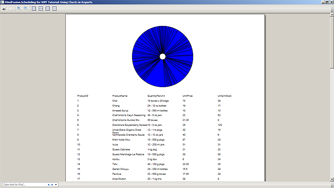
Running the application will have the following result:
3. Providing pie data using a query
As is observed from the illustration above, the chart pies are very small due to the large amount of products displayed. One way to resolve this problem is to filter the data displayed on the chart according to some criteria. To do this we need to create a custom query and a new data adapter in our data set.
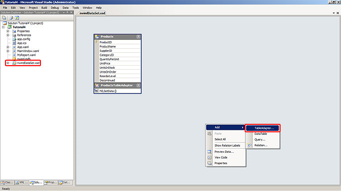
Navigate to the nwindDataSet.xsd file in the Solution Explorer window and double-click on it to open the data sat diagram in the environment. Right-click on an empty area in the diagram designer and select the 'Add -> TableAdapter...' command from the context menu.
A new table adapter is created in the data set and the TableAdapter Configuration Wizard is displayed. Ensure that the appropriate connection is selected in the combo box and click 'Next'. On the 'Choose a Command Type' step leave 'Use SQL statements' as selected and click 'Next'. The 'Enter a SQL Statement' step appears.
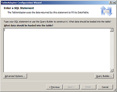
We have to enter the text of our SQL query in the next step. There are several ways to improve the query creation experience, but we will use a ready-made query text that selects only the products with price less than 20 and sorts them in ascending order.
| SQL
Copy Code
|
|---|
SELECT ProductName, UnitPrice |
Click the 'Advanced Options...' and uncheck the 'Generate Insert, Update and Delete statements' check box. Click 'OK' to close the 'Advanced Options' dialog box, then click 'Finish'. The table adapter representing our query is now properly initialized and appears on the diagram.
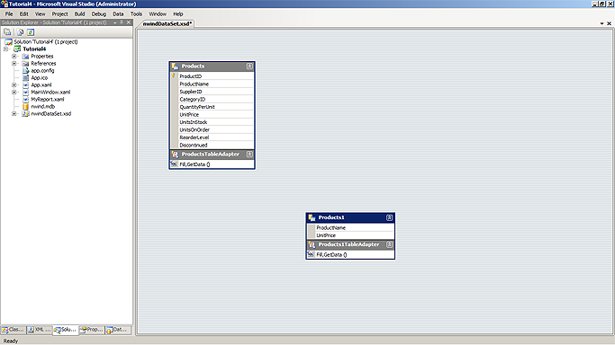
Select the data table representing the newly created query and press F2 to rename it. Replace "Products1" with "CheapProducts" then press ENTER. Rename the associated adapter to "CheapProductsTableAdapter". Save the data set and close it.
Go back to the report declaration and change the binding of the pie chart from Products to CheapProducts, then navigate to the window's constructor and add the following code for populating data from the data source using the newly created adapter:
| C#
Copy Code
|
|---|
Tutorial4.nwindDataSetTableAdapters.CheapProductsTableAdapter cheapProductsAdapter = |
| Visual Basic
Copy Code
|
|---|
Dim cheapProductsAdapter As New Tutorial4.nwindDataSetTableAdapters.CheapProductsTableAdapter() |
Running the application will now display the filtered list of products as illustrated below:

Tutorial 5 demonstrates how to paint the chart pieces with different colors and how to custom render the corresponding items in the data range.