


Composite Nodes
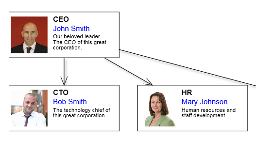
The CompositeNode class makes it easier to add custom graphics primitives to nodes. Appearance of composite nodes is defined by a tree of layout panels and child components. Unlike MindFusion's desktop diagram libraries, node templates are specified using JSON notation instead of XML. A sample node class derived from CompositeNode can be defined declaratively as below.
JavaScript
 Copy Code Copy Code
|
|---|
var OrgChartNode = CompositeNode.classFromTemplate("OrgChartNode", |
Objects from the MindFusion.Drawing namespace, such as Rect, Image, Path, Video, double as CompositeNode components. You can create custom components by deriving from ComponentBase and assigning a name to the custom class by calling registerComponent. Apart from JSON templates, the visual tree can also be created by adding panels and drawing objects programmatically starting from CompositeNode.root.
Panel classes include:
Named components (with specified name value) can be accessed by calling the getComponent method. Components whose autoProperty attribute is enabled will have a pair of get/set property methods generated automatically by classFromTemplate method. The auto-properties from above template can be used as below.
| JavaScript
Copy Code
|
|---|
var node1 = new OrgChartNode(diagram); |
Auto properties are also automatically serialized in JSON format, cloned by node.clone() method and saved/restored by undo commands.
The Shape class used to specify ShapeNode geometry can also be used as a component. When its isOutline attribute is set, the shape will control CompositeNode's geometry too, defining hit test and clip area, and link alignment points along node's border. If isOutline is disabled, the shape will serve mostly as a decorative element. The code below shows a sample fragment specifying shape component in template:
| JavaScript
Copy Code
|
|---|
{ |
A Button component that raises event when clicked can be added to template like this:
| JavaScript
Copy Code
|
|---|
{ |


