A set of properties for customizing items' appearance is provided by the ItemSettings class. The itemSettings property of the Calendar class gives you access to the itemSettings for your schedule.
The cssClass property lets you specify a common css class for styling all items. Use the size property to adjust the items' dimensions. Spacing property can be used to change the amount of space between adjacent items. The display of continuation arrows of multi-line items is controlled by the showContinuationArrows property. You can choose whether or not to use the built-in functionality of the item cues by setting the showCues property accordingly. Finally, items display can be switched on and off through the showItems property.
The following code creates a calendar and customizes its items. The code assumes you have initialized a <div> element with id "calendar" in a web page that references the JavaScript file, which contains this code:
JavaScript
 Copy Code Copy Code
|
|---|
var p = MindFusion.Scheduling; // create a new instance of the calendar // set the view to MonthRange, which displays several months in a grid |
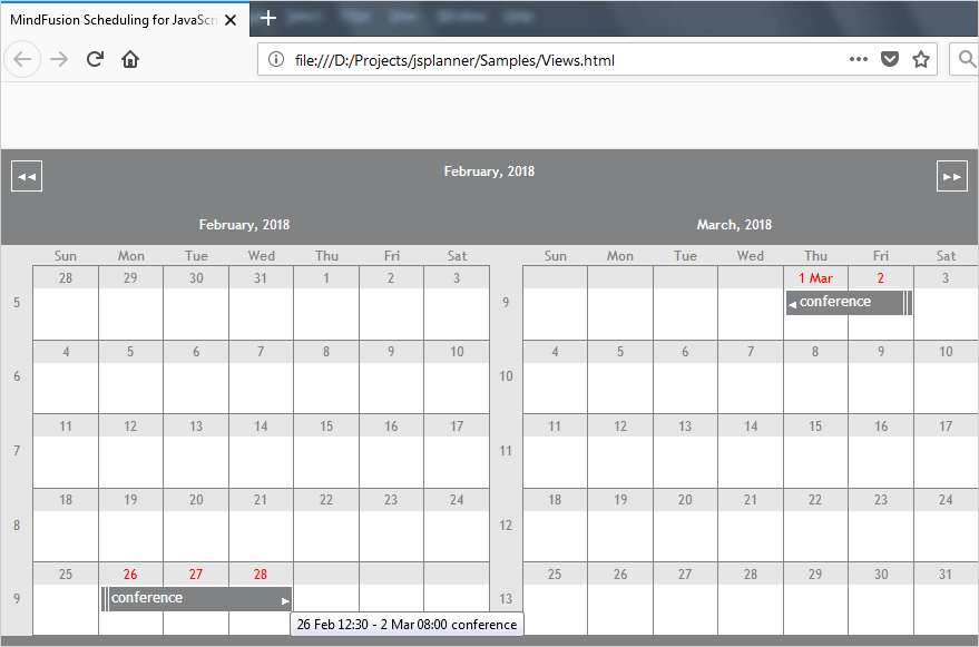
Here is the result:

A MonthRange view with custom item settings and tooltips.
Tooltips are displayed for items, view cells and headers in the calendar views. Tooltips are only displayed if the Calendar.showTooltips property is set to true. The item tooltip is formatted according to ItemSettings.itemTooltipFormat property.