


Calendar Headers
The calendar control can display different headers, depending on the current view, which can be controlled via the corresponging *viewSettings property - namely monthRangeSettings, monthSettings, weekRangeSettings, listSettings, timetableSettings, resourceViewSettings and timelineSettings.
The MonthRange view supports a main header, controlled by the MonthRangeSettings.headerStyle property, which can optionally display a title and/or navigation buttons, used to scroll back and forth the displayed month range. The format of the displayed title can be modified via the titleFormat and titleSeparator properties.
The SingleMonth view supports a main header, controlled by the MonthSettings.headerStyle property, which can optionally display a title and/or navigation buttons, used to scroll back and forth months and years. The format of the displayed title can be modified via the titleFormat property.
It can also display a vertical header, containing week numbers to the left or right of the view contents and a horizontal header, containing the day names. The properties specifying the display mode of these two headers are weekHeaderStyle and dayNamesHeaderStyle.
The display format of single day cells are set through the generalFormat, firstDayOfMonthFormat and firstDayOfYearFormat properties.
WeekRange View
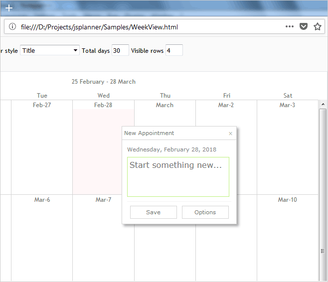
The WeekRange view supports a main header, controlled by the WeekRangeSettings.headerStyle property, which displays a title, formatted by the titleFormat and titleSeparator properties. An additional horizontal header, containing the day names can be displayed by setting the dayNamesHeaderStyle property. The display format of single day cells are set through the generalFormat, firstDayOfMonthFormat and firstDayOfYearFormat properties.
The following code customizes a calendar with a WeekRange view:
JavaScript
 Copy Code Copy Code
|
|---|
var p = MindFusion.Scheduling; // create a new instance of the calendar calendar.theme = "light"; // render the calendar control |
Here is the result:
A weekRange view with custom header separator and formatting.
The List view supports a main header, controlled by the ListSettings.headerStyle property, which can optionally display a title and/or navigation buttons. The title text is formatted by the titleFormat property. The display format of single day cells are set through the generalFormat, firstDayOfMonthFormat and firstDayOfYearFormat properties.
The Timetable view supports a main header, controlled by the TimetableSettings.headerStyle property, which can optionally display a title and/or navigation buttons. The title text is formatted by the titleFormat property. The navigation buttons scroll the view by the specified through the scrollStep property number of days.
The showDayHeader property specifies whether the view should display a separate set of item rows in the header, used for visualizing all-day items.
The appearance of the timeline header of the view can be customized via the format, groupHours, twelveHourFormat, showMinutes and showAM.
The Resource view can display between 1 and 3 hotizontal timelines. The timelines’ appearance is customized through the corresponding instance of the TimelineSettings class e.g. topTimelineSettings, middleTimelineSettings and bottomTimelineSettings. All of them expose a unit, unitCount and format properties.


