

Version History
The list below describes past changes and additions to JsDiagram:
Set the enableSpatialIndex property of Diagram to create an index of item positions for faster hit-testing and viewport clipping queries. This should greatly improve user interaction and rendering speed for diagrams containing tens of thousands or more items.
JavaScript
 Copy Code Copy Code
|
|---|
// create 20000 links + nodes in total |
The constraints property lets you apply size and direction constraints to a node. It returns a NodeConstraints object with following properties:
These constraints are considered when a user modifies the node interactively. They are ignored if node placement is changed programmatically by using API methods and properties.
Event emitter objects are now exposed as properties of Diagram and DiagramView, and you can register handlers by calling their addEventListener method:
| JavaScript
Copy Code
|
|---|
| diagram.nodeCreated.addEventListener( (sender, args) => { if (sender.defaultShape.id == "Rectangle") args.node.anchorPattern = pattern1; else args.node.anchorPattern = pattern2; }); |
Legacy event handling syntax will remain supported for compatibility with old code.
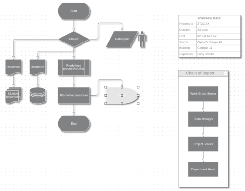
Table rows can be assigned to distinct sections of the table. Each section can be collapsed or expanded, hiding or showing all rows in the section except the header one. To define a section, set the header property of a row. A section consists of all rows after a header row and spans to the next header. Each header row displays a [±] button that allows expanding or collapsing the section interactively. Clicking that button raises the tableSectionCollapsed and tableSectionExpanded events. Sections can be collapsed or expanded programmatically by setting the expanded property of their header rows.
To allow for stricter Content Security Policy rules, the library no longer loads CSS scripts automatically. If you use components from the Diagramming.Controls package, you must now explicitly link the common-ui.css file from distribution's themes folder.
The library registers each control class as a web component. You can use the following tags to create corresponding components:
When instantiated as a web component, each control class creates required HTML elements as internal shadow DOM. You can get the JavaScript object corresponding to a web component by calling controls' find method with id argument.
| HTML
Copy Code
|
|---|
<mindfusion-diagramview |
| JavaScript
Copy Code
|
|---|
var diagramView = DiagramView.find("diagramView"); |
The library now includes several standard animation classes and methods.
The animate method of DiagramItem can run following animations:
Following animations can be applied to DiagramNodes:
The animate method of DiagramView can run following animations:
The reversedLinks property of TreeLayout, RadialTreeLayout and BorderedTreeLayout lets you arrange trees where links point from child to parent nodes, instead of the default parent to child direction.
TabbedDiagramView wrapper components now available in React, Angular, Vue and Blazor packages.
The DiagramDocument class represents a collection of diagram pages or sheets, represented by DiagramPage objects. New pages can be added to the document and existing pages can be removed and reordered by using the addPage and removePage methods respectively. The toJson, saveToXml and saveToString methods of DiagramDocument save all pages in a single file, and respectively the fromJson, loadFromXml and loadFromString methods load all pages from the file. DiagramDocument can also load files created by the serialization methods of Diagram, and will show them in a single page.
DiagramPage is derived from Diagram and only adds a few properties, so any code that processes Diagram objects will work with DiagramPage objects too. A diagram document forwards each event raised by its pages, giving you a chance to use the same handler for events raised by different pages. If a page should implement distinct user interaction or validation logic, it is also possible to attach handlers to the Diagram events inherited by DiagramPage.
A single DiagramPage could be assigned to the diagram property of DiagramView, and that lets you create your own user interface for presenting a list of pages to the user and selecting a current page. The package also includes a TabbedDiagramView that presents all pages of a document in a tabbed user interface where each tab corresponds to a page. The page displayed in the active tab is exposed by the selectedPage property of TabbedDiagramView. The active page can be changed interactively by activating its associated tab. New pages can be added and removed to / from the document through buttons in the tab strip and the pages can be rearranged by dragging their associated tabs with the mouse.
The TabbedDiagramView control is a view that displays DiagramDocument objects. Individual diagram pages can be activated through the tabs located at the top or at the bottom of the control. The appearance and behavior of the tab strip can be customized using various properties. The location and visibility of the strip is specified through the tabAlignment property. Its height can be changed via the tabsSize property. showAddButton and showNavigationButtons determine the visibility of the buttons for interactive tab creation and tab navigation respectively. showTabCloseButtons specifies whether the tabs can be closed interactively, by clicking on the small 'x' button displayed in each tab. allowReorder enables interactive tab rearrangement by mouse dragging.
TabbedDiagramView comes as s a part of the diagramming-controls npm package or the MindFusion.Diagramming.Controls namespace for UMD users.
For npm users simply import the diagramming-controls package:
| JavaScript
Copy Code
|
|---|
import * as Controls from '@mindfusion/diagramming-controls'; |
For UMD users, add references to files from distrbution's /umd folder using <script> tags. Note that the order of the scripts matters.
| HTML
Copy Code
|
|---|
<!-- core Diagramming --> <!-- for TabbedDiagramView --> |
| JavaScript
Copy Code
|
|---|
var doc = new MindFusion.Diagramming.DiagramDocument(); |
or simply
| JavaScript
Copy Code
|
|---|
var diagramView = MindFusion.Diagramming.Controls.TabbedDiagramView.create( |
You can specify a title, iconUrl and titleColor for diagram pages by setting the corresponding properties.
Default images for the navigation buttons must be located in an ./icons folder. Alternatively, you can style the control with a predefined css theme, in which case the themes included in the distribution must be located in a ./themes folder and referenced in the head of the HTML document, e.g.
| HTML / JavaScript
Copy Code
|
|---|
<link rel="stylesheet" type="text/css" href="themes/business.css" /> |
MindFusion.Diagramming for Blazor allows integrating the JavaScript diagramming API into Blazor applications. It contains a set of .NET wrapper classes, that use Blazor's JSInterop API to create and manipulate the client-side objects. The package provides easy access from C# code to the most of the MindFusion.Diagramming functionality, including different node types, layouts and styling. Additional UI components such as Overview, NodeListView, ZoomControl and Ruler are included too.
The control now supports several ways to zoom using lasso tool:
The RadialTreeLayout class arranges tree levels in concentric circles around the root. The levelDistance property specifies the distance between adjacent circles. The direction property specifies placement of first child node. Set stretchFactor to a value larger than 1 in order to stretch level circles into ellipses, providing more space for the layout when using wider nodes.
The @mindfusion/diagramming-react package now contains functional-component wrappers for the DiagramView and auxiliary controls, and has been upgraded to React 18. Old class-component wrappers have been moved to the @mindfusion/diagramming-react-cc package.
Using the functional components looks like this:
| JSX
Copy Code
|
|---|
const [diagram] = useState(new Diagramming.Diagram()); |
The DiagramView control exposes a forwardRef, that can be passed on to other controls, such as the Overview and ZoomControl. To obtain a reference to the underlying core controls, use the respective find method of the ref.
Fixed LinkLabel deserialization from old file formats when using along-length positioning.
The NodeLabel class allows multiple captions to be displayed for a single DiagramNode of any type. Node labels provide a set of properties allowing full customization of their display and positioning. Label position is defined by specifying a pin point and offset from it, set through setCornerPosition, setEdgePosition, setCenterPosition methods. In addition, the horizontalAlign and verticalAlign properties of NodeLabel specify on which side of pin point to draw the label's caption.
For example, following code adds extra labels to top-left and bottom-right corners of a ShapeNode:
| JavaScript
Copy Code
|
|---|
var node = diagram.factory.createShapeNode(10, 50, 40, 30); |
The control now handles DOM Pointer events to implement multi-touch interactions, such as zooming, node rotation or simultaneous drawing of multiple diagram items:
Latter modes can be used for collaborative whiteboarding / classroom scenarios.
Built-in multi-touch can be disabled altogether by setting enableMultiTouch to false, e.g. if you need to handle touch events yourself or through a third-party gesture library. If disabled, the control will revert to its mouse event handling code from previous versions. It will also no longer be able to capture mouse input during drag operations (to detect mouse pointer leaving the view), which is handled through DOM Pointers API.
Angular component's event emitter names no longer have an 'on' prefix. E.g. use (nodeCreated) instead of (onNodeCreated) to bind to the nodeCreated event.
JsDiagram source code has been refactored following ES6 standards, including modules, classes, properties and native collections. ArrayList, Dictionary and Set classes from MindFusion.Collections namespace have been removed, and replaced by respective JavaScript native Array, Map and Set. Get/set functions have been replaced by getter/setter properties, which should help using the diagram API with binding expressions of various JS frameworks. You could enable propFunctions in CompatConfig in order to continue using legacy get/set functions during migration. The distribution still includes ES5-compatible scripts located in Scripts/umd folder, which are transpiled from current ES6 code, and whose classes are exposed as members of global MindFusion namespace object as in previous versions. The Scripts/esm folder contains ES6 code that lets you import JsDiagram classes from respective modules.
The Diagram control has been refactored into two classes. What remains of Diagram is now just a model class that defines diagram structure and implements serialization. The new DiagramView class deals with rendering and user interaction. You can show the same diagram in several views, each one rendering at different scroll positions and zoom levels. The separation also makes it easier to use the diagramming API in node.js server code, avoiding the need to load DOM shim/polyfill packages.
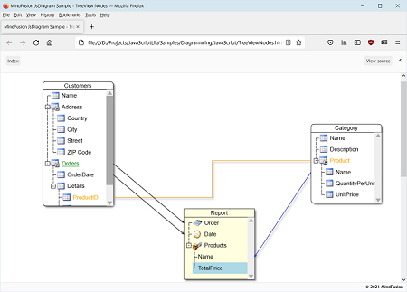
The TreeViewNode class represents nodes that can display hierarchical data. The root items displayed in the node can be accessed through the rootItems property. Items can be added and removed individually by using the addItem and removeItem methods, or in bulk by calling the fromObject method, which loads the tree view items from an array of objects.
The printPreview and print methods of DiagramView let you export the diagram as a list of smaller images in HTML page. Supported options include printArea (defaults to diagram's content bounds) and pageSize (defaults to DiagramView's viewport). Note that print methods use HTMLCanvasElement.toDataURL() internally, so any limitations it has will apply (such as canvas size and CORS).
The OrthogonalLayout class implements an orthogonal graph layout algorithm. Each link is drawn as a chain of alternating horizontal and vertical segments. Nodes are placed in a way that facilitates few links bends and crossings. This algorithm was designed for planar graphs where the nodes have at most four incident links, and produces best results with such graphs as input. It can arrange any arbitrary graph as well, by adding some dummy nodes and links to planarize the graph and reduce its vertex degree, and removing them after the layout.
The library now includes nine stock themes, accessible via respective static methods of the Theme class. Call the setTheme method of Diagram to apply a theme.
|
|
|
|
|
|
|
|
|
Appearance of adjustment handles can be customized via ActiveItemHandlesStyle, SelectedItemHandlesStyle and DisabledHandlesStyle properties. The HandlesVisualStyle objects returned by them provide sub-properties corresponding to graphic attributes of the different handle types. Adjustment handles can now be painted not only in solid color but with arbitrary brushes such as gradients and patterns.
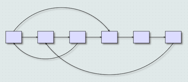
TopologicalLayout applies graph topological ordering to the diagram (topological ordering of a graph is one where link's origin node is placed before link's destination node). The layout algorithm arranges nodes in a row or a column, depending on the value of the direction property, in such a way that there are no backward links when the graph is acyclic. If the graph contains cycles, the algorithms selects ordering with as few backward links as possible. Links that connect non-adjacent nodes are rendered as arcs, whose amplitude is proportional to the distance between respective connected nodes. Forward links are rendered at one side of the nodes and back links are rendered at the opposite side. All that makes it easy to discern graph features such as overall flow direction, cycles and nested cycles.
Serialization and clipboard operations should now work under Electron.js. In previous versions they would throw exceptions due to restricted use of eval.
For compatibility with MindFusion diagramming API for other platforms, StrokeThickness is now specified in diagram's MeasureUnit instead of pixels. You can set CompatConfig.pixelThickness = true in order to revert to using pixel values.
ControlNode objects display custom HTML content, specified via their Template property. A node's DOM structure is created inside the Content div element, which is then rendered on top of the diagram canvas. Note that this prevents ControlNodes drawing in diagram' usual Z order, and they will always appear on top of other diagram items.
By default the diagram intercepts mouse events of all hosted html elements to enable moving nodes or drawing links. You can specify that interactive elements, such as buttons or text boxes, should receive input instead by setting their data-interactive attribute to true.
You can register event handlers for elements in the template by assigning function names to data-event attributes in the form data-event-'eventName'='handlerName'. Alternatively, you can attach event listeners using DOM API once nodeDomCreated is raised to signify that content is available. E.g. access child elements by calling args.getNode().getContent().querySelector(...) and attach handlers via elements' addEventListener method.
ControlNodes create DOM elements from their template only in the main diagram, and render images instead when shown in Overview or NodeListView. Note that in this case image elements in the template will render only if specified in base64 format. The Utils.toDataUrl method helps you convert an image URL to base64 data URL.
New ControlNodes.html example included in distribution demonstrates the ControlNode API.
Composite nodes can now contain buttons. Button components respond to user clicks by calling the JavaScript function whose name is assigned to their clickHandler attribute. A button can show a text label assigned to the text attribute, or an image whose URL is assigned to imageLocation. The following example adds a button to CompositeNode template:
| JavaScript
Copy Code
|
|---|
| { component: "Button", brush: "#ccc", text: "Delete", width: 30, cornerRadius: 3.5, clickHandler: "onDeleteClick" } |
The DiagramView React component allows integrating the MindFusion.Diagramming API into React applications. It renders a Diagram instance assigned to "diagram" prop as its model. Most diagram properties can be set from JSX, and all diagram events can be handled through JSX syntax as well. For more information, see the Integration with React topic.
The diagram-view Vue.js component allows integrating the MindFusion.Diagramming API into Vue.js applications. It renders a Diagram instance assigned to "diagram" prop as its model. Most diagram properties can be set from the vue template, and all diagram events can be handled through the v-on directive as well. For more information, see the Integration with Vue.js topic.
The diagram-view Angular component allows integrating the MindFusion.Diagramming API into Angular applications. It renders a Diagram instance assigned to "diagram" property as its model. Most diagram properties can be set from the html template, and all diagram events can be handled through event binding syntax as well. For more information, see the Integration with Angular topic.
VideoNode objects display video streams, along with UI elements to play, pause, seek and change volume. Call node's setVideoLocation method to specify its video URL. Auto-playing is not supported at this time, and the video can be started only by users clicking the play button. VideoNode is built around Video component, which can also be used in CompositeNode templates.
The Shape class used to specify ShapeNode geometry can also be used as a component. When its isOutline attribute is set, the shape will control CompositeNode's geometry too, defining hit test and clip area, and link alignment points along node's border. If isOutline is disabled, the shape will serve mostly as a decorative element. The code below shows a sample fragment specifying shape component in template:
| JavaScript
Copy Code
|
|---|
{ |
Diagram rendering and user interactions are now faster. The control redraws the smallest possible area after diagram changes, and compresses refresh operations into a single batch when possible. Custom node classes that need to draw outside of their Bounds should override the getRepaintBounds method to specify the repaint area.
The component now loads in stand-alone mode by default and does not depend on any third party libraries. With this change, it won't work out of the box in Internet Explorer versions older than 11. You can still explicitly enable JQuery or MsAjax modes for older browsers, or alternatively use polyfill libraries for missing APIs (e.g. JSON serialization).
FlowchartLayout recognizes program code-like patterns in the graph, such as loops, sequences and if/switch branchings, and arranges them recursively. FlowchartLayout could be used to arrange other types of graphs as well, though with some restrictions. For example it treats all back links as loops in the code, and expects that they are nested - loop links starting closer to the stop node should end closer to the start node. Another similar restriction is that there shouldn't be any cross-links that connect different branches of a decision sub-graph.
The PathFinder class provides methods that help you find paths and cycles in a graph:
Path objects returned by these methods contain nodes, links and items arrays containing sequences of elements in the path. The new PathFinder sample page included in distribution demonstrates path finding and animations over the found paths.
Nodes and Text components with style text enabled can now contain <a> tags to create hyperlinks. When a link is clicked, the control raises hyperlinkClicked event to let you implement navigation:
| JavaScript
Copy Code
|
|---|
// node is a ShapeNode instance |
The SvgExporter class creates a Scalable Vector Graphics (SVG) drawing from the content of a Diagram. The exportElement method returns a DOM <svg> element that can be directly added to the page. The exportString method returns an SVG string that can be saved in local storage or submitted to server.
| C#
Copy Code
|
|---|
function onExportSvg() |
The diagramming.js script can be loaded as an AMD module now. If it detects an AMD loader during startup, it will list common.js as its dependency, so it is enough to require only diagramming.js as application's direct dependency:
| C#
Copy Code
|
|---|
MindFusionImpl = "StandAlone"; |
The CompositeNode class implements nodes whose appearance can be defined via composition of components and layout containers. The content of a composite node can be created by building a tree of components programmatically, or by loading a JSON template. This initial release includes layout containers such as StackPanel and GridPanel. Objects from the MindFusion.Drawing namespace now double as CompositeNode components (Image, Text, Path, Rect). Future versions will add interactive components like buttons and text editors. Extended overview is available here.
arrangeAnimated methods added to Diagram and ContainerNode classes display movement of items from their original locations to new locations assigned by the layout object. This can be used to create an explode effect by starting new layout from overlapping nodes on same position, or an insertion effect by adding a new node to an existing layout.
All kinds of user interaction are now carried out by controller objects. The startDraw method of BehaviorBase-derived classes that returned an opaque InteractionState instance has been replaced by createController method returning a controller of class specific to the modified item and interaction types. Built-in controllers include CreateNodeController, CreateLinkController, ModifyNodeController, ModifyLinkController, PanController. You can also create custom controllers by deriving and overriding the methods of SinglePointerController:
| JavaScript
Copy Code
|
|---|
SinglePointerController.prototype = |
The Diagram class provides record, stopRecording and replay methods that can be used to save and replay all user actions with keyboard and mouse. The replay method takes recording, timer and diagramJson parameters. The recording argument is an array of records returned by stopRecording. If the timer argument is set to true, events are replayed from a timer preserving their original timing, otherwise they are replayed immediately. Timer mode can be used to show tutorials played directly in the diagram. Immediate mode could be used to automate user interaction testing where an assertion is checked after replaying series of events. Recorded events could also be replayed as macros if ran on a diagram with items placed on same initial coordinates.
User interaction can now be tested automatically in several ways outlined below.
| JavaScript
Copy Code
|
|---|
onMouseDown: function (position, button) |
The Ruler control provides horizontal and vertical scales that help users measure and align diagram items. In order to set up a Ruler instance, create a DIV element parenting the diagram's scroller div -
| HTML
Copy Code
|
|---|
<div id="ruler"> |
| JavaScript
Copy Code
|
|---|
var ruler = MindFusion.Diagramming.Ruler.create(document.getElementById("ruler")); |
The diagram can now be used without JQuery and Microsoft Ajax libraries. To enable that mode, set MindFusionImpl = "StandAloneImpl" before loading diagramming.js. Stand-alone mode requires relatively modern browsers, the base feature-set against we test it is the one of IE11.
The shape of a ShapeNode can be flipped horizontally or vertically. Enable the AllowFlip property and the shape flips when an edge is dragged over its opposite edge. You can get or set current flip state using FlipX and FlipY properties.
Dependencies between diagram items are now expressed by rule objects and applied in sequence by the DiagramMediator class. Built-in dependencies are implemented by ItemFollowsContainerRule, AttachedFollowsMasterRule, LinkFollowsNodesRule, NodeFollowsSelectionRule rules. You can create custom rule objects with following API and add them to DiagramMediator.AllRules array to make items follow other items during user interaction -
| JavaScript
Copy Code
|
|---|
var MyRule = |
There are no separate trial / licensed builds of MindFusion scripts provided anymore, instead you disable trial mode by specifying a license key string. License keys are now listed on the Keys & Downloads page at MindFusion customer portal. Copy the key to a diagram_lic.txt file in same folder where the diagram html page is located. The file name and location can be changed by calling the diagram's setLicenseLocation method. Alternatively, the key string can be set directly by calling setLicenseKey method.
Builder objects with property setters and shortcut methods for font and brush creation add support for fluent programming style. Static With and instance init methods in DiagramItem, Style and Layout -derived classes return a builder instance that can be used to set up respective new or existing objects:
| JavaScript
Copy Code
|
|---|
diagram.addItem( |
Tree-maps represent hierarchies by nesting child nodes within their parents, where the areas of leaf nodes are proportional to their Weight values. Unlike other layout algorithms, TreeMapLayout expects hierarchies to be defined via grouping or containment (attachTo method and ContainerNode class), and will ignore any links in the diagram. The diagram area covered by the topmost nodes in a hierarchy is specified via the layoutArea property. By default, the layout tries to keep the ratio of node sides as close as possible to one. However this could make it hard to distinguish separate levels of the hierarchy. To alleviate that, set squarify to false, and child nodes will be arranged either as a row or a column inside their parent node, alternating directions for each level. The drawback is that when Weight ratios differ greatly or nodes contain many children, some nodes could end up with very narrow rectangles.
In addition to the loadFromXml method added in a previous version, the Diagram class now provides saveToXml method that serializes its contents in XML format supported by all MindFusion diagram libraries for mobile, desktop and web platforms. saveToXml posts the XML as text/xml to specified URL. The new saveToString and loadFromString methods generate or load XML strings instead, when their argument is set to SaveToStringFormat.Xml (a Json enumeration member creates JSON strings by calling older toJson method).
A FreeFormNode collects all points from users' mouse or touch input and displays them as node's outline. To let users draw free-form nodes interactively, set Behavior to DrawFreeForms or LinkFreeForms. Use the Points property of FreeFormNode to get or set outline points programmatically. If the Closed property is set, the node is drawn as a closed shape and its interior filled, or otherwise the node is drawn as a poly-line. If the distance between first and last points drawn by user is shorter than AutoCloseDistance, the node's Closed property is automatically set to true. AutoCloseDistance default value is Number.MAX_VALUE, so free-form nodes are always closed.
Additional drawing modes, convenient for touch input, convert FreeFormNode objects drawn by user to ShapeNode objects with matching shapes. To enable them, set Behavior to DrawFreeShapes or LinkFreeShapes. The shapes against which the user's input is matched are set via diagram's FreeFormTargets property. By default it contains Rectangle, Decision and Ellipse shapes.
Columns and rows of a TableNode can now be resized interactively if its AllowResizeColumns or AllowResizeRows properties are enabled. In order to resize, move the mouse pointer to the border line on column's right side or row's bottom side until it shows resize cursor and start dragging. The control raises tableColumnResizing and tableRowResizing events to let you validate new size or prevent resizing some elements. The tableColumnResized and tableRowResized events are raised after the operation completes.
The ShapeLibrary class lets you use custom geometric shapes created using MindFusion ShapeDesigner tool. Call its loadFromXml method to load a library XML file. getShapes returns an array of the loaded Shape objects. The ShapeLibraryLocation property of NodeListView creates a prototype ShapeNode object for each shape from the specified library.
The EnableStyledText property of ShapeNode allows using HTML-like formatting tags to apply various attributes to the node's text. At this time the component supports the following formatting tags:
The ZoomControl class lets users change interactively the current zoom level and scroll position of a Diagram. To set it up, add a <canvas> to the page, place it anywhere over the target diagram canvas, call the create method, and set the control's Target property to that diagram. Set the ZoomStep and ScrollStep properties to specify the amount added to diagram's zoom level or scroll position by ZoomControl's buttons. You can customize the control's appearance by setting properties such as Fill, BorderColor, CornerRadius and TickPosition.
The Diagram.ShadowsStyle property and ShadowsStyle enumeration let you switch shadow rendering order between rendering all shadows in a single background layer (OneLevel) and drawing each shadow close to its node, possibly overlapping other nodes (ZOrder). ShadowsStyle.None lets you disable shadows altogether.
The SvgNode class represents nodes that can display SVG drawings. SVG graphics are rendered instead of Image, and on top of the geometry rendered by the base ShapeNode class. Enable the Transparent property to hide the node's geometry and leave only the drawing visible. The SVG file is loaded and associated with the node through an SvgContent object, which should be initialized and then assigned to the Content property.
Now the control can use jQuery for browser abstraction instead of Microsoft Ajax. To enable jQuery support, set MindFusionImpl="JQuery" before loading the diagram script. Instead of Microsoft Ajax $create function, use the static Diagram.create(element) method to create a Diagram instance for a given Canvas element.
If the UndoEnabled property is set to true, the Diagram control tracks changes done to its items and allows undoing and redoing them later by calling the undo and redo methods respectively. Multiple changes could be recorded as a single undoable operation by enclosing them between startCompositeOperation and commitCompositeOperation calls. It is also possible to create custom undoable operations by deriving from the Command class and calling executeCommand with the custom command as argument.
Diagram items can now be animated through the Animation class in the MindFusion.Animations namespace. The class implements several built-in animation and easing types, and allows definition of custom animation functions, to create fluid and pleasing animation effects. The new Animations example demonstrates how to apply several animation types to both nodes and links.
A single item or a selection of items can be copied or cut to a clipboard maintained by the diagram control. This is done programmatically using the copyToClipboard and cutToClipboard methods. To paste the clipboard contents into the current diagram, call pasteFromClipboard. If running under Internet Explorer, it is also possible to copy to the system clipboard by passing a true argument to clipboard methods.
The lane grid lets you emphasize the relationship between a group of diagram items by displaying them in a distinct lane or cell within the grid. To display the lane grid, set the ShowLaneGrid property of the Diagram class to true. In order to customize the grid, set the various attributes exposed by the LaneGrid property, which lets you specify the number of rows and columns, add headers, customize the cell appearance, etc. The new Lanes sample page uses the lane grid to let users draw Gantt charts.
Now it is possible to resize multiple selected nodes simultaneously. To enable that, set the AllowMultipleResize property to true. When enabled, dragging a corner or side adjustment handle of any node resizes all nodes in the selection. The operation can be cancelled for all nodes by handling the selectionModifying validation event.
The new magnifier tool allows users to interactively zoom in (or out) portions of the diagram by holding down a modifier key or pressing a mouse button. The magnifier's appearance can be customized via properties such as MagnifierShape and MagnifierFrameColor. Its size and magnification can be set via MagnifierWidth, MagnifierHeight and MagnifierFactor properties. The magnifier appears when users press the mouse button mapped to MouseButtonActions.Magnify. It can also be shown programmatically by setting the MagnifierEnabled property.
The package now includes a MindFusion.Diagramming-vsdoc.js file providing code completion information. To load it in Visual Studio, add e /// <reference path="MindFusion.Diagramming-vsdoc.js" /> tag to the top of your script files. Use the static Diagram.create and Diagram.find methods instead of $create and $find to let Visual Studio infer the type of returned Diagram objects correctly.
Links whose Shape is set to Polyline or Cascading can be rendered with rounded joints between their segments. To enable that, set the diagram's RoundedLinks property to true. The RoundedLinksRadius property lets you specify the radius of joint arcs.
The component can represent the crossing point of two links either as an arc (bridge) drawn for the link with higher Z index, or as a cut in the link with lower Z index. To enable that, set the diagram's LinkCrossings property to either Arcs or Cut member of LinkCrossings enumeration. Set CrossingRadius to specify the radius of crossing arcs.
Appearance of nodes' adjustment handles can be customized by calling the setHandlesStyle method. Supported styles include round and square handles, dashed and hatched frames, and some combinations. Apart from appearance, the handles style also controls what part of a node can be dragged to move or resize it. It is also possible to render custom handles by handling the drawAdjustmentHandles event, and implement custom hit-testing by handling the hitTestAdjustmentHandles event.
A dynamic link automatically orients its end segments so that they point to the target nodes' centers while the link's nodes are dragged around. If a node's AnchorPattern is set, link ends will align to the closest anchor point instead. Positions of the link's end points are also updated when the next-to-last control points are being modified. To enable this, set the Dynamic property to true.
Two visual effects, represented by GlassEffect and AeroEffect classes, can be applied to nodes. To apply an effect, create an instance of the respective class, set up its properties, then add the instance to the Effects collection of a node (or to Diagram.NodeEffects collection to apply it to all nodes). Effects can be added, removed or modified at any time and this will immediately reflect on the diagram. Effects of different types can be applied simultaneously. It is also possible to apply more than one effect of the same type.
The LinkLabel class allows multiple captions to be displayed for a single DiagramLink object. Link labels provide a set of properties allowing full customization of their display and positioning. Labels can also be arranged automatically to avoid overlapping nodes and other labels by setting LinkLabel.AutoArrange to true.
An instance of the Style class can be used to set items' appearance properties as a single unit via the setStyle method. In order for style attributes to be used, the respective local appearance properties of DiagramItem objects must have undefined or null values. If an item's Style does not define a value for some attribute, it is looked up in the styling hierarchy, first in the diagram's Style, next in the current Theme, and finally in the set of default styles defined for each item class.
Diagram items can now cast shadows. The shadow color is specified via the setShadowColor method and the offset of a shadow from its item is set via setShadowOffsetX and setShadowOffsetY methods. Shadows aren't rendered if getEffectiveShadowColor returns null or undefined value.
Nodes can be filled using radial gradients by passing objects in following format to setBrush. If the gradient should blend only two colors, they can be specified using color1 and color2 fields instead of colorStops.
| JavaScript
Copy Code
|
|---|
var brush = |
A TableNode displays tabular data, and can be used to represent table schemas in database diagrams or classes in class-hierarchies. A table contains cells arranged in a grid, and every cell can display text and/or image. Cells, columns and rows can be customized in various ways - there are properties available for setting their extents, style, image and text alignment. The number of cells in a table's grid can be programmatically changed by calling methods such as redimTable, insertRow and insertColumn. If a table contains many rows, you can let users scroll them up or down by calling the setScrollable method.
A ContainerNode can contain other diagram nodes. When a container is moved, its child nodes move too. Containers can be nested one within another to unlimited depth. They can be folded to a smaller size, hiding their child items, and unfolded to show content again. Nodes inside a container can be linked to nodes both inside and outside of it. If a link connects items in the same container, the container is not considered an obstacle by the auto-routing algorithm.
JsDiagram allows attaching a node to another node, establishing a subordinate - master relationship between them. The easiest way to attach nodes is to call the attachTo method. When a master node is moved, all of its subordinates follow it, so that the initial distance between them stays constant. This happens both when a user moves the master node around, and when the node's position is changed using a method or a property.
If a diagram represents a tree structure, the tree branch starting from a node can be collapsed or expanded again in order to hide or display hierarchy details. To enable this, call the setExpandable method. There is a [±] button displayed beside an expandable node to allow users to collapse or expand the tree branch starting there. By default, pressing that button automatically toggles the Expanded property of the node and raises the TreeExpanded or TreeCollapsed events.
Call setBehavior with one of the Behavior members as argument to specify how the diagram should handle mouse input.
When running under the iOS Safari web browser, the control handles one-finger touch events to allow drawing and selecting items interactively. In addition, the hit-test area around adjustment handles is larger to make touch modifications easier. Two-finger gestures are delegated to the browser - they either scroll the canvas when dragging in the same direction or zoom the page when dragging in opposite directions. The preventDefaultTouch flag can be set to false to revert to the default one-finger touch behavior (scroll the whole page).
The alignment grid help users place the diagram items more precisely. To activate the grid, set the AlignToGrid property to true. If the grid is active while an item is being created or modified, the item's control-points are aligned to the nearest grid points. The distance between adjacent grid points is set via the GridSizeX and GridSizeY properties. The grid can be either visible or invisible, depending on whether the ShowGrid value is true or false. If visible, the grid is painted as a matrix of points or as series of crossing lines, as specified by the GridStyle property. GridColor defines the color with which the alignment points or lines are painted.
In contrast to TreeLayout, which centers the parent node above its child nodes, BorderedTreeLayout arranges children in columns at a horizontal offset form their parent (see Tutorial 2). BorderedTreeLayout members control the tree direction, how much space to leave between tree levels, and between nodes on the same level.
The AnchorPattern class represents a set of AnchorPoint objects, which specify the exact locations where links are allowed to connect to nodes. A pattern can be assigned to nodes by calling their setAnchorPattern method. The AnchorPattern class exposes several predefined patterns as static fields: decision2In2Out, decision1In3Out, leftInRightOut, topInBottomOut.
A link whose AutoRoute property is enabled automatically finds a route that won't cross nodes marked as obstacles. Call setRouteLinks to specify the default AutoRoute value of new links. Links can be explicitly routed by calling their route method or the routeAllLinks method of Diagram. The minimal distance between routed links and nodes can be set by calling setRouteMargin.
The FractalLayout tree layout algorithm places child nodes symmetrically around their parent node.Nodes at the lowest level are arranged directly in a circle around their parent. At the upper level, the already arranged nodes form branches that are arranged in a circle around the new parent node. The algorithm is recursively repeated till the highest level is reached. To apply FractalLayout, pass its instance as argument to the arrange method.