

Overview
MindFusion.Charting provides two type of gauge controls – oval and linear. The two types of gauges are represented by the OvalGauge and LinearGauge classes respectively. The purpose of the gauge controls is to visualize various quantities in two layouts – circular and linear.
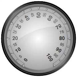
The most important component of each gauge control are the scales contained within it. The scales are collections of gauge elements such as ticks, labels, pointers, and so on. The gauges are merely shells, which provide visual decoration to the shells nested within them. Scales can be added to the gauges programmatically or in design-time through the Scales collection. The image below demonstrates an oval gauge with a single scale added to it.
Removing the scale from the above gauge will result in an empty gauge control.
As previously mentioned the scales can contain ticks, labels, pointers, ranges and other elements. There are two types of scale corresponding to the two types of gauges – OvalScale and LinearScale, which share a common base class – BaseScale. The oval scale distributes its elements in a circle and the linear scale distributes its elements along a horizontal or vertical axis. The scales are responsible for arranging their contents. They also provide user interaction.
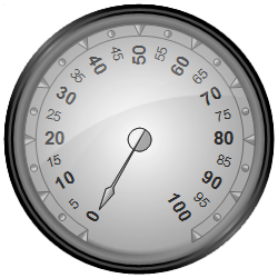
The following example adds a pointer to the gauge defined in the previous section:
To learn more about gauge scales, refer to the Scales topic.
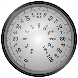
Gauge controls can contain more than just one scale. A common scenario is an oval gauge containing several concentric scales displaying different measures. The following code creates an oval gauge control with two concentric scales:
C#
 Copy Code Copy Code
|
|---|
var scale = new OvalScale(); |
The following image demonstrates the gauge:
The customization of the gauge controls is achieved by performing custom painting of various gauge elements. This is done by handling one or more of the paint events. Two events raised for each gauge element – a Prepaint* event and a *Paint event. The first event is raised before the default rendering of the element and can be used to paint before and/or cancel the default rendering. The second event is raised after the default rendering has completed. For example, the events raised for the gauge background are PrepaintBackground and PaintBackground. For a complete list of the available paint events, see BaseGauge Events.
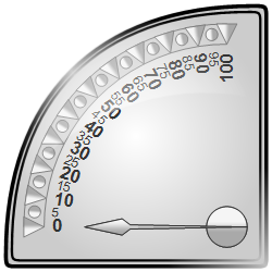
There are several built-in gauge styles for quadratic and semicircular gauges. These styles can be enabled through the Style property of the OvalGauge class. The image below illustrates the QuadraticNW style: