

Ticks and Labels
There are three categories of ticks and labels in a scale – major, middle and minor. Each category is governed by a separate settings object in the BaseScale class – MajorTickSettings, MiddleTickSettings and MinorTickSettings.
The number of ticks from a specific category can be specified in either of two ways:
If both of the above properties are specified Step will take precedence. The ticks and/or labels in a particular category can be hidden through the ShowTicks and ShowLabels properties of the respective settings objects.
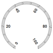
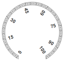
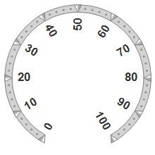
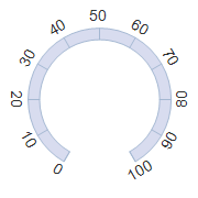
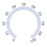
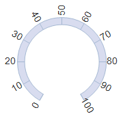
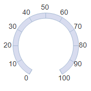
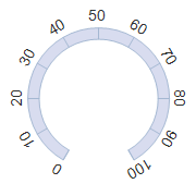
Here is a table with some examples illustrating various combinations of the above properties, applied on an oval scale with MinValue set to 0 and MaxValue set to 100:
Settings | Scale |
|---|---|
MajorTickSettings |
|
MajorTickSettings |
|
MajorTickSettings |
|
The alignment of ticks and labels relative to the scale geometry is specified through the TickAlignment and LabelAlignment properties. The following scheme illustrates the possible alignment modes in an oval scale:
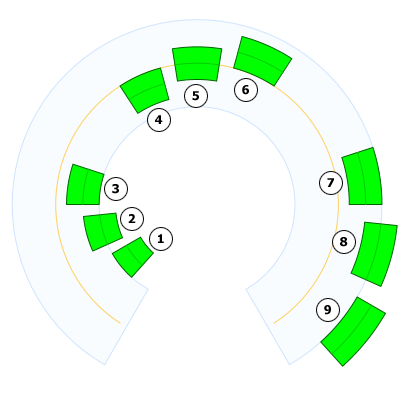
The pale blue lane at the background represents an oval scale, the orange line represents the center of the scale and the green objects are the elements being aligned to the scale using different alignment modes. The center of each element is illustrated in light green color. The alignment modes used for each of the elements in the scheme is specified below:
The position of the aligned elements can be further adjusted through their offset, specified respectively by the TickOffset and LabelOffset properties.
The following schemes illustrates all possible label rotation modes in an oval scale.
Auto | BaselineAwayFromCenter | BaselineToCenter | None | Sideways |
|---|---|---|---|---|
|
|
|
|
|
The fill and stroke of the ticks are specified through the Fill and Stroke properties. The TickShape specifies the shape of the ticks. There are several predefined shapes available. The tick appearance can can be customized by handling the PrepaintTick or PaintTick events. The size of the ticks is controlled by the TickWidth and TickHeight properties and can be specified as either relative or absolute value.
The foreground color of the labels can be specified through the LabelForeground property. The size of the label font is set through the FontSize property. FontSize is of type Length and can express relative sizes. The other font attributes of the labels are specified from the FontFamily, FontSize and FontStyle properties of the containing scale.
It is possible to customize the appearance of the ticks in a specific interval by using CustomInterval objects. To initialize the custom interval, set its MinValue and MaxValue properties to reflect the range of ticks this interval will apply to, then use its Fill and Stroke properties to specify explicit fill and stroke for the ticks in this interval. Finally add the custom interval to the CustomIntervals collection of the respective TickSettings.
Below is an example of a custom interval added to an existing scale. The custom interval specifies red background for all major ticks in the range [10..50].
C#
 Copy Code Copy Code
|
|---|
var interval = new CustomInterval(); |
The text of the labels can be customized beyond simple formatting of the value associated with them. This can be achieved by handling the QueryLabelValue event of the BaseScale class. The handlers of this event will receive an instance of the QueryLabelValueEventArgs class. The new label value can be assigned to the NewValue property of this instance.