TabControl
The TabControl represents a container of windows, whose contents are displayed in the same area, and whose headers are displayed in a separate tab strip. The content of only one of the tabs in the TabControl is displayed at a time.
1. Accessing, adding and removing tabs
Use the tabs property to get a reference to the control's collection of TabPage-s. Use tabs.add and tabs.remove methods to add and remove TabPage-s.
JavaScript
 Copy Code Copy Code
|
|---|
// create a new instance of the TabControl control
var tabControl = new ui.TabControl(document.getElementById("tabcontrol"));
tabControl.width = tabControl.height = new ui.Unit(100, ui.UnitType.Percent);
tabControl.theme = theme;
tabControl.tabHeaderClick.addEventListener(handleTabHeaderClick); var tab = new ui.TabPage("«");
tab.header.size = new ui.Unit(20);
tab.header.interactive = false;
tab.header.tooltip = "Previous Tab";
tab.data = -1;
tab.enabled = false;
tab.header.cssClass = "tab-back";
tabControl.tabs.add(tab); |
2. Changing the current tab
Set the selectedItem property to display the corresponding tab, or the selectedIndex property to select the tab by its index in the tabs collection.
| JavaScript
Copy Code
|
|---|
if(tabControl.tabs.count > 1)
tabControl.selectedIndex = 0; |
3. Customization
The orientation property specifies the position of the tab strip - top or left. Depending on the orientation two other properties can be used to control the tab headers size - tabStripSize, which is the height of the tab strip in a vertical TabControl, or the width of the tab strip in a horizontal TabControl, and tabSize, which is the width of the tab headers in a vertical TabControl, or the height of the tab headers in a horizontal TabControl.
| JavaScript
Copy Code
|
|---|
// create a new instance of the TabControl control
var tabControl = new ui.TabControl(document.getElementById("tabcontrol"));
tabControl.width = tabControl.height = new ui.Unit(100, ui.UnitType.Percent);
tabControl.size = new ui.Unit(20, ui.UnitType.Pixel);
tabControl.theme = "standard"; |
The default click behavior of a tab header (e.g. changing the current tab in the TabControl) can be suppressed by setting the enabled property to false.
Reordering of the tabs headers is enabled by default, but it can be disabled for a specific tab by setting its header.interactive property to false.
| JavaScript
Copy Code
|
|---|
var tab = new ui.TabPage("«");
tab.header.interactive = false; |
4. Events
Important events for the TabControl are:
- selectedItemChanging - a validation event, raised when the selected tab is changing.
- selectedItemChanged - a notification event, raised when the selected tab is changed.
- tabHeaderClick - a notification event, raised when a tab header is clicked.
| JavaScript
Copy Code
|
|---|
tabControl.selectedItemChanging.addEventListener(tabControlEventHandler);
function tabControlEventHandler(sender, args)
{
if(args.oldItem.data == 1")
{
args.cancel = true;
}
}
|
TabPage
The
TabPage class represents a tab page in a
TabControl.
There are three different ways to specify the contents of the TabPage:
- by setting an HTML string as the contents template via the template property. The provided HTML string will be set as the innerHtml of a scrollable div inside the TabPage's content element.
- by specifying an URL of a local page via the templateUrl property. The HTML of the specified page will be treated as is the HTML string from the above case.
| JavaScript
Copy Code
|
|---|
var tab = new ui.TabPage("«");
tab.header.size = new ui.Unit(20);
tab.header.interactive = false;
tab.header.tooltip = "Previous Tab";
tab.data = -1;
//use this code to set the navigation page
//tab.navigateUrl = "products.html";
//use this code to specify the template
tab.templateUrl = "Window1.html";
tab.allowClose = false; tabControl.tabs.add(tab); |
- by specifying an URL of an external page via the navigateUrl property. In this case the external page will be displayed in an internally created IFrame inside the TabPage's content element.
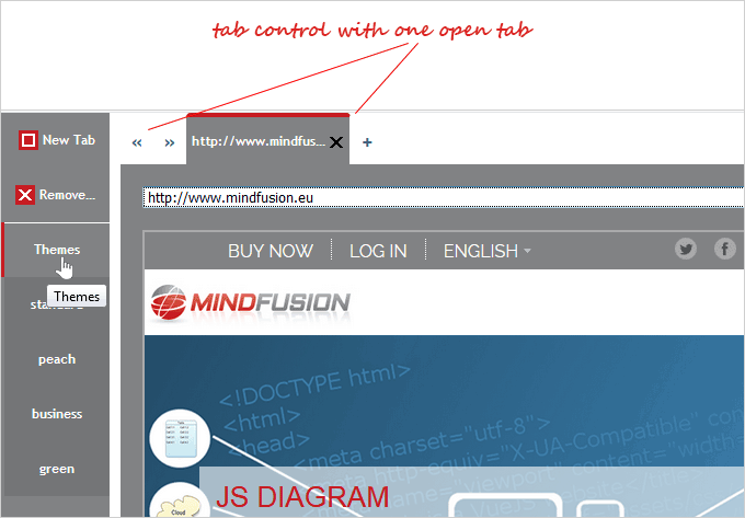
The tab header can display a title text, an icon and a close button.


