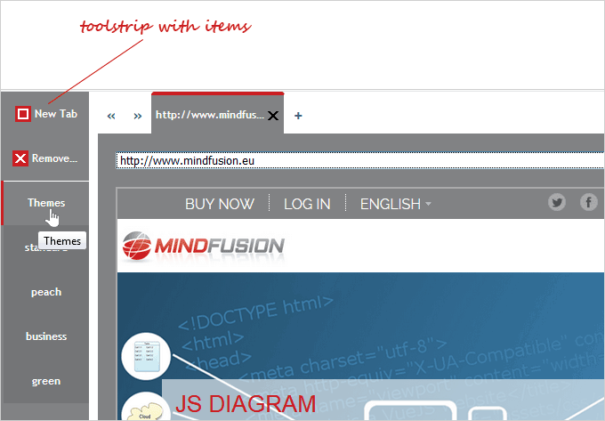
ToolStrip
The ToolStrip control represents a container of toolbar buttons, which can be arranged vertically or horizontally.
1. Accessing, adding and removing toolstrip items
Use the
items property to get a reference to the control's collection of
ToolStripItem-s. Use items.
add and items.
remove methods to add and remove
ToolStripItem-s.
JavaScript
 Copy Code Copy Code
|
|---|
// create a new instance of the ToolStrip control
var toolstrip = new ui.ToolStrip(document.getElementById("toolstrip"));
toolstrip.width = new ui.Unit(100, ui.UnitType.Pixel);
toolstrip.height = new ui.Unit(100, ui.UnitType.Percent);
toolstrip.itemSize = new ui.Unit(50);
toolstrip.orientation = ui.Orientation.Vertical;
toolstrip.collapsible = true;
toolstrip.scrollable = false;
toolstrip.theme = theme; var button = new ui.ToolStripItem(ui.ToolStripItemType.Label, "New Tab");
button.tooltip = "New Tab";
button.cssClass = "toolbutton-add";
toolstrip.items.add(button); |
2. Customization
The orientation property specifies how toolstrip items are arranged - horizontally.(the default), or vertically. Depending on the orientation the itemSize property can be used to control either the height (for vertical orientation), or the width of the ToolStripItem-s. By default, when there is not enough room to display all items, the control will display arrow icons on both ends, which will scroll the ToolStrip's contents when pressed. This behavior can be turned off by setting the scrollable property to false.
The ToolStrip control has a bult-in expand/collapse capability, which can be switched on and off via the collapsible property. The expand/collapse state can be checked through the expanded property and can be set programmatically by using the collapse and expand methods.
| JavaScript
Copy Code
|
|---|
if(!toolStrip.expanded)
toolStrip.expand(); |
The appearance of the control can be modified by setting its
theme and
cssClass properties.
3. Events
Important events for the ToolStrip control include:
- itemMouseEnter - a notification event, raised when a mouseenter event occurs in an item's element.
- itemMouseLeave - a notification event, raised when a mouseleave event occurs in an item's element.
- itemClick - a notification event, raised when a toolstrip item is clicked
| JavaScript
Copy Code
|
|---|
toolstrip.itemDoubleClick.addEventListener(handleToolbuttonClick); function handleToolbuttonClick(sender, args)
{
if (args.item.data == "1")
toolstrip.theme = tabControl.theme = args.item.title;
else if (args.item.title == "New Tab")
addEmptyPage();
else if (args.item.title == "Remove Tab")
{
if (tabControl.items.count() > 3)
tabControl.tabs.remove(tabControl.selectedItem);
}
} |
ToolStripItem
The
ToolStripItem class represents an item in a
ToolStrip control. A
ToolStripItem displays the text, specified by its
title property, and, optionally, an icon, specified by its
imageSrc property. Fine-tuning of the
ToolStripItem-s' appearance can be done by setting its type property to an appropriate value from the
ToolStripItemType enumeration. Items with
ToolStripItemType.Label type will display both the title and the icon, while setting the type to
ToolStripItemType.Icon will display just the icon. Items with
ToolStripItemType.Separator type are commonly used as a group divider. Depending on the type a different css class will be added to the item's DOM element to allow custom css styling.
| JavaScript
Copy Code
|
|---|
var ui = MindFusion.UI; // create a new instance of the WindowHost control
var toolstrip = new ui.ToolStrip(document.getElementById("toolstrip")); var button = new ui.ToolStripItem(ui.ToolStripItemType.Label, "New Tab");
button.tooltip = "New Tab";
button.cssClass = "toolbutton-add";
button.height = button.width = 30;
toolstrip.items.add(button);
button.enabled = false; |


