


Tooltip
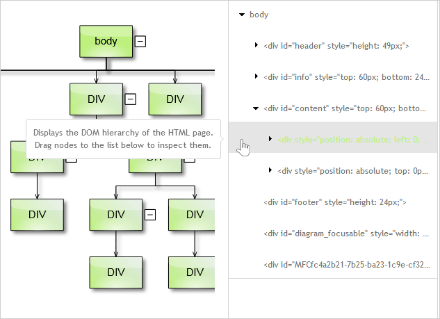
The Tooltip control represents a popup window, containing a custom message. Here is a typical tooltip shown when the user hovers with the mouse over a TreeNode in a TreeView:
The Tooltip constructor expects two parameters, which are the tooltip target, or the DOM element to which the tooltip is linked, and the message text.
JavaScript
 Copy Code Copy Code
|
|---|
var text = "Select items from the list to highlight the corresponding DOM element in the page"; |
The tooltip will be shown automatically when the event, specified by its trigger property, occurs on the target element, e.g. when it is hovered. The tooltip will be hidden automatically when a matching event occurs, e.g. then the mouse leaves the target element.
| JavaScript
Copy Code
|
|---|
tooltip.trigger = ui.TooltipTrigger.Hover; |
| JavaScript
Copy Code
|
|---|
if(tooltip.target == diagram._element) |
By default, the ToolTip will be shown when the user hovers the target's DOM element. The triggering event can be changed by setting the trigger property to another of the TooltipTrigger enumeration values. TooltipTrigger.Click will show the tooltip when the target element is clicked, and will hide it upon subsequent click. Setting it to TooltipTrigger.None would mean that the tooltip's visibility is to be controlled programmatically.
| JavaScript
Copy Code
|
|---|
tooltip.trigger = ui.TooltipTrigger.None; if(tooltip.target == listItem1.element) |
The position property specifies where, relative to the target's element bounds, will the tooltip be shown. If the property is set to TooltipPosition.Cursor an additional property - follow, can be used to specify whether the tooltip should follow the mouse cursor.
| JavaScript
Copy Code
|
|---|
toolTip.position = TooltipPosition.Cursor; |
The content of the tooltip can be set to a custom HTML string via its template property.
| JavaScript
Copy Code
|
|---|
var tip = new ui.Tooltip(listItem.element); |
The appearance of the control can be modified by setting its theme and cssClass properties.
Important events for the ToolTip control include:
| JavaScript
Copy Code
|
|---|
tooltip.tooltipShowing.addEventListener(handleTooltipShowing); function handleTooltipShowing(sender, args) |


