


The list below describes past changes and additions to MindFusion.WPF Pack:
New in 2024.R4
 Diagramming for WPF
- Set EnableVirtualization to false to stop DiagramView's UI virtualization, trading time for presenter creation when scrolling with up-front time to create presenters for all diagram items.
- DiagramView now honors HorizontalContentAlignment and VerticalContentAlignment properties inherited from base Control class, letting you align or center a smaller diagram inside the view.
- Fixed exception when item's ToolTip property is set to a System.Windows.Controls.ToolTip instance rather than a string.
- DataContext of a ToolTip control assigned to items is set to the item that displays it.
- New Export overload of SvgExporter lets you export an already rendered part of DiagramView quicker than overloads taking Diagram argument.
- Fix for ItemRemoved being raised twice.
- TabbedDiagramView no longer interprets underscores in Title property of pages as ALT shortcut, drawing them as is now.
 Spreadsheet for WPF
- DATEDIF function fix for calculating month difference.
New in 2024.R3
Diagramming for WPF
Export XPS files
The XpsExporter class from MindFusion.Diagramming.Wpf.XpsExport.dll assembly exports diagrams to XPS (XML Paper Specification) files. The Export method overloads let you export either Diagram or DiagramDocument objects.
Support for custom in-place edit controls
Handle the CreateEditControl event to display a custom WPF control for users to edit item's content. This event is raised when entering in-place editing mode, either interactively by users or by calling the BeginEdit method. You could handle the event to return a composite control for editing many of the item's properties, and not only text. When leaving in-place editing mode, the DiagramView raises DestroyEditControl to let you copy to the item any values entered by the user and close the custom editor.
ContainerNode improvements
- Unfolding a ContainerNode now always restores original size from UnfoldedSize property, regardless of AutoGrow and AutoShrink values. To revert to old behavior, call ResizeToFitChildren from ContainerUnfolded event handler.
- PatternRouter no longer ignores containers whose Obstacle property is enabled.
- Fixed ContainerNode rotation for children added using GroupAnchorStyles or AttachToNode flags.
- Fixed ContainerNode rotation when RotationStep is set.
New mouse events
- NodePointerEnter and NodePointerLeave are raised when the mouse pointer respectively enters or leaves the boundaries of a node. NodeHovered fires if the pointer rests over a node for HoverDelay milliseconds.
- LinkPointerEnter and LinkPointerLeave are raised when the mouse pointer respectively enters or leaves the boundaries of a link. LinkHovered fires if the pointer rests over a link for HoverDelay milliseconds.
Miscellaneous
- DividerPen property added to ContainerNode, TableNode and TreeViewNode classes. It lets you customize the appearance of the divider line drawn between a node's caption bar and content area.
- ScrollWheelDelta and ScrollClickDelta properties let you customize the amount by which the view scroll position changes when users scroll using the mouse wheel or by clicking scrollbar arrows.
- Handle the CreateToolTipControl event to create custom ToolTip instances.
- AutoHandlesItem and AutoAnchorsNode properties return the items that currently display automatic adjustment handles or anchor points.
- Fixed SvgExporter and PdfExporter memory leaks.
- Fixed exceptions in SvgExporter for some text symbols.
- The ToolTipDelay property lets you specify the delay in milliseconds before showing an item's tool-tip.
- DiagramLink tool-tip fixes.
- Fix for node presenter not disappearing until next WPF layout pass if UIElement.UpdateLayout is called from NodeDeleted.
- Fixed exception thrown when a custom node template contains TextRun objects.
- Fixed rendering of RoundedLinks with larger StrokeThickness.
- Fix for tooltips not closing when the mouse pointer moves outside of the DiagramView.
- Minimum required .NET Framework version lowered from 4.7.2 to 4.6.2.
API changes
- The TextBox property of InPlaceEditEventArgs has been renamed to EditControl, and its type changed from TextBox to base Control type.
New in 2024.R2
Diagramming for WPF
Custom anchor point / pattern classes
The control now supports serialization of custom AnchorPoint and AnchorPattern -derived objects. Call the RegisterClass method to specify XML or JSON type identifiers of the custom classes. Override SaveToXml and LoadFromXml to serialize custom properties in XML format. Override SaveToJson and LoadFromJson to serialize custom properties in JSON format. Custom classes must also implement no-argument and copy constructors.
Miscellaneous
- New LinkDensity partitioning method added to CompositeLayout, divides the graph depending on ratio of nodes to links in subgraphs.
- JsonImageHandler lets you serialize custom image sources to JSON format.
- AnnealLayout now normalizes distance calculations, making its cost property values independent from diagram's MeasureUnit.
- Enable the FlipImage property of ShapeNode to make node's Image follow the geometric shape mirroring specified by FlipX and FlipY properties.
- Set the AutoDeleteLinks property to false to prevent deleting links along with a node they connect, and disconnect the links instead.
- JsonSerializeTag event is now raised when serializing AnchorPoint Tag values in JSON format.
- The control automatically shows ContextMenu of right-clicked objects. It also raises NodeMenuOpening, LinkMenuOpening and ContextMenuOpening validation events to let you cancel the operation selectively.
- Fix for Disallow* mouse cursors not showing.
- Fix for custom table cell templates not rendering in version 4 DiagramView.
- Fix for CreateImage exporting nodes at zero position.
- Fix for incomplete layout by Print and PrintPreview methods of DiagramDocument.
Spreadsheet for WPF
- Set the ShowLeadingApostrophes property to stop hiding escaping leading apostrophe (used to treat remaining cell content as text).
New in 2024.R1
.NET 8 support
The MindFusion.WPF Pack distribution now includes assemblies and sample projects for .NET 8. Locally installed assemblies do not appear automatically in Visual Studio toolbox at this time; you can either add them manually or through Nuget package manager.
Diagramming for WPF
UI virtualization improvements
- The Overview control now virtualizes items when its ScaleMode is different from FitAll.
- Large ContainerNodes that cover several screens now create presenters only for Children inside current DiagramView viewport.
- Fixed UI virtualization memory leaks.
NodeListView improvements
- The IconSize property specifies the size of node icons displayed by NodeListView.
- DefaultNodeSize specifies default size of nodes created by dragging from NodeListView.
- Fix for NodeListView not drawing supplementary labels.
- Fixed NodeListView exception when hosted in a third-party accordion control.
ItemLabel improvements
- Item labels can now by styled using global styles whose TargetType is set to NodeLabel or LinkLabel.
- ItemLabel JSON serialization fixes.
- Fixed exception when EnableWrap is set without specifying label's MaxWidth.
- Fixed label hit-testing when spatial indexing is enabled.
- Fix for DiagramLink in-place editor opening at incorrect position.
- RemoveLabel now automatically repaints the node.
Drag-and-drop improvements
- The control now displays a ghost image of nodes dragged from NodeListView. Set the DragIndicatorOpacity property to set the image opacity.
- Set HorizontalDropAlignment and VerticalDropAlignment to specify placement of dropped node relative to mouse pointer
Miscellaneous
- Set LayerTowardsStart property of LayeredLayout to place child nodes closer to parent nodes.
- Call CloseToolTip method if you need to hide tooltips explicitly.
- Fixed MouseInputMode of ControlNode when using new DiagramView.
- OriginAnchor and DestinationAnchor setters now realign segments of cascading links.
- Fix for selection lasso not always rendering inside DiagramView.
- Fix for HorizontalScaleHeight and VerticalScaleWidth setters not updating the Ruler.
- SnapMarksToPixels and MarkLength properties added to Ruler control.
- Fix for item interactions starting on mouse-down event instead of first mouse-move, as in old versions of the diagram control.
- Fix for custom templates not showing NodeRenderer in new DiagramView.
- Fixed exception when Scrollable containers are nested.
- Fixed exception when (programmatically) moving offscreen containers.
New in 2023.R2
Diagramming for WPF
Model / view separation
Diagram is now considered a model class and must be displayed inside DiagramView control. DiagramView contains a built-in ScrollViewer, so updating applications to this version should be a matter of replacing old ScrollViewer with new DiagramView, and using zoom, scroll and behavior properties of the view object instead of diagram one.
For compatibility with legacy code, Diagram still inherits from Control and can be used on its own for time being, but following new features are only available through the new DiagramView class. In addition, view-related properties of Diagram, such as ZoomFactor, Scroll position, Behavior, are now marked as obsolete and will display compile warnings when used.
UI virtualization
DiagramView and ContainerNode add UI elements to WPF visual tree only for diagram items they are currently visible in respective viewports. This should improve diagram's rendering / refresh speed.
Note that rendering speed improves only when showing a smaller part of the diagram inside DiagramView's viewport. Rendering a lot of items at small zoom levels or in overview's fit-all mode will still need a lot of processing, so you might want to apply constraints on minimal zoom level of diagram view and overview controls for large diagrams.
Spatial index
Set the EnableSpatialIndex property of Diagram to create an index of item positions for faster hit-testing and viewport clipping queries. When combined with UI virtualization, this should greatly improve user interaction and rendering speed for diagrams containing tens of thousands or more items.
C#
 Copy Code Copy Code
|
|---|
// create 20000 links + nodes in total |
Multi-touch support
DiagramView handles WPF touch events and implements multitouch gestures that can be controlled via following properties:
- If MultiTouchZoom property is enabled (default), the view can be zoomed or panned using two-touch pinch / flick gestures.
- If MultiTouchModify property is enabled (default), diagram nodes can be moved, scaled and rotated using two-touch pinch / flick gestures.
- If MultiTouchZoom property is disabled, each touch draws diagram items corresponding to current behavior.
- If MultiTouchModify property is disabled, each touch started from a node draws a diagram link.
- Latter modes can be used for collaborative whiteboarding / classroom scenarios.
- Setting MultiTouchDraw to false lets you prevent drawing multiple items simultaneously, while keeping other multitouch gestures enabled.
- If MultiTouchDraw is enabled (default), a second touch will still cancel first-touch drawing if added within TouchGestureInterval time and TouchGestureDistance distance, and start a multi-touch gesture.
- Additional TouchHitDistance property makes it easier to grab adjustment handles on touch screens, without increasing the AdjustmentHandlesSize value.
Async serialization
Files can now be saved and loaded asynchronously. Async methods create a copy of the diagram to process it in a worker thread, and custom item classes must implement Clone method or copy constructor in order to serialize them as expected.
- async SaveToXmlAsync and LoadFromXmlAsync methods of Diagram and DiagramDocument implement serialization in XML format.
- async SaveToJsonFileAsync, SaveToJsonAsync, LoadFromJsonFileAsync, LoadFromJsonAsync methods of Diagram and DiagramDocument implement serialization in JSON format.
Miscellaneous
- PageMoved and PageRenaming events added to TabbedDiagramView control.
- Different arrowhead shapes can be filled with distinct brushes as set through HeadBrush, BaseBrush and IntermediateBrush.
- DiagramDocument JSON serialization methods.
- Selectively prevent adding or removing child nodes to/from a container by handling the ContainerChildAdding and ContainerChildRemoving events.
- FoldIconSize property added to ContainerNode.
- Clone methods of Diagram and DiagramDocument return a copy of the diagram / document and its items.
- Fix for ShapeNode.Clone not copying ImagePadding value.
- Set GridPatternHatch and GridPatternThreshold to replace alignment grid with hatch pattern at low zoom levels for faster drawing.
- More precise baseline alignment in exported SVG texts.
- SvgNode parser now supports multiple class names in the "class" attribute of SVG elements.
- Fixed CreateImage results when called with Windows display scaling enabled.
- RemoveLabel now automatically repaints the node.
- OriginAnchor and DestinationAnchor setters now realign segments of cascading links.
- Fix for HorizontalScaleHeight and VerticalScaleWidth setters not updating the Ruler.
- SnapMarksToPixels and MarkLength properties added to Ruler control.
API changes
- Diagram should now be hosted inside DiagramView. For time being it can still be used as a standalone control, but support for this will be removed in a future release.
- Set Behavior, ZoomFactor, Scroll*, *ButtonActions properties of DiagramView instead of Diagram.
- Instead of setting Document property of Overview to a Diagram instance, set its DiagramView property.
- Instead of setting Document property of Ruler to a Diagram instance, set its DiagramView property. The latter is the default content property now. If you still need to show stand-alone diagram inside Ruler from Xaml, you must explicitly set it through <diag:Ruler.Document> tag.
- For consistency with other MindFusion diagram libraries, DiagramNodeAdapter has been renamed to ControlNode. Its UIElement property has been renamed to Control.
Spreadsheet for WPF
- The CellIndex class can be used to convert between integer column / row and string representation of a cell address.
- A new [] indexer of CellCollection accepts CellIndex as parameter.
- OldValue, CurrentColumn and CurrentRow properties of IExpressionEvaluatorContext provide more contextual information for custom function evaluation.
- Fixed incorrect bitmap size imported by ExcelImporter.
 Virtual Keyboard for WPF
- Fix for AltGr grapheme generation not working in some applications.
 Scheduling for WPF
- AppointmentForm now accepts return keys in description field to create new lines.
- AppointmentDeleted property added to AppointmentForm.
- Appointment form arrow bitmaps replaced with vector ones.
New in 2023.R1
Diagramming for WPF
DiagramLink improvements
- The Rotate text style of links now honors TextTrimming property, trimming long labels at segment ends.
- Link crossing decorations are now also drawn over a control point if it is collinear with adjacent control points.
- The ValidateLinkCrossing event validates visibility of individual link crossing point decorations.
- Fix for missing segment joints when drawing thick links with LinkCrossings enabled.
SVG improvements
- Fix for hyphens offsetting text vertically in exported SVG.
- FromFile and FromStream static methods added to SvgContent let you load SVG drawings with less code.
- SvgContent path parser fixes for missing delimiters and S commands.
- Fixed SVG sub-path rendering in SvgNode.
- Improved text positioning for nodes with large fonts in exported SVG files.
- SvgNode stroke thickness fixes.
VirtualizingDiagram improvements
- Fix for LinksSource changes not repainting immediately.
- RealizeItems method added to VirtualizingDiagram lets you create actual items in specified off-screen area.
- VirtualizingDiagram fix for new ContainerNode design.
- New Arrange overload of base Layout class allows arranging a subgraph of VirtualizingDiagram.
Miscellaneous
- Fix for NodeLabel not rendering with small font size when including some punctuation symbols.
- Fix for Arrange method of ContainerNode not applying layout.
- Arrange method of ContainerNode now adds offset for CaptionHeight; adjusting for caption through layout's Margins is no longer necessary.
- New CopySelection overload lets you copy a list of items without selecting them.
- TableNode now displays the tooltips of its row anchor points.
- TableNode now clips anchor points of rows scrolled outside current table viewport.
- Fixed ChangeItemCmd exception when saving DiagramLink properties.
- MoveShades mode no longer resets custom Opacity values to 1 after the interaction.
Spreadsheet for WPF
- Fixed ExcelExporter exception when exporting validations with null message texts.
- Fixed ExcelExporter export of quoted texts.
 Reporting for WPF
- Fix for applying font attributes through style resources.
Virtual Keyboard for WPF
- The RepeatDownOnly property specifies whether keys repeat only key-down events, or pairs of down and up events.
Scheduling for WPF
Localization
Localization support has been added to MindFusion.Scheduling built-in forms. All captions and control values can be customized by setting the corresponding property of the LocalizationInfo class. The localization data can also be exported to and loaded from XML. For additional information, refer to Localization.
Distribution now includes localization files for the following languages:
- Chinese
- Dutch
- French
- German
- Italian
- Japanese
- Korean
- Polish
- Portuguese
- Spanish
- Turkish
New in 2022.R2
Diagramming for WPF
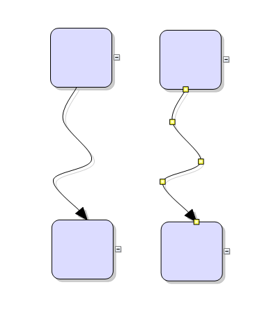
Pattern router
New PatternRouter class routes links by applying patterns of segment and turn sequences and accepting them when resulting paths do not cross nodes. A path is accepted if its final segment ends in target point and is orthogonal to respective side of target node. If there are several possible paths, the router selects the shortest one. The MinimumDistance property specifies minimum allowed distance of link segments from nodes. The PreferredDistance property specifies distance of first or last link bend from associated node. PatternRouter includes several predefined patterns designed to create consistent-looking paths, and allows creation of custom patterns. Custom patterns can be defined as sequence of RouteStep objects specifying whether the path advances by relative or absolute distance, or changes direction:
| C#
Copy Code
|
|---|
var rightZigzag = new RoutePattern(); |
Composite router
The CompositeRouter class lets you chain link routers (objects implementing ILinkRouter interface) so that a link passes through the sequence until it gets routed successfully. Diagram's default router is now set to a CompositeRouter instance containing a PatternRouter and GridRouter sequence. This applies the several standard pattern paths when possible, and otherwise routes links using the cost minimizing heuristics-based grid router.
SvgExporter improvements
- Item's Opacity is set as SVG "opacity" attribute.
- Item's FontWeight is set as SVG "font-weight" attribute.
- Fixed text left padding in SvgExporter.
- SvgExporter sets more precise font size.
SvgNode improvements
- The ContentAutoBounds property specifies whether to calculate content bounds from SVG elements' coordinates, or to honor the drawing's viewbox.
- SvgNode now displays bitmaps embedded in SVG content.
- SvgNode now supports dashed lines in SVG content (defined via stroke-dasharray attribute).
- Fixed index exception in SvgNode when path coordinates are delimited by new-line characters.
New grouping types
- Attach to fractional position of main node and keep attached node's size by calling AttachToFractionalPosition method of Group or respective AttachTo overload.
- Implement custom group positioning by calling AttachCustom and overriding UpdateGroup. The UpdateGroup override must set the position of attached nodes by calling their SetBounds method.
- Attach a node to a point from link's geometry (not necessarily a control point) by calling AttachAlongLinkLength method of Group or respective AttachTo overload. The group preserves original distance from node to the point along link's length, regardless of the number and shape of link segments.
Miscellaneous
- Disabling AvoidOverlaps property of RoutingOptions lets you create routes with overlapping segments.
- EnableParallelism and MaxDegreeOfParallelism layout properties now available in CoreCLR assemblies (.NET Core 3 and 5+ versions).
- Intersects methods changed to public virtual to allow overriding them in custom item classes.
- The ResizeType property of LaneGrid allows setting interactive row/column resize mode that preserves total grid size by subtracting resize amount from lane adjacent to the resized one.
API changes
- Suspend and Resume methods removed from ILinkRouter. Call Diagram's SuspendLinkRouter and ResumeLinkRouter methods instead.
- Default Diagram.LinkRouter changed from QuickRouter to CompositeRouter instance.
- bool SmartPolylineEnds property of RoutingOptions replaced by PolylineRouting enum property, which also provides an option to prevent inclined link segments for LinkShape.Polyline routes.
New in 2022.R1
.NET 6 support
The MindFusion.WPF Pack distribution now includes assemblies and sample projects for .NET 6. Locally installed assemblies do not appear automatically in Visual Studio toolbox at this time; you can either add them manually or through Nuget package manager.
Diagramming for WPF
Multiple labels per node
The NodeLabel class allows multiple captions to be displayed for a single DiagramNode of any type. Node labels provide a set of properties allowing full customization of their display and positioning. Label position is defined by specifying a pin point and offset from it, set through SetCornerPosition, SetEdgePosition, SetCenterPosition methods. In addition, the TextAlignment and TextVerticalAlignment properties of NodeLabel specify on which side of pin point to draw the label's caption.
For example, following code adds extra labels to top-left and bottom-right corners of a ShapeNode:
| C#
Copy Code
|
|---|
var node = diagram.Factory.CreateShapeNode(30, 70, 80, 60); |
Export improvements
- New Export overloads of exporter classes allow writing to System.IO.Stream.
- ExcelExporter exports pen width of links.
- ExcelExporter sets more precise positions of link end points.
Miscellaneous
- The MoveLabels behavior lets user move link and node labels interactively.
- HorizontalOffset and VerticalOffset now work for link labels positioned using SetLinkLengthPosition method.
Virtual Keyboard for WPF
- CurrentCase now reflects Shift + AltGr combinations.
- The control now tracks state of Caps-lock and Shift keys of physical keyboard (if one is attached to the system).
- The Stretch property specifies how the control fills available space in its parent element.
- ChangeLanguage overloaded methods let you set current language either by Windows SDK layout identifier or by CultureInfo.
Spreadsheet for WPF
- MROUND function fixed for 0 argument values.
Reporting for WPF
- The FromFile method lets you load a report template from external file.
- The FromStream method lets you load a report template from System.IO.Stream.
- Report expressions can now fetch values from DataRow fields.
- Report expressions no longer throw exception for DBNull values.
New in 2021.R2
Diagramming for WPF
Scrollable containers
Set the Scrollable property of ContainerNode to let users scroll the container's contents. The node then displays scrollbars at right and bottom edges that can be used to scroll interactively. The ScrollX and ScrollY properties let you determine current scroll position or change it programmatically. Note that in order to let container's content overflow and become scrollable, you must either disable AutoGrow, or allow users reduce container size by changing HandlesStyle and EnabledHandles properties from their default MoveOnly / Move values.
Container improvements
- ContainerNode containment is no longer implemented via a Group object. Child nodes are now stored in a dedicated Children collection, and a node's container is returned by the Container property.
- The ClipChildren property specifies whether to clip child items to container’s boundaries.
- Enable the AutoDeleteChildren property to automatically delete child nodes when a container is deleted.
- Drag-and-drop operations from NodeListView and ShapeListBox automatically add the newly created node to a container if one is found at the drop position.
- Call the ResizeToFitChildren method to resize a container, making it big enough to contain its child nodes.
- The FoldedSize property of ContainerNode specifies the container's size when it is folded.
- The KeepInsideParent constraint of child nodes now also prevents them from overlapping the container's caption bar.
Miscellaneous
- ArrangeAsync method is now available in CoreCLR assemblies (.NET Core 3 and .NET 5).
- The EnumAllPaths method of PathFinder yields each path immediately when found.
- Fixed link-drawing exceptions when both TableNode and its Rows have their AnchorPattern set and ConnectionStyle is set to Both.
API changes
- Container's child nodes are no longer accessible via SubordinateGroup; use the container's Children collection instead.
- A node's container is no longer accessible via MasterGroup; use the Container property instead.
- Child nodes are now also children of their Container in the WPF visual tree, instead of the Diagram, which could affect code that relies on VisualTreeHelper API.
Virtual Keyboard for WPF
Fixed unequal layout margins; now the keyboard should center correctly inside its layout area.
 Charting for WPF
Fixed segment clipping in linecharts for values outside of current vertical range.
Spreadsheet for WPF
- Custom format strings can now contain color names in square brackets, compatible with Excel color specifiers.
- Fix for skipping manual page breaks (set via PageBreak property).
- Fix for diagonal borders showing in exported Excel files when border width is set to 0.
- Fixed missing parentheses when ExcelImporter imports shared formulas.
- Extends the set of expression types in which blank cells are promoted to zeros or empty strings when referenced from formulas.
- Names of named ranges can include backslash and question mark symbols.
 MindFusion.UI for WPF
Fix for DockControl activating wrong window when undocking items and application contains two top-level windows.
New in 2021.R1
.NET 5 support
The MindFusion.WPF Pack distribution now includes assemblies for .NET 5. Locally installed assemblies do not appear automatically in Visual Studio toolbox at this time; you can either add them manually or through Nuget package manager.
Diagramming for WPF
SVG nodes
The SvgNode class represents nodes that display SVG drawings, in addition to the rendering provided by the base ShapeNode class. A node's SVG drawing is rendered after its associated bitmap Image. Set the Transparent property of base type to hide the node's Shape geometry and draw only SVG graphics. The SVG drawing that should be shown inside an SvgNode is specified through the node's Content property. SVG graphics are loaded and associated with the node through an SvgContent object, which should be initialized and then assigned to this property.
Import diagrams from SVG
The SvgImporter class allows importing Scalable Vector Graphics files (*.svg) into MindFusion.Diagramming. Each top-level SVG group element is imported as a separate SvgNode, whose Content is set to the group's child elements. If the SVG file was exported from Visio or OpenOffice Draw, SvgImporter will create DiagramLink objects for groups it recognizes as connectors in order to recreate the original diagram model, though in this case it will not preserve fully the original appearance of connectors in SVG.
Code 128 barcodes
BarcodeNode now supports barcodes in code 128 format.
Lasso zoom tool
The control now supports several ways to zoom using lasso tool:
- Set the Behavior property to Zoom to always draw zoom lasso.
- Set the Zoom flag for one of the keys in ModifierKeyActions to let users draw zoom-lasso with respective modifier key pressed and the left mouse button.
- Assign Zoom value to RightButtonActions or MiddleButtonActions property to zoom using respective mouse button.
Layout improvements
- Automatic layout classes now process DiagramLinks connected to TreeViewItems.
- Set CompactLaterally property of LayeredLayout to create more compact layouts.
Fishbone diagrams
The FishboneDiagram controls creates Ishikawa diagrams (a.k.a. fishbone or cause-and-effect diagrams) from specified data source. Fishbone diagrams are used to display causes of manufacturing effect / defect / event, grouped in categories, and arranged as ribs around a backbone. The FishboneDiagram control creates a category branch (rib) for each item specified in the ItemsSource property. Category labels are obtained from the items' property specified by LabelPath. The causes in a category are obtained from the collection-property of items specified via CausesPath. If the collection contains strings, they are displayed directly as labels in respective branch. If causes are data objects, their labels are obtained through CauseLabelPath.
Miscellaneous
- The TextLinePositions property returns the positions of text lines in ShapeNode.
- Fixed TextLines exception when Text is empty string.
- PdfExporter and SvgExporter now support ImageBrush brushes.
- Arc direction fixes in PdfExporter and SvgExporter.
- Fixed DiagramLink exceptions in clipboard copy and paste methods.
- The MoveNodes behavior allows grabbing nodes to drag them without using adjustment handles.
- Added protected visibility to CompleteModify overloaded method of DiagramItem, called for indirect modifications.
- PanBehavior class used to implement Pan and PanAndModify behaviors is now public, allowing deriving custom behaviors from it.
- ArrangeAnimated fixes.
- ImageAlign supports new FitLeft, FitTop, FitRight and FitBottom alignment styles, which resize Image to fit node's boundaries and align it to respective border.
- The InitializeLasso event lets you customize appearance of selection lasso before it shows on screen.
API changes
- NodeModifying and LinkModifying events are now also raised for items in multiple-selection.
- The Behavior property setter no longer clears current selection. Call the SetBehavior method with true argument instead if you need selection cleared too.
Scheduling for WPF
Dark themes
Two dark themes added, accessible via the Dark and Black elements of ThemeType enumeration.
Dark | Black |
|---|---|
|
|
Reporting for WPF
Code 128 barcodes
Barcode objects now support barcodes in code 128 format.
Virtual Keyboard for WPF
- UnicodeKey fix for sending key to popup window in same process.
- Dispose and DisposeShared methods added.
Spreadsheet for WPF
- ExcelImporter fix for default false value of validations' showErrorMessage attribute.
- SUMIF and AVERAGEIF fixes for multiple-column ranges.
MindFusion.UI for WPF
- New SvgViewer control added to the pack, lets you display SVG drawings in WPF.
- BarcodeLabel now supports barcodes in code 128 format.
- WindowDocking and WindowUndocking validation events added to DockControl.
- ItemSelected and ItemClosing events added to DockControl.
- Fixed wrong dock overlay position when Windows 10 display scaling is enabled.
New in 2020.R1
Diagramming for WPF
Animated layout
ArrangeAnimated methods added to Diagram and ContainerNode classes animate the movement of items from their original locations to new locations assigned by the layout object. This can be used to create an explode effect by starting new layout from overlapping nodes on same position, or an insertion effect by adding a new node to an existing layout.
JSON Serialization
Diagrams can now be serialized in JSON format. This can be used for interoperability with MindFusion JavaScript diagramming library, or for general storage in JSON files or databases. To serialize a Diagram to a JSON string, call its SaveToJson method. To deserialize a diagram back from its JSON representation, call the LoadFromJson method. Custom item classes can implement JSON serialization for their additional properties by overriding the SaveToJson and LoadFromJson methods of DiagramItem. Such classes must be registered for serialization by calling the RegisterItemClass method and providing a string identifier for the clientClass parameter.
Localization improvements
- Right-to-left text support in PdfExporter.
- Support for right-to-left text in styled text. This is still experimental and behind static RightToLeftStyledText flag.
- Fix for PdfExporter creating incorrect PDF files on Chinese versions of Windows.
DXF Exporter
DxfExporter exports diagrams to AutoDesk Drawing Exchange Format (DXF) files. In order to use this component, add a reference to the MindFusion.Diagramming.Wpf.DxfExport.dll assembly to the project. To create a DXF file from a diagram, create a DxfExporter instance and call its Export method, specifying a Diagram object and a file path as arguments.
Miscellaneous
- Arrange method of ContainerNode arranges the child items inside a container using the specified layout class.
- Set the AutoGrow property to false to prevent containers from resizing automatically when they would not fit newly added nodes.
- New CreateDiagramLink overload of the Factory class makes it easier to create links between TreeViewNode items.
- NodeCreateCancelled, NodeModifyCancelled, LinkCreateCancelled, LinkModifyCancelled events raised when create or modify operation on item is cancelled.
- SelectionModifyCancelled event raised when modification of multiple-selection is cancelled.
- For consistency with MindFusion APIs for other platforms, the Diagram class now provides Arrange and ArrangeAsync (CLR 4.5+) methods that take a layout object as argument.
- Improved rendering performance for large diagrams.
- MoveShades mode now supported for nodes with custom templates.
- LinkPadding property of LayeredLayout is now applied for all link types.
- RerouteLinks.Never flag is now considered by multiple selection.
- Fixed ExcelExporter exception when exporting multi-page documents.
- LoadFromXml method of Diagram is now virtual and can be overridden.
- Fixed exception in GridRouter.
- Fixed Clear method of diagram's Items, Links, Nodes collections.
- Fixed formatting of link texts that contain pipe symbols.
- Fixed offset of custom shapes outline in exported PDF and SVG files.
- Fixed uneven multiple resize when AutoAlignNodes is enabled.
Spreadsheet for WPF
Localization improvements
- Cells can display right-to-left text.
- Fix for PdfExporter creating incorrect PDF files on Chinese versions of Windows.
- Right-to-left text support in PdfExporter.
Miscellaneous
- ExcelExporter fix for format warnings in Excel when opening Worksheet whose Name is longer than 30 characters.
- Validation dropdown can now display values from a named cell range.
- Enable AutoFillCopyOnly to make the auto-fill tool only copy values instead of extrapolating new values from selection.
- VLOOKUP function fixes.
MindFusion Virtual Keyboard
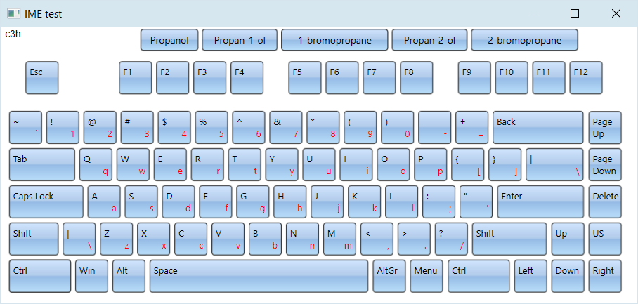
General IME mode
The component now supports general IME mode that maps raw input sequence to dictionary entries. The keyboard collects clicked characters in a staging area and shows the matching entries as suggestions. Users can either click a suggestion button to send its content as input, or click the space key to send the first suggestion.
To enable IME mode, call the LoadImeTable method, specifying the language for which to load IME table and the dictionary file path. The table file format contains one line per entry, with three tab delimited values: raw input, translation, frequency. For example, a hypothetical IME table that translates chemical formulas to compound's common name could look like this:
| C#
Copy Code
|
|---|
| c3h8o Propan-2-ol 2 c3h8o Propanol 4 h2o Water 1 c3h8o Methoxyethane 1 c3h8o Propan-1-ol 3 c2h6 Ethane 1 c3h7br 1-bromopropane 3 c3h7br 2-bromopropane 2 .... vk.LoadImeTable( new CultureInfo("en-US"), "chemical.txt"); |
and suggestions for the partial input "c3h" will look like this:
Chinese
The component can parse IME tables from the Linux Ibus project to implement various Chinese transliteration systems. For example you can load following tables for respectively mainland China's simplified Chinese, Taiwan's traditional Chinese and Hong-Kong's Cangjie input methods:
Zhuyin
https://github.com/definite/ibus-table-chinese/blob/master/tables/zhuyin.txt
Cangjie
https://github.com/definite/ibus-table-chinese/blob/master/tables/cangjie/cangjie3.txt
The following image shows the Zhuyin input method: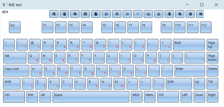
Japanese
If current language is Japanese, the keyboard renders Hiragana characters. In addition, LoadImeTable can parse tables from Google's mozc project to convert Hiragana to Kanji. To enable this mode, specify path to a directory containing the 10 dictionary files from following link:
https://github.com/google/mozc/tree/master/src/data/dictionary_oss
This image demonstrates Hiragana to Kanji conversion:
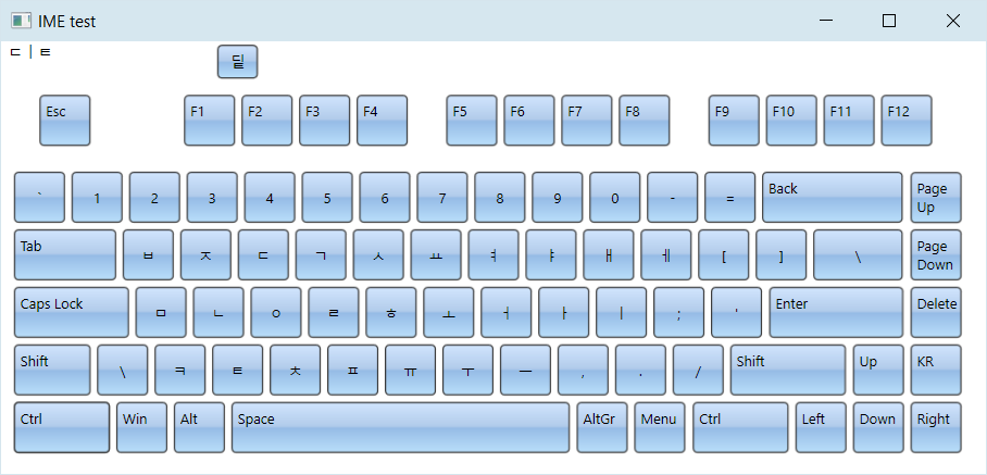
Korean
The keyboard renders Hangul letters when current language is Korean, and automatically enables IME mode that converts letter sequences to Hangul syllabic blocks according to Unicode rules:
Dictionary licensing
Note that the open source Chinese and Japanese dictionaries linked above have licensing terms of their own - some are in the public domain, some include attribution / no warranty clauses, some are LGPL. For licensing terms, check comments in respective dictionary files or license sections of their parent project. If there is enough interest, we will provide built-in dictionaries on MindFusion's standard licensing terms for next releases.
Scheduling for WPF
JSON serialization
Schedules can now be serialized in JSON format. This can be used for interoperability with MindFusion JavaScript scheduling library, or for general storage in JSON files or databases. To serialize a Schedule to a JSON string, call its SaveToJson method. To deserialize a schedule back from its JSON representation, call the LoadFromJson method. Custom item classes can implement JSON serialization for their additional properties by overriding the SaveTo(JsonObject) and LoadFrom(JsonObject) methods of base Item class. Such classes must be registered for serialization by calling the RegisterItemClass method and providing a string identifier for the clientClass parameter.
Miscellaneous
- The ShowPaddingItems property specifies whether to show items in padding days of month views.
- GetFirstDate, GetFirstVisibleDate, GetLastDate, GetLastVisibleDate methods added to Calendar.
Charting for WPF
Specify custom grid line positions by setting GridType to Custom and assigning coordinates to XGridLines and YGridLines collections.
New in 2018.R1
Diagramming for WPF
Non-blocking layout methods
All graph layout classes now contain an async ArrangeAsync method that runs layout calculations in a background task. This is only available in .NET 4.5 build of the diagram assemblies.
| C#
Copy Code
|
|---|
async void OnLayoutLayered(object sender, RoutedEventArgs e) |
Layout improvements
- The KeepLinkShapes property of LayeredLayout lets you preserve initial Shape value of links when LinkType is set to Cascading. The orthogonal path applied by latter property is approximated using respective link shape.
- Set ConsiderNodeShapes property of LayeredLayout to align link end points to non-rectangular node borders.
- Fix for wrong link positions when the diagram contains folded containers.
- Fix for unnecessarily large distance between subsequent layers after a long node appears in a layer.
PathFinder improvements
- Speed of FindAllCycles and EnumAllCycles methods improved.
- FindAllCycles and EnumAllCycles no longer report mirrored versions of cycles in undirected mode.
Export Excel files
The ExcelExporter class from MindFusion.Diagramming.Wpf.ExcelExport.dll assembly exports diagrams to Excel Open XML Format (XLSX) files. Diagrams are exported as Excel AutoShapes drawings. The Export overload that takes a DiagramDocument parameter creates a sheet for each DiagramPage in the document. The Export(Diagram) overload creates a single Excel sheet.
Export improvements
- CreateImage fix for blurry bitmaps when exporting large diagrams.
- Visio2013Exporter processes links' arrowheads.
- Visio2013Exporter preserves the diagram Z order.
- Visio2013Exporter exports links' Text and Labels.
- Visio2013Exporter exports Image of ShapeNode objects.
- SvgExporter fix for non-zero origin of diagram's Bounds.
VirtualizingDiagram improvements
- VirtualizingDiagram can contain nodes of different types now. Nodes returned for data items by InstantiateNode callback are stored in separate pools according to their type, and data items reuse node instances from respective pool. VisualCacheSize now specifies the size of per-type node pools.
- If a data item has Container property set, the control associates its node with Container item's node. It Container item has been realized as a ContainerNode, the source node is added to it as a child. If Container's realized node is of another type, the source node is attached as subordinate using AttachTo method. An alternative way to specify container items is via the ResolveContainer callback.
Overview improvements
- The boolean FitAll has been replaced by ScaleMode enumeration property. It implements a third scaling mode where overview's scale stays fixed and ignores diagram's zoom level.
- If AllowZoom is enabled, users can zoom the diagram by resizing the overview's viewport tracking rectangle.
Miscellaneous
- The LinkTextEdited event is now raised when a LinkLabel has been edited. The edited label is specified via Label property of the event arguments object.
- LinkPadding property added to LayeredLayout specifies how much space to leave between links when LinkType is set to Cascading.
- GridAlignPoint property of DiagramNode class specifies which point of a node should snap to a point of the alignment grid.
- Z order of ContainerNode's children is now local to the container. Adding child node to a container no longer changes ZIndex values.
- The Compact method of Diagram class moves nodes as far possible to the top or left sides of diagram without changing their initial relative positions.
- The ExtendSelection element of ModifierKeyAction lets users select items with lasso rectangle without deselecting old ones.
- Set KeepInsideDiagram property of Selection to prevent users from dragging multiple selection outside of diagram boundaries.
- Fix for link auto-routing around rotated DiagramNodeAdapter objects.
- ImagePadding property of ShapeNode, TableNode and Cell lets you set padding space between element's borders and the contained Image.
- Visio2013Exporter now applies the TextVerticalAlignment property of nodes.
- Improved GridRouter routes when connected nodes are close to each other.
- New Add overload of ContainerNode enables resizing child nodes proportionally to their container.
- Group rotation fix when setting RotationAngle to zero from code.
- The Visibility property of LinkLabel lets you hide labels temporarily.
Spreadsheet for WPF
Autofiltering
Worksheets now support autofiltering. To enable it, call the AutoFilter method of the CellRange class. To specify autofiltering criteria for individual columns, use the AutoFilter overload. These criteria can also be specified interactively, through the drop-down buttons inside the headers of each column in the target range.
Localization
The standard forms from the MindFusion.Spreadsheet.Wpf.StandardForms.dll assembly can now be localized for German, Spanish, French, Korean, Portuguese, Russian, and Chinese. To do this call the new SetLocalizationInfo method of the Workbook class and provide a XML file containing the localized strings for the respective language. The XML files for the above languages can be found in the Localization folder inside the component installation.
Grouping and Outlining
Rows and columns can now be grouped. To group or ungroup a range of rows or columns, use the Group or Ungroup methods of the RowRange and ColumnRange classes. To set the outline level of a row/column or a range of rows/columns directly, use the OutlineLevel property. Groups can be expanded and collapsed interactively, by clicking on the expand/collapse button in the view, or programmatically, by settings the IsCollapsed property of the respective row or column.
New Events
Several new events have been added to the WorkbookView class: ColumnGroupCollapsed, ColumnGroupExpanded, ColumnOutlineLevelToggled, RowGroupCollapsed, RowGroupExpanded, and RowOutlineLevelToggled.
Miscellaneous
- The ExcelImporter class now exposes a ReadConditionalFormats property, which can be used to prevent importing of conditional formats.
MindFusion Virtual Keyboard
Key improvements
- The UnicodeKey class can send any Unicode symbol as input to target text controls.
- The IsPressed property is set to true while a key is pressed down by the user, allowing for data triggers in Xaml templates to change appearance of pressed keys.
- Values of Content property of RegularKey can now be sent to external processes.
Keyboard improvements
- A new Windows10 color scheme added to MindFusion.UI.Wpf.ColorSchemes.
- The SetKeyLabels method lets you override labels of keys for a given language.
Active window tracking
- The control updates its layout immediately when a window with a different current language activates.
- Pressing a key no longer activates last target window, which was necessary when keyboard is used as a popup inside application but led to activation flickering. Set the new PreventActivation property instead to disable the keyboard's popup window from activating altogether.
Miscellaneous
- Move multiple selected keys in keyboard creator.
- Various keyboard creator fixes.
New in 2017.R1
Charting for WPF
Funnel Chart
Funnel charts are often used to represent the stages of a process and show relative values or measurements associated with each stage. In MindFusion.Charting API, funnel charts can be created using the FunnelChart control associated with a FunnelSeries providing data. FunnelChart inherits appearance properties from the base Chart class, and offers additional customization through StemWidth and SegmentPadding properties.
Miscellaneous
- Set ShowCrosshairs to display crosshairs in RealTimeChart.
- InnerLabelAlignment property of BarSeries lets you customize label alignment in bars.
- ClearMeshSelection method lets you clear selected meshes in 3D charts.
Diagramming for WPF
Flip shapes
The shape of a ShapeNode can be flipped horizontally or vertically. Enable the AllowFlip property and the shape flips when an edge is dragged over its opposite edge. You can get or set current flip state using FlipX and FlipY properties.
Fluent API
Extension methods in MindFusion.Diagramming.Wpf.Fluent and MindFusion.Diagramming.Wpf.Layout.Fluent namespaces let you initialize objects using fluent programming style:
| C#
Copy Code
|
|---|
using MindFusion.Diagramming.Wpf.Fluent; |
ShapeListBox control
The ShapeListBox control displays a list of Shape icons along with their DisplayName. It lets users drag-and-drop a Shape to the diagram's canvas to create a new ShapeNode. Set the ItemsSource property to an array or collection of shapes that should be rendered inside the control. For example, setting the Shape.Shapes list as ItemsSource will show all pre-defined shapes. You can customize the shape appearance by setting ShapeBrush and ShapeSize properties.
DiagramLink improvements
- AllowSplitLinks now works for Bezier links too. Users can insert a new Bezier segment by dragging any point (other than a control point) of a selected link. Adjacent segments can be merged back into a single one by dragging a tangent control point (square adjustment handle) onto a pass-through control point (round adjustment handle).
- IntermediateShape shapes are now rendered at correct position for Spline links.
- RerouteLinks.WhileModifying now works when multiple nodes are being dragged, either due to selection or grouping.
- Fix for link visibility issues when folding nested containers.
- The component no longer keeps a separate segmentCount field, removing a common source of errors. The SegmentCount property now calculates its value from ControlPoints elements. The UpdateFromPoints(updateGroups, updateSegments) overload has been removed too.
- SegmentCount setter no longer refuses changing number of segments if auto-routing is enabled or the link is a self-loop.
- The new Spline element of LinkShape enumeration draws links as interpolating splines that pass through all of their control points:
Shape formula improvements
- The LocationForNode method of ShapeControlPoint returns current position of the control point for a node.
- The UpdateShapeControlPoints method of ShapeNode lets you update the node appearance after adding new control points to a Shape.
- ControlPoints are now saved in shape libraries.
Miscellaneous
- TextLines property of ShapeNode returns the lines of text as wrapped for current node size.
- The PanAndModify behavior lets you select and modify when the mouse pointer is over an item, or pan the view otherwise.
- Fix for LayeredLayout not sorting subgraphs correctly when using the MultipleGraphsPlacement.*Sort options.
- The RotationStep property of Diagram class specifies the increments applied to a node's RotationAngle during interactive rotation.
- The Bounds property of DiagramNode now supports binding.
- GridRouter evaluates routes between more distant sides of connected nodes when RoutingOptions.EvaluateFarPoints is enabled.
- Fix for magnifier offset when origin of Diagram.Bounds is non-zero.
- Enable inertia for pan interactions by setting the PanInertia property to true.
- A NodeRenderer added to custom node templates will now repaint automatically when any dependency property of the node changes.
- Set FreeFormMode to enable free-form lasso selection that lets users draw irregular outline to select items inside.
- HeadStrokeDashStyle property added to DiagramLink lets you set the dash style of arrowhead outlines independently from link segments' one.
- Fixed orientation change gesture for cascading links when AllowSplitLinks is enabled.
- PdfExporter now creates page hyperlinks if HyperLink is set to a value in "page://{number}" format, e.g. set "page://1" to open the second PDF page when the item is clicked.
- Disable adding new headers to the lanes grid by setting AllowAddHeaders to false.
- The Visio Stencils import API provides access to BeginArrow and EndArrow values.
- The Visio Stencils import API provides access to Connection elements defined for a shape.
- Fixed bug in ResizeToFitText method with long words in the text when preserving node's ratio.
Scheduling for WPF
RangeSelector integration
The Calendar control can integrate with the new RangeSelector component in order to implement a timeline in the Resource view. The new ResourceTimeline sample illustrates this integration.
Spreadsheet for WPF
Improved XLSX Import and Export
The ExcelExporter and ExcelImporter classes are now times faster than before and the results are more accurate. Various problems and inconsistencies were fixed. Both classes now expose a View property. If you set the View property of the ExcelExporter, the exporter will also export view information, such as the active tab and selection. Alternatively, setting this property during import, will cause the view information to be imported.
Miscellaneous
- It is now possible to add images to worksheet cells.
- The CsvExporter class can now export partial worksheets through the new Export overload.
- The WorkbookView expoxes new Cut, Copy, and Paste methods, which can be used to cut, copy, and paste the current selection of the active worksheet in the view.
- The WorkbookView now exposes ColumnsMoved, RowsMoved, ColumnsResized, and RowsResized events.
- The WorkbookView now exposes ColumnsMoving and RowsMoving events, which can be used to validate interactive columns and rows moving.
- The WorkbookView now exposes ColumnsResizing and RowsResizing events, which can be used to validate interactive columns and rows resizing.
New in 2016.R2
Charting for WPF
Candlestick Charts
The CandlestickSeries class represents movements of stock or currency prices in financial charts. Individual values in the chart are specified via StockPrice objects assigned to the series' Values property. Candlestick bodies are filled using brushes from the Fills collection if ones are specified, or otherwise with the FallingPriceBrush and RisingPriceBrush depending on the difference between Open and Close prices. CandlestickSeries can be added to either LineChart or BarChart controls.
Miscellaneous
- Bars in BarChart3D can be rendered as cylinders by setting the new BarModel3D property to Cylinder.
- LineChart performance has been improved when rendering large data-sets.
API Changes
- Piece substrings renamed to Slice in PieChart properties and related types.
- CrossHair substrings' capitalization changed to Crosshair in AxesChart properties.
Virtual Keyboard for WPF
Virtual Keyboard for WPF has been initially added to MindFusion.WPF Pack.
New in 2016.R1
License keys
There is no separate trial build of the control assemblies anymore. Instead, set the LicenseKey property of the controls to disable their evaluation mode and stop displaying trial messages. If your application contains more than one control by MindFusion, you could call MindFusion.Licensing.LicenseManager.AddLicense(key) from application start-up code to specify the key once instead of setting it per each control. License key strings are now listed on the Keys & Downloads page at MindFusion's customer portal.
Visual Studio 2015 support
MindFusion.WPF Pack now includes support for Visual Studio 2015. The installer can create VS2015 toolbox palette for the component.
Barcodes
The new BarcodeLabel class allow displaying EAN, UPC or QR barcodes.
Charting for WPF
Improved Zooming
Selected area with width smaller than MinZoomSpan does not evoke any action in the control. In addition, the new ZoomChanged event fires whenever zoom occurs and provides useful data for the zoom action with its ZoomChangedArgs.
Cross Hair Improvements
The cross hair control has been improved with several new properties, a method and an event. The properties are:
- CrosshairBackground, which lets you change the background of the control.
- CrosshairTemplate, which you can use to set your own ControlTemplate for the cross hair.
- CrosshairType that let you choose among several types of cross hair to display.
The new CrosshairPosition method returns the current location of the cross hair. For more precise handling of cross hair movements a new event is available – CrosshairPositionChanged.
Greatly Improved 3D Charts
3D charts have received plenty of improvements, new properties and performance optimizations:
- PointMergeThreshold – The property sets the radius of an area around a given point where no other points are drawn. The result is better performance especially in charts with numerous points, which happen to be close to one another. Of points with similar coordinates only a single one is rendered, the rest are omitted.
- InterpolationType.None – A new InterpolationType has been added to the InterpolationType, which does not interpolation but adds data directly and connects the points with triangulation.
The SurfaceType enum has been replaced with three bool properties, which makes the API easier to understand and use.
- ShowSurface – shows/hides the surface of a 3D chart
- ShowScatters – shows/hides the scatters
- ShowWireFrame – shows/hides the wireframe
ScatterFaceSize – the property regulates the size of the polygons that build a 3D scatter. Bigger values lead to bigger polygons, which results in faster performance and more rough scatter mesh.
Effect3D.ShaderEffect – the property can be applied to all 3D chart elements, including scatters and performs much faster.
Exporting Images
Two new methods have been added for exporting the chart as an image – CreateImage and ExportImage.
Custom Formatting of Labels in Real-time Charts
A new property has been added to the RealTimeChart library – Axis.LabelFormatProvider. Use it to specify custom formatting of numeric labels. If required, you can specify format arguments for your format classes with Axis.LabelFormat.
Diagramming for WPF
Free-form nodes
A FreeFormNode collects all points from users' mouse or touch input and displays them as node's outline. To let users draw free-form nodes interactively, set Diagram.Behavior to DrawFreeForms or LinkFreeforms. Use the Points property of FreeFormNode to get or set outline points programmatically. If the Closed property is set, the node is drawn as a closed shape and its interior filled, or otherwise the node is drawn as a poly-line. If the distance between first and last points drawn by user is shorter than Diagram.AutoCloseDistance, the node's Closed property is automatically set to true. AutoCloseDistance default value is Double.MaxValue, so free-form nodes are always closed.
Additional drawing modes, convenient for touch input, convert FreeFormNode objects drawn by user to ShapeNode objects with most similar shape. To enable them, set Behavior to DrawFreeShapes or LinkFreeShapes. The shapes against which the user's input is matched are set via diagram's FreeFormTargets property. By default it contains Rectangle, Decision and Ellipse shapes.
Shape control points
Shape formulas can now be parameterized by associating control points with Shape objects. Each control point is passed to the shape script as a named variable. Apart from the name, you can specify the default, min and max coordinates for each parameter via the ShapeControlPoint constructor, and whether to treat its values as percents or fixed offset.
Resize table columns and rows
Columns and rows of a TableNode can now be resized interactively if its AllowResizeColumns or AllowResizeRows properties are enabled. In order to resize, move the mouse pointer to the border line on column's right side or row's bottom side until it shows resize cursor and start dragging. The control raises TableColumnResizing and TableRowResizing events to let you validate new size or prevent resizing some elements. The TableColumnResized and TableRowResized events are raised after the operation completes.
Barcode nodes
The BarcodeNode class displays EAN, UPC or QR barcodes as node's content. In-place edit operations let users enter new numeric codes for 1D codes or text strings for QR codes. The barcode format is specified via the Format property, the encoded number or text is set via Content, and color of 1D bars / 2D modules via BarColor.
Support for Visio stencils
The diagram can now display shapes from stencil files in Visio 2003 XML stencil format (.vsx). To load a stencil file, use an instance of the VisioStencil class. The shapes are displayed in the diagram through VisioNode objects. To associate a stencil shape with the node, create an instance of the VisioContent class and assign it to the node's Content property. Note that standard stencils installed with Visio are copyrighted by Microsoft, and you should not use them in your application. This feature is intended to let you use public domain stencils, or commercial clipart you have purchased a license for.
ShapeDesigner improvements
- The ShapeDesigner control supports undo. Call its Undo or Redo methods to respectively undo or redo a change done to the designed shape.
- ZoomFactor property added to ShapeDesigner. It also supports interactive zoom in/out via mouse wheel.
- The SelectedElement property exposes the graphic element currently selected in ShapeDesigner canvas. You can bind to its stroke and brush properties to create alternative user interface for editing element attributes.
AnchorPatern improvements
- The XUnit and YUnit properties allow specifying the coordinates of an AnchorPoint as a fixed offset from the node's top-left corner rather than in percentage, so that the point position does not change when the node is resized.
- The AnchorPattern property of Shape class lets you associate anchor points with shape definitions. If a ShapeNode instance does not contain its own AnchorPattern, it will derive the one defined by the node's Shape.
- The RowAnchorPattern property lets you specify default AnchorPattern for all table rows.
Miscellaneous
- Undo/redo records for in-place edit operations are now created automatically. They are represented by instances of the EditTextCmd class.
- LinkTextStyle.Center improved for vertical links.
- KeepInsideDiagram property of NodeConstraints prevents a node from leaving diagram boundaries during user interaction (the older RestrictItemsToBounds property does not stop nodes from leaving diagram area but returns them to original position if dropped outside).
- Dashed selection frames are now drawn in two colors and should be visible on both the default white background and custom darker backgrounds. You can change the second dash color by setting DashBackground property of HandlesVisualStyle.
- Set the WhileModifying flag in RoutingOptions.TriggerRerouting to reroute links while users drag their end points.
- Custom connection point classes can now override NearestAnchorPoint to implement custom anchor point selection logic; the method is now also called at the beginning of interactive link creation.
- LinkHitDistance is now backed by a dependency property.
- Fixed node spacing in bottom-to-top TreeLayout.
- AllowRenamePages property of TabbedDiagramView now automatically sets new Title values instead of only raising events.
- ChangeUnit now also scales stoke widths.
- ShapeDesigner supports alignment grid, which can be customized using ShowGrid, AlignToGrid and GridSize properties.
- ShapeDesigner allows specifying anchor points for the shape.
Fixed bugs
- Fixed a bug where link to a child node inside a nested container would not point to correct position if both nested and outer containers are folded.
- Fix for incorrect Visio formula parsing in VisioNodes for some regional settings.
- Dots in item borders were not visible with default StrokeDashCap value when using dot and dash-dot stroke styles. Default value has been changed from Flat to Square to fix that.
- Links to contained nodes were left visibly disconnected from them after deleting a folded ContainerNode.
 Mapping for WPF
Zoom control
The ZoomControl class lets user change interactively the current zoom level and scroll position of a MapView. To set it up, add a ZoomControl to the page, place it anywhere over a MapView, and set the control's Target property to that view. Set the ZoomStep and ScrollStep properties to specify the amount added to view's zoom level or scroll position by ZoomControl's buttons. You can customize the control's appearance by setting properties such as Fill, CornerRadius and TickPosition.
Miscellaneous
- The new Behavior property lets users select multiple map elements interactively.
Reporting for WPF
Report Parameters
Parameters can now be added to a report through the new Parameters collection of the Report class. The parameters provide name, description and value and can be of any type, including expression. For more information about parameters, check the Report Parameters topic.
Barcodes
Reporting for WPF reports can now display UPC-A, UPC-E, EAN-8, EAN-13, and QR barcodes. The barcodes are represented by the new Barcode report item.
Miscellaneous
- Fixed an issue with horizontal data ranges.
- Items in data range headers and footers can now bind to the data source of the data range.
- New sample illustrating the Barcode report items.
Scheduling for WPF
Interactive Recurrence Rescheduling
Recurrences can be rescheduled interactively by holding down the RescheduleRecurrenceKey while dragging a recurrent item. The control tries to preserve the current pattern of the recurrence when possible. Otherwise, the recurrence may be modified to accommodate to the new start and end times of the modified item. Interactive rescheduling is not registered in the undo history.
New Theme
A new built-in theme is available in Scheduling for WPF – the Light theme. It is available through the ThemeType enumeration.
New Members
Several new properties and events have been added to the control:
- The RescheduleRecurrenceKey property in the Calendar class can be used to modify recurrences interactively.
- TickSize added to the ResourceViewSettings class.
- Calendar.FilterItem event.
New in 2015.R1
Diagramming for WPF
Support for Xaml templates
- Template property has been added to the base DiagramNode class and now all node types can be templated. A NodeRenderer element can be added to templates to invoke nodes' standard low-level drawing code before rendering custom template elements.
- TableNode cells can be templated by setting the Template property of the Cell class for individual cells, or by defining a template for all cells using a default style with {x:Type diag:TableNode+Cell} as a target type.
Improved arrowhead rendering
- Arrowheads are rendered as a single path when possible and several arrowhead Shape definitions have been changed to implement mitered joints when HeadPen is set to a thick pen.
- The point where end segments connect to arrowheads can be specified via the LinkSegmentInset property of Shape. Shape definitions from the ArrowHeads class set it to suitable default value. This allows using transparent or semi-transparent brushes without seeing the link line drawn behind arrowheads.
Shape designer control
The ShapeDesigner component implements a vector-drawing canvas where Shape definitions can be created interactively. Call the ImportShape method to open a shape for editing. Call the ExportShape method to create a Shape with specified Id from current content of the designer canvas. ShapeDesigner shows a palette with two kinds of elements: Primitives which when dropped on the canvas add a single curve or line segment, and Templates which when dropped on canvas add a closed path of several graphic primitives.
Tree map layout
Tree maps represent hierarchies by nesting child nodes within their parents, where the areas of leaf nodes are proportional to their Weight values. Unlike other layout algorithms, TreeMapLayout expects hierarchies to be defined via grouping or containment (see AttachTo method and ContainerNode class), and will ignore any links in the diagram. The diagram area covered by the topmost nodes in a hierarchy is specified via the LayoutArea property. By default, the layout tries to keep the ratio of node sides as close as possible to one. However this could make it hard to distinguish separate levels of the hierarchy. To alleviate that, set Squarify to false, and child nodes will be arranged either as a row or a column inside their parent node, alternating directions for each level. The drawback is that when Weight ratios differ greatly or nodes contain many children, some nodes could end up with very narrow rectangles.
Decision flowchart layout
DecisionLayout arranges simple flowcharts consisting of decision boxes with up to three outgoing links per node and activity boxes with a single outgoing link per node. The nodes are arranged in columns and rows, whose distance depends on the HorizontalPadding and VerticalPadding property values. When links share the same row or column, they are placed at a distance specified via LinkPadding. The layout arranges nodes recursively starting from StartNode. If StartNode is not specified, the algorithm selects the root of the deepest branch of the graph's spanning tree as start node.
Export Visio 2013 files
The Visio2013Exporter class can export the content of Diagram and DiagramDocument objects to Visio 2013 VSDX files. In order to use it, add a reference to the MindFusion.Diagramming.Wpf.VisioExport.dll assembly. Similarly to the VDX format exporter, Visio2013Exporter relies on a template file, called Visio2013.vxt, containing some boilerplate Visio XML code. The template must be either located in same folder as the application assemblies, or its path must be specified via the TemplatePath property. At this time the exporter supports shapes from Visio basic stencil.
Visio2013Importer improvements
- The importer now supports Visio group shapes. Child shapes in groups are no longer lost when importing, and their corresponding diagram nodes are attached to the corresponding group node.
- Visio NURBS curves are now imported as Bezier-style links.
- Fix for importing connectors with applied rotation transform.
- Shapes with a hidden attribute in master definition are now imported as invisible items.
- The Item argument of ImportItem event handlers is now pre-set to a DiagramItem instance created for the imported Visio shape, letting you avoid parsing some standard data such as Bounds or Text. You can either modify this item's properties, or replace it with a new instance of a different type.
- Fixed a crash when a shape master does not have a name attribute (this happens with custom stencils).
- Fixed a crash when theme1.xml is missing from the imported vsdx archive (this happens with files converted from old Visio versions to 2013 format).
- Fixed a parse exception for some non-English locales.
- Fixed a bug where one-segment connectors were imported at wrong positions.
- Added support for gradient brushes.
Other export improvements
- PdfExporter, SvgExporter and WmfExporter will now render the swimlane grid if PrintOptions.EnableLanes is set.
- VisioExporter export speed has been improved greatly for large diagrams.
Miscellaneous
- Layout algorithms now automatically resize diagram's Bounds if it's not large enough to fit the arranged content. To revert to old behavior and keep fixed Bounds size, set GrowToFit to false.
- The control raises DrawForeground event to let you render custom graphics on top of the diagram.
- Set the Brush property of LinkLabel to fill the background of link labels.
- TabbedDiagramView now activates the first tab after its document is loaded from a file.
- TextPadding property is now applied by table cells.
- Multiple-resize of rotated nodes fixed to apply same offsets in nodes' local coordinate system.
- Anchoring.Keep option is now honored by OrthogonalRouter.
- ZoomIn, ZoomOut, ZoomToRect, ZoomToFit methods added to DiagramView control.
- Diagram.XmlOptions properties let you enable or disable style and theme serialization.
- The magnifier tool now shows swimlanes and grid points.
- The ChangeUnit method sets a new MeasureUnit and scales the coordinates of diagram items to keep them the same size.
- the SetSelfLoopShape event is raised when a link becomes a self-loop, giving you a chance to set a custom shape for the link.
- LinkLabels are now copied by DiagramLink copy constructor and clipboard methods.
- Fixed LinkLabel positioning along Bezier links.
- NodeStyleSelector property of VirtualizingDiagram lets you dynamically apply styles based on node's data.
- Changing Diagram's ZoomFactor now updates MindFusion.UI.WpfZoomControl slider automatically.
- Fix for wrong scale when printing diagrams with MeasureUnit different from WpfPoint.
Dependency properties
The following properties have been converted to dependency properties:
- CellFrameStyle, Shape, and CaptionHeight properties of TableNode.
- CaptionHeight and Shape properties of ContainerNode and TreeViewNode.
- MeasureUnit property of Diagram class.
- Arrowhead shape and size properties of DiagramLink class.
- Default-value properties of Diagram class.
API changes
- For consistence with MindFusion libraries for other platforms, BackBrush in default diagram style has been changed to white brush.
- Type of LinkLabel.Margin property changed from double to Thickness.
- ZoomControl can be now used with other MindFusion components and has been moved to MindFusion.Common.Wpf assembly in MindFusion.UI.Wpf namespace.
- The SelectionMoved event has been renamed to SelectionModified, and is also raised if nodes are resized when AllowMultipleResize is enabled. Event handlers now receive SelectionEventArgs parameter instead of EventArgs.
- The SelectionMoving event has been renamed to SelectionModifying, and is also raised if nodes are resized when AllowMultipleResize is enabled. Event handlers now receive SelectionValidationEventArgs parameter instead of ValidationEventArgs.
Spreadsheet for WPF
Spreadsheet for WPF has been initially added to MindFusion.WPF Pack.
Charting for WPF
Real-time Chart Library
A brand new library has been added to the Charting for WPF component - a real time chart. The new control is specially optimized to render fast large amounts of data in real time. Its major feature is the ability to handle a lot of points without loading the machine it runs on. The library also offers various customization options for the chart - scatters, multiple legends, multiple Y and Y2 axes, custom labels, tooltips, grid. You can read more about the component in the "Real Time Chart" section in the "Programming Interface Overview" topic. We have added samples, tutorial and detailed documentation for the component in the Charting for WPF installation.
Miscellaneous
- ShowCrosshair renders a cross hair that will trace the mouse position over the plot area.
- Curve property, which when enabled draws a line as a canonical spline.
3D Charts
- All 3D charts support unlimited number of series.
- New property Lights holds a collection of Light objects instead of the LightType property.
- Detailed hit testing, which returns a ChartHitTestResult3D that contains the clicked 3D point, the normalized 3D point, a collection of chart elements (if found), and the nearest peak (in surface charts).
- AllowMeshSelection property, which when enabled allows selection of mesh objects with a mouse click. The MeshSelectionBrush sets the brush for the selection.
- Behavior3D property, which lets you choose how the chart responds to mouse interactions.
- Improved performance for all chart types.
Surface Charts
- SurfaceType property, which sets whether scatters or surface is drawn.
- SurfaceSeries.GroundLevelMargin property, which sets the GroundLevel-offset.
- Each Series3D can be clipped in a given range with the ClipMinimum and ClipMaximum properties.
- TextureType property sets the texture of the chart - Brush or ColorMap.
- New ColorMapList property, which sets a Color map with arbitrary colors and offsets.
- CloseModelFigure property, which closes the sides of the model if enabled.
Scheduling for WPF
Improved data grid
The cells and headers in the data grid can now be customized through a set of new properties: CellBorderBrush, CellBorderThickness, HeaderBackground, HeaderBorderBrush, HeaderBorderThickness, HeaderFontSize, HeaderForeground, and HeaderMargin. The new ColumnCreating event can be used to replace a grid column with a custom one.
New Holiday Providers
Five new holiday providers have been added to the MindFusion.HolidayProviders.dll assembly, namely AustraliaHolidayProvider, FranceHolidayProvider, GermanyHolidayProvider, RussiaHolidayProvider, and UKHolidayProvider.
Improved Timetable view
The WorkTimeStartHour and WorkTimeEndHour properties have been renamed to WorkTimeStart and WorkTimeEnd respectively and are now of type TimeSpan to allow more flexible work time intervals. In addition, the new WorkTimeStarts and WorkTimeEnds properties can be used to specify different work time intervals for the different days in the view. The new ColumnHeaderTemplate property can be used to customize the column headers by using a DataTemplate object.
Improved WeekRange view
The Week Range view can now display week numbers, similarly to the Single Month view. The week numbers can be enabled through the WeekHeaderPosition property and can be customized through the RotateWeekHeaderTexts, WeekHeaderFormat, WeekHeaderStyle, and WeekNumbersHeaderWidth properties.
Improved Resource view
The row headers can be customized through the new RowHeaderTemplate property.
Miscellaneous
- New resource and item hit-testing methods: GetItemAt and GetResourceAt.
- The modifier key to clone items interactively can now be specified through the ItemCloneKey property.
- New ItemStartModifying event.
- Various bug fixes.
- Two new samples - CustomMonthCalendar and CustomTimetableGrid.
Mapping for WPF
Zoom control
The ZoomControl class lets user change interactively the current zoom level and scroll position of a MapView. To set it up, add a ZoomControl to the page, place it anywhere over a MapView, and set the control's Target property to that view. Set the ZoomStep and ScrollStep properties to specify the amount added to view's zoom level or scroll position by ZoomControl's buttons. You can customize the control's appearance by setting properties such as Fill, CornerRadius and TickPosition.
Miscellaneous
- The new Behavior property lets users select multiple map elements interactively.
Reporting for WPF
Improved charts
Several new properties have been added to the LineChart class to imporive the customization for the plot, grid, legend and axes. The axes settings can be specified through the new XAxisSettings and YAxisSettings properties.
The AxesChart class exposes four new properties, which can be used to specify the intervals displayed by the chart axes. The new properties are XMinValue, XMaxValue, YMinValue, and YMaxValue.
Miscellaneous
- Report items can be searched by name through the new FindItem method.
New in 2014.R1
Visual Studio 2013 support
MindFusion Pack for WPF now includes support for Visual Studio 2013. The installer can create VS2013 toolbox palette for the components, and can optionally install VS2013 sample projects.
Diagramming for WPF
Import Visio 2013 files
The Visio2013Importer class can import .vsdx files, created by version 2013 of Microsoft Visio. In order to use it, you must add a reference to the MindFusion.Diagramming.Wpf.VisioImport.dll assembly. Various overloads of the Import method can be used to import the Visio drawing into a DiagramDocument whose pages correspond to the Visio pages, or into a single Diagram whose content is merged from all imported pages. When merging multiple pages, their positions in the diagram depend on the PagesPerRow value. Visio2013Importer supports Visio's basic flowchart and data flow stencils. For each node shape from the .vsdx file, the importer creates a ShapeNode object whose Shape, Text, Brush and Stroke properties are set to values corresponding to the imported Visio shape. For each connector shape, the importer creates a DiagramLink object whose Origin and Destination are set to the corresponding imported nodes, and whose ControlPoints reflect the geometry of the connector.
Zoom control
The MindFusion.UI.WpfZoomControl class lets the users to interactively change the current zoom level and scroll position of a Diagram or DiagramView. To set it up, add a MindFusion.UI.WpfZoomControl to the window, place it anywhere over the target diagram, and set the control's Target property to that diagram or view. Set the ZoomStep and ScrollStep properties to specify the amount added to view's zoom level or scroll position by MindFusion.UI.WpfZoomControl's buttons. You can customize the control's appearance by setting properties such as Fill, Stroke, CornerRadius and TickPosition.
Miscellaneous
- Enable the AllowRenamePages property of TabbedDiagramView to let users rename a DiagramPage interactively by clicking its tab.
- Several new shapes added for better compatibility with Visio 2013 basic stencil: RightTriangle, Decagon, Trapezoid, Star4Pointed, Star5Pointed, Star6Pointed, Star7Pointed, Star16Pointed, Star24Pointed, Star32Pointed, Donut, Plaque.
- DefaultEncoding and AutoDetectEncoding properties added to PdfExporter.
- New RoundAndSquare and RoundAndSquare2 handle styles can be set as the HandlesStyle of nodes.
- SkipEmptyPages property added to PrintOptions.
- The projection of a node on the scales of Ruler control now shows the boundaries of the rotated node shape. To ignore rotation as in older versions, set ProjectRotatedBounds to false.
- Fixed invisible inplace edit text-box problem under Windows 8 and .NET 4.5.
- Fixed bug in undo/redo of RotationAngle assignments.
New in 2013.R2
Charting for WPF
New Bubble chart
A new chart has been added - the bubble chart. The bubble chart is represented by the new BubbleChart class. Its data series are specified through instances of the BubbleSeries class. The visual elements inside the chart are represented by Bubble objects.
Improved 3D charts
The 3D charts, such as BarChart3D and SurfaceChart, no longer derive (indirectly) from Chart. Instead, they share a new base class - Chart3D. This way the 2D and 3D class hierarchies are now parallel. Many of the properties of the old 3D chart classes have been promoted to the new Chart3D class. The hit-testing in 3D charts has also been improved. The Chart3D.HitTest method returns a ChartHitTestResult3D object, which contains information about the result of the hit-testing operation, in addition to the list of ChartElement objects available in the 2D version.
Several new properties have been added to the SurfaceChart, including CloseModelFigure, Effect3D, SurfaceType. The SurfaceType property now enables the surface chart to display its associated data as scatter marks, rather than a surface. The scatter marks can be customized through several new properties in the SurfaceSeries class, namely ScatterSize, ScatterType, and ShowScatterFlag.
Chart Effects
New ChartEffect property has been added to the Chart class. Currently the only supported effect is Glass.
Miscellaneous
- ClipToPlotArea, SecondaryGridFills, and SecondaryGridStrokes properties added to AxesChart;
- AxisCrossingPoint, HorLabelAlignment, and VertLabelAlignment properties added to AxisSettings;
- ToolTipText and ToolTipType properties added to ChartSeries;
- New and improved existing samples;
Diagramming for WPF
Display graphs in 3D
The DiagramView3D control lets you display the elements of a diagram in 3D space. Assign the Diagram that should be displayed in this view to the Diagram property. DiagramView3D adds a 3D model to the scene for each node or link of the specified diagram. The positions of nodes in 3D coordinate space are specified via the Position3D attached property. Links are rendered as straight lines connecting the 3D node models. By default, nodes always face the camera, unless NodeRotationType is set to None.
Import OpenOffice Draw files
The DrawImporter class can import .odg files, created by the OpenOffice Draw vector graphics editor. In order to use it, you must add a reference to the MindFusion.Diagramming.Wpf.DrawImport.dll assembly. Various overloads of the Import method can be used to import the OpenOffice drawing into a DiagramDocument whose pages correspond to the Draw pages, or into a single Diagram whose content is merged from all imported pages. DrawImporter supports shapes from the General and Flowchart shape palettes in Draw. For each node shape from the .odg file, the importer creates a ShapeNode object whose Shape, Text, Brush and Stroke properties are set to values corresponding to the imported OpenOffice shape. For each connector shape, the importer creates a DiagramLink object whose Origin and Destination are set to the corresponding imported nodes, and whose ControlPoints reflect the geometry of the connector.
Import Visio 2003 XML drawings
VisioImporter allows importing Visio 2003 XML Drawing files (*.vdx) into WpfDiagram. The standard Visio flowchart shapes, as well as most of the UML and Database entity shapes are imported to their closest representation in the MindFusion.Diagramming object model. The Visio connectors are imported as DiagramLink objects, preserving the relationship between the connected nodes. In addition, most of the attributes of Visio objects such as text, text formatting, fill and line colors and styles are preserved. The component raises an event for each imported node to let you set the node shape if it is not recognized by MindFusion.Diagramming or if you need to set a different shape.
The Import method imports all Visio pages into a DiagramDocument, creating a DiagramPage for each page from the VDX. To determine how many pages there are in a Visio document and import only a single page, call the GetPageCount and ImportPage methods. All pages of a Visio drawing can be imported into a single Diagram by calling the ImportAllPages method, which lays out the pages as set in PagesPerRow.
Miscellaneous
- Improved appearance of hatch patterns used to draw frames for several HandlesStyle types.
- Added support for loading HatchBrush objects from files saved by Windows Forms and ASP.NET versions of the control. Such brushes are implemented using the WPF ImageBrush class, and you can create brushes corresponding to GDI+ HatchStyle patterns using the CreateInstance method of the HatchBrush class.
- AttachTo overloads that attach nodes to link segments or control points now allow specifying negative index values. Negative values are interpreted as relative to the last point or segment, regardless of the current number of link segments. For example, -2 denotes the second-to-last point or segment.
- Improved handling of clip paths in PdfExporter.
- The swimlane grid can be exported to Visio by setting the ExportLanes property of VisioExporter.
- The Copy method lets you copy text attributes between objects implementing the ITextAttributes interface, such as diagram items, table cells and tree items.
- Improved placement of link labels along shorter link segments.
- The ArrangeLinkLabels method rearranges link labels whose AutoArrange flag is set.
New in 2013.R1
Visual Studio 2012 support
MindFusion.WPF Pack now includes support for Visual Studio 2012. The installer can create VS2012 toolbox palette for the components, and can optionally install VS2012 sample projects. In addition, toolbox palettes are now created for all .NET target frameworks supported by the respective Visual Studio versions.
Charting for WPF
Styles and Themes
Styles define the appearance of a given chart element - the axis, the series, the legend. Each ChartTheme is a collection of styles. With Charting for WPF you can now:
- create themes based on the appearance of an existing chart
- create themes with the ThemeEditor tool
- save themes to XML files
- load themes from XML files
- use a number of predefined themes.
The Working with Themes tutorial gives detailed information on how to create, save, load and edit themes with Charting for WPF.
Better Design Time Support
Charting for WPF lets you now edit all collection properties, including the Series collection, the brushes and strokes in design time through the property grid.
Axis Intervals
The new AxisSettings.IntervalCount property lets you specify the exact number of intervals at the axis. In such case the control does not use the Interval property and calculates the value of each interval based on AxisSettings.Min, AxisSettings.Max and AxisSettings.IntervalCount.
API Changes
- ChartSeries.Fills, ChartSeries.Strokes, LineSeries.ScatterFills, LineSeries.ScatterStrokes are now of type BrushCollection. The change was required by the new design time support features.
- a bug with the Series property in the ChartLegend was fixed.
 Important Note Important Note |
|---|
Due to the extended design time support that we added in this version all predefined data series and brush collections have been removed from the charts. This might lead to exceptions if you reference them. To correct this just create a new instance of the type you are trying to access in the collection. |
Diagramming for WPF
Preserve order in tree layout
The Balance property of TreeLayout can be set to Preserve to keep the original geometric order of child nodes when arranging them under their parent. This can be used to arrange tree branches in a specific order by first positioning them in increasing horizontal or vertical positions. Another possibility is to apply TreeLayout from NodeModified handler to let users rearrange the tree branches by dragging and dropping a node.
Selection improvements
- Set Behavior to SelectOnly to let users select existing items, but not modify them or draw new ones.
- The SetsDirtyFlag property of the Selection class specifies whether the Dirty flag should be set when selection changes.
- SelectionStartMoving event raised when the user begins moving multiple selected items.
- The ToggleSelection modifier key can be used to select or deselect items by clicking, but disables selection via lasso rectangle.
Miscellaneous
- The AllowAddChildren and AllowRemoveChildren properties of ContainerNode specify whether users are allowed to add or remove child nodes to / from the container.
- The GetNearestBorderPoint method of DiagramNode can be used to find a point from the node's border closest to a specified point.
- The ScrollZoneSize property of Diagram can be used to specify the size of the area near the control edges that starts auto-scrolling.
- The last row in a TableNode will now be rendered clipped if it fits only partially inside the node, whereas in previous versions the row would not be rendered at all.
- The HandlesStyle of a link can now be set to Invisible to stop rendering its selection handles, but still allow dragging control points.
- The Tag property of DiagramDocument (inherited from FrameworkElement) is now automatically saved in XML files if it's a simple value, and SerializeTag is raised to let you save complex objects.
Fixed bugs
- Ruler alignment guides did not set the Dirty flag.
- Images exported by CreateImage excluded items at negative coordinates.
- ZTop and ZBottom methods did not work correctly with layers.
Reporting for WPF
Exporting
New exporters have been added - PdfExporter and MhtmlExporter, which enable exporting to the PDF and MHTML formats respectively. For more information about the new exporter, check Exporting Reports.
Side-By-Side Containers
Items in the report can now be arranged parallelly by putting them inside the new SideBySideContainer report item. For example, this is useful to display two (or more) data ranges one next to the other.
Miscellaneous
- New DefaultEncoding property in PdfExporter;
- New Median aggregate function;
Scheduling for WPF
Improved item presenter
The ItemPresenter class now provides the start and end time of the represented item fragment through the new StartTime and EndTime properties. In addition, derived classes can override the new OnStartTimeChanged, OnEndTimeChanged, and OnItemPropertyChanged methods to get notified when the StartTime or EndTime properties change or when any property of the underlying item changes.
Improved recurrence
The Recurrence class now exposes a new event - ValidateOccurrence, which can be used to validate and customize the occurrences of a recurrence pattern.
New in 2012.R2
Charting for WPF
Radar and Polar charts
A brand new type of charts has been added - the radar chart control. It supports:
- unlimited number of data series
- 4 types of labels at the inner axis and outer axes
- label borders
- customizable sweep angle and sweep direction
- spiderweb
- labels for each data series
- scatters
- custom labels
Hit testing
Charting for WPF supports hit testing. Use the HitTest method, which returns a list of ChartElement objects that contain the specified point. Each chart element has properties that help you identify the data that it represents:
- PiePiece.SliceIndex and PiePiece.SliceValue get the index of the data this piece represents in the Data for the PieSeries as well its value.
- Bar.BarIndex and Bar.SeriesIndex get the index of the bar in the series and the index of the series in the Series collection. The Value property gets the value for the bar.
- Line.SeriesIndex gives you the index of the Line in the Series collection. DataPoints gives you the data for this Line as provided by the user.
Visual effects
Each chart supports the System.Windows.Media.Effects.DropShadowEffect and System.Windows.Media.Effects.Blur effect. Use the Effect property to specicy the chosen effect.
Diagramming for WPF
Node effects
Two visual effects, represented by GlassEffect and AeroEffect classes, can be applied to nodes. To apply an effect, create an instance of the respective class, set up its properties, then add the instance to the Effects collection of a node (or to Diagram.NodeEffects collection to apply it to all nodes). Effects can be added, removed or modified at any time and this will immediately reflect on the diagram. Effects of different types can be applied simultaneously. It is also possible to apply more than one effect of the same type.
Improved styling support
The Brush, Stroke* and Font* dependency properties no longer contain initial local values and will inherit style values without having to clear the local values first. The diagram now exposes a style property for each built-in node type, which allows creating global styles for nodes directly in the diagram's markup code in the Xaml page. The properties are called ShapeNodeStyle, TableNodeStyle, etc. and are of the WPF's standard Style type.
Themes and Theme Editor
A theme in WpfDiagram is a set of styles, each associated with specific item type. When the theme is applied to a diagram, the styles registered in the theme affect all objects of their associated type. Themes are represented by the Theme class and can be assigned to Diagram objects through their Theme property. Styles are associated with item types within the theme through the RegisterStyle method. The package now includes a Theme Editor tool that provides simple visual environment for theme creation and modification. There are also several predefined themes available in the Themes subfolder of the installation root folder. For more information about this new feature, check Styles and Themes.
Diagram documents and tabbed views
The DiagramDocument class represents a collection of diagram pages or sheets, represented by DiagramPage objects. DiagramPage is derived from Diagram and only adds a Title property, so any current code that processes Diagram objects will work with DiagramPage objects too. New pages can be added to the document and existing pages can be removed and reordered via the Pages collection. The diagram document provides higher level of events for the pages contained inside it. The document supports the notion of an active page.
The new TabbedDiagramView can be used to display DiagramDocument objects. The view displays tabs for the individual pages in the document. The active page can be changed interactively by activating its associated tab. New pages can be added and removed to/from the document through buttons in the tab tray and the pages can be rearranged by dragging their associated tabs with the mouse.
One-way graph Layout
The OneWayLayout class ensures that links enter into nodes from the same general direction and exit them from the opposite side. If the graph contains cycles, some links bend around the nodes to keep the enter/exit direction consistent. The algorithm aims to minimize the number of such links.
Multiple labels per link
The LinkLabel class allows multiple captions to be displayed for a single DiagramLink object. Link labels provide a set of properties allowing full customization of their display and positioning. Labels can also be arranged automatically to avoid overlapping nodes and other labels by setting LinkLabel.AutoArrange to true.
Layers
Items can now be assigned to layers, and layers can be hidden, locked or moved up/down in the Z order as a group. Set the LayerIndex property of items to associate them with layers in the Diagram.Layers collection. The Layer objects provide Visible, Locked and ZIndex properties, which will affect all items in the respective layer. Layers also expose a Title property shown in the LayerListView control. Newly drawn items are added to the layer specified via Diagram.ActiveLayer. For additional information about layers, refer to Layers.
Layer list control
The LayerListView control provides user interface for working with Layer objects. The control displays a list of all layers in a specified Diagram with a title and an overview area, and also allows editing of layer's Title, Visible and Locked properties and choosing the Diagram's currently active layer. New layers can be added to the Diagram by clicking the '+' button. The selected layer can be deleted by clicking the '-' button.
Parallel layouts
The .NET 4 version of Diagramming for WPF takes advantage of the Task Parallel Library (TPL) to enable parallelism on the different layout algorithms. Set the EnableParallelism property on the Layout class to true to enable arranging different subgraphs on different threads to possibly improve performance on multiprocessor systems. In addition, the maximum degree of concurrency can be manipulated through the MaxDegreeOfParallelism property. Note that only independent subgraphs are processed in parallel, so the SplitGraph property of layout classes that provide it must also be set.
Magnifier
The new magnifier tool allows users to interactively zoom in (or out) portions of the diagram by holding down a modifier key or pressing a mouse button. The magnifier's zoom factor and appearance can be customized. Additional information can be found in the corresponding section of Scrolling and Zooming.
Miscellaneous
- the value of DiagramItem.ZIndex property is no longer required to be unique and smaller than the number of items;
- the Shape property in ContainerNode and TreeViewNode can be set to Rectangle or RoundedRectangle;
- diagram item collection types now implement the generic IList<> interface;
- PdfExporter now creates PDF Bezier objects for Bezier curves in the diagram instead of approximating them with lines;
- the DrawBackground event is raised to let you render custom graphics in the diagram background;
- VisioExporter.DynamicsOff can be used to disable dynamic link routing in Visio 2010 in order to preserve the position of control points from the exported diagram;
API changes
- LinkStyle enum renamed to LinkShape;
- DiagramLink.Style property renamed to Shape;
- TableStyle enum renamed to SimpleShape;
- TableNode.Style property renamed to Shape;
- ZLevelUp, ZLevelDown, ZTop and ZBottom methods now require a boolean argument specifying whether items are allowed to change layers;
- ZIndex no longer corresponds to the position of items within Diagram.Items collection. Items however still contains the items sorted by Z order, as defined by item's ZIndex and LayerIndex;
- Event handler delegates have been removed; events are now defined as generic EventHandler specialized via EventArgs type. For example the type of NodeCreated is now EventHandler<NodeEventArgs>;
New in 2012.R1
Charting for WPF
Surface charts
New type of charts has been added to the Charting for WPF control. It supports:
- positive and negative values on the X, Y and Z-axis with the SurfaceSeries.XData,SurfaceSeries.YData and SurfaceSeries.ZData properties;
- wireframe with adjustable color, width and thickness with the ShowWireFrame, SquareSize and WireFrameThickness properties;
- customizable surface color, elevation shape and sensitivity with the SurfaceColor, ElevationShape and ElevationSensitivity properties;
- interactive rotation of the camera with the AllowCameraInteraction property;
- adjustable camera position and light type with the RotationAngle, RotationAxis and LightType properties;
- scaling of the chart with the Scale property.
The new chart is represented by the SurfaceChart class. The tutorial Building a Surface Chart offers step-by-step instructions on how to adjust a surface chart according to your needs.
Dragging
Users can drag data points in line charts or the top of a bar in bar charts to change the data value. This is done by setting the Behavior property to Behavior.AllowXDrag or Behavior.AllowYDrag. The Behavior enumeration now allows bitwise combination and you can enable dragging along both X and Y axis.
Second X-axis
The X2AxisSettings allows you to define a second X-axis. Data for series that are bound to X2 is set with X2Data. X2Labels sets custom labels for the X2-axis. Data binding is available through the X2DataPath and X2LabelPath properties.
Zoom
Zooming is now supported in all types of bar and line charts - just set the Behavior property to Behavior.ZoomChart. You can zoom out the chart one step at a time by calling ZoomOut. Use ResetZoom to restore the chart to its original state at once.
DateTime values
You can set the XData, YData or Y2Data of the LineSeries or BarSeries instances to DateTime values. Set the ValueFormat property of the respective AxisSettings object to ValueFormat.DateTime and specify appropriate DateTime values as start and end of the axis. You can find details on how to use DateTime values with the control in the DateTime Values section of this reference.
Miscellaneous
- You can set the start angle in pie charts with StartAngle.
- Labels at the chart axis can be rotated with the LabelRotationAngle property.
- Improved space calculations in line and bar charts with mixed data.
- Data binding properties for the second Y-axis are available: Y2DataPath and Y2LabelPath.
- Chart series can have dashed strokes or outlines with the StrokeDashArray, StrokeDashCap, StrokeDashOffset, StrokeEndLineCap, StrokeLineJoin, StrokeMiterLimit and StrokeStartLineCap properties.
- The new LabelStroke property sets the brush for drawing labels at chart axes. The TitleStroke defines the brush for drawing the title label. TitleRotationAngle defines the rotation angle of the title label in horizontal axes.
Diagramming for WPF
Rotation improvements
- Attached nodes can rotate together with their master node if the group's FollowMasterRotation property is set to RotateChildren.
- The Text of a ShapeNode can be rotated independently from the node by setting the TextRotationAngle property.
- Fixed a bug where links did not follow the rotation of their target TreeViewNode.
- The scroll buttons shown in the caption bar of a TableNode can now be used when the table is rotated.
Virtualization
VirtualizingDiagram can display very large diagrams where there are actual DiagramNode and DiagramLink instances created only for the elements that should be currently shown on screen. This helps keeping the WPF visual tree small and could lead to huge performance improvements if there are thousands of elements in the diagram.
The data items that should be displayed as nodes must be assigned to the NodesSource property, and the data items that should be displayed as links must be assigned to the LinksSource property. The BindingMode property specifies whether the data source should be updated when the user draws new diagram items interactively.
Automatic node alignment
If AutoAlignNodes is enabled, the node currently being drawn or resized is aligned to another node so that a pair of their vertical or horizontal sides become collinear. To specify the maximal distance at which nodes are aligned, set the AutoAlignDistance property. The pair of aligned nodes is indicated visually by drawing an alignment guide using the pen assigned to AlignmentGuidePen.
Fractal tree layout
FractalLayout is a tree layout algorithm that places child nodes symmetrically around their parent node. Nodes at the lowest level are arranged directly in a circle around their parent. At the upper level, the already arranged nodes form branches that are arranged in a circle around the new parent node. The algorithm is recursively repeated till the highest level is reached. If nodes in the tree have uniform number of children, the end result has fractal-like appearance (subsets of the graph look like scaled-down copies of the whole graph).
You can choose which node should be displayed at the center of the topmost circle by setting the Root property. If it is not specified, the algorithm automatically selects a root that leads to more balanced distribution of nodes.
Miscellaneous
- The SaveToXml method now saves the definition of a custom Shape if a node's Shape has not any Id specified.
- If NegatedY is set, the vertical Ruler scale displays negated Y coordinates.
- The Ruler control scales now start from the origin of the diagram's Bounds instead of (0,0).
- Fixed a bug where GroupAnchorStyles attachments did not preserve the correct distance for some values.
- The TextBox control used for in-place editing now wraps text to multiple lines by default.
- The Id property added to DiagramItem allows assigning custom identifiers to items. It can also be used to just store additional custom data similarly to Tag.
- Call FindLinkById and FindNodeById to find items by their Id.
- HookHeaders enables lane headers to be anchored to the left and top sides of the control's visible area.
- Improved path-finding for long links in QuickRouter.
- StartPoint and EndPoint provide a shortcut to setting the first and last control points of a DiagramLink.
- Specify start and end nodes in LayeredLayout via the StartNode and EndNode properties.
- GetAllIncomingLinks and GetAllOutgoingLinks methods added to DiagramNode.
- Self-loop links that connect TableNode rows or TreeViewNode items are now routed around the node preserving their correct end points.
- Links automatically align to the center of table rows or tree-view items when AutoSnapLinks is enabled.
- Diagram.Viewport returns the currently visible region of the diagram.
- Draw with the right or middle mouse button by setting RightButtonAction or MiddleButtonAction to Draw.
Mapping for WPF
Mapping for WPF has been initially added to MindFusion.WPF Pack.
Scheduling for WPF
Optimizations
The Calendar control now support virtualization and is able to handle hundreds of items. The virtualization cannot be turned off. When using custom item or cell presenters, you need to pay special attention to the fact that those presenters can be subsequently reused by the virtualization engine for other items or cells. When a CellPresenter is reused, its StartTime and EndTime properties are updated to reflect the start and end time of the new cell. This causes the OnStartTimeChanged and OnEndTimeChanged methods to be invoked. When an ItemPresenter is reused its Item property is updated and its OnItemChanged method is invoked.
Delayed Scrolling
Delayed scrolling can now be enabled through the new DelayScroll property. When scrolling is delayed calendar views do not update immediatelly during scrollbar interactions. Instead the control displays a small tooltip with information about the new scroll position. The contents of the tooltip can be a date or an index, depending on the specific view and the scrollbar being modified. When the scrollbar interaction is complete, the view updates to reflect the new scroll position.
Miscellaneous
The new KeepItemOrder property can be used to prioritize the newly created items during collision processing.
New in Q3.2011
 DataViews for WPF
Various improvements to the DataViews for WPF components, including the ability to programmatically drill in and out of views as well as scroll to a particular activity or resource.
Diagramming for WPF
Dynamic node shapes
Shape instances can be defined using custom code that takes into consideration the current width and height of nodes. This allows creating shapes whose primitive elements change non-uniformly, e.g. by growing only in width or height when a node is resized. There are two ways to create such shapes. The first one is to use the Shape constructor that takes a CreatePathDelegate parameter, which can be implemented using a .NET function. Another Shape constructor takes a string argument that represents a Visio-like shape formula evaluated in run-time. The latter method enables serializing the shape code in external files, which can be reused by different applications and by MindFusion components for other platforms.
CompositeLayout algorithm
CompositeLayout partitions the diagram into several subgraphs and applies the algorithm specified via the SubgraphLayout property on each part. If the part is a tree, it is arranged using the algorithm specified via the SubtreeLayout property, which is set to a radial TreeLayout instance by default. Finally the algorithm specified via MasterLayout is applied on the graph that represents the overall partition. By running the polynomial-complexity layout algorithms on small subgraphs, CompositeLayout is able to process a large graph much faster than if a layout algorithm is applied on the whole graph.
CompositeLayout can run on custom partitions specified as lists of nodes, or automatically partition the diagram via two automatic methods based on graph connectivity and graph path lengths. Set the PartitionMethod and CustomPartition properties to specify how the diagram should be partitioned.
SpringLayout improvements
- Better handling of large nodes and nodes with non-uniform size.
- The SpringLayout energy model has been changed to one that leads to better symmetry in the arranged graphs. The old model can still be used by setting LayoutMethod to Classic. This is recommended when using rounded links.
- The Randomize property allows starting the layout process from random node positions.
Other layout improvements
- If there is only one used execution path after a branching and up to two empty ones, FlowchartLayout will now center the used path under the branching start node.
- OrthogonalLayout now produces more compact layouts with less link bends if MinimizeLinkBends is enabled.
- If the Radius of CircularLayout is set to 0, the algorithm automatically selects a radius that fits all nodes along the circle's circumference.
- KeepLaneSizes property added to the SwimlaneLayout algorithm.
Miscellaneous
- Call SetZoomFactor to zoom the diagram with the specified zoom center point.
- The DrawAdjustmentHandles method can be used when custom-drawing to render adjustment handles with their standard look and feel.
- Set the StableSort property to get consistent results between different runs of LayeredLayout.
- Now it is possible to resize multiple nodes simultaneously. To enable this, set AllowMultipleResize to true.
Reporting for WPF
Exporting
A new exporter has been added - ExcelExporter, which enables exporting reports to the Open Office XML format. In addition, the APIs of all exporters have been unified. For more information about the new exporter, check Exporting Reports.
Scheduling for WPF
Exporting
New exporter has been added - ExcelExporter, which enables exporting calendars to the Open Office XML format.
Miscellaneous
Many Calendar properties have been changed to dependency properties. These include Schedule, Date, EndDate, and more.
MindFusion.UI for WPF
Many new controls, including DockControl, TabControl, Slider, Rating, ColorPicker and more.
New in Q2.2011
DataViews for WPF
A completely new assembly has been added to MindFusion.WPF Pack - MindFusion.DataViews.Wpf. The assembly contains two new controls - ActivityChart and ResourceChart. The Activity Chart and Resource Chart secions in this documentation discuss those controls in more details.
New in Q1.2011
Charting for WPF
Charting for WPF has been initially added to MindFusion.WPF Pack.
Diagramming for WPF
Swimlane layout algorithm
SwimlaneLayout can be used to arrange process diagrams in which nodes representing activities are placed in swimlanes representing resources. The index of the resource allocated to an activity should be assigned to the corresponding node's LayoutTraits[SwimlaneLayoutTraits.Lane].
By default, the algorithm works with the diagram's LaneGrid, but its SwimlaneGrid property can be set to any class that implements ISwimlaneGrid. This allows applying the layout to a custom-drawn grid rendered through a custom control template, or one composed of locked background nodes.
CascadeLayout algorithm
CascadeLayout places nodes on a virtual grid and arranges links orthogonally, such that if the source graph is planar all links are guaranteed to have no more than two bends and will not intersect. By default the layout method arranges nodes in rows and link segments in columns; this can be changed by setting the Orientation property.
TriangularLayout algorithm
TriangularLayout places nodes on a virtual grid, such that if the source graph is planar, all links are guaranteed to have a single segment and not intersect. If the graph is not planar, its intersecting links can be optionally segmented and bended in order to improve readability. The layout method places the nodes from the external face on a triangle and recursively adds the rest of the nodes as vertices of internal triangles. As a result, it is very effective for near maximal-planar (a.k.a. triangular) graphs.
HierarchicalLayout algorithm
HierarchicalLayout places nodes on user-defined levels, such that if the source graph is level-planar, all links are guaranteed to have a single segment and not intersect. The layout method requires that for each node LayoutTraits contains a HierarchicalLayoutTraits.Level entry specifying the level, and no two connected nodes must be on the same level.
Miscellaneous
- OrthogonalLayout results have been greatly improved for nonplanar and high vertex-degree graphs.
- LinkType adds supports for Bezier links to SpringLayout.
- The swimlane grid can be printed by setting the EnableLanes property of PrintOptions.
- The text of lane headers can be edited by the user if LaneGrid.AllowInplaceEdit is enabled.
- TextBrush has been moved to the base DiagramItem class and now it is a dependency property.
- EnumAllCycles method added to PathFinder.
- Table cells now derive their default text attributes from the CellTextStyle property.
Scheduling for WPF
Resource View Improvements
- The rows in the resource view can now be resized interactively by the users. To enable this functionality set AllowResizeRows to true.
- The header texts are no longer scrolled out of view during horizontal scrolling.
Holiday Providers
The implementations of the new IHolidayProvider interface can now be used to supply culture-specific lists of holidays. The USHolidayProvider can be used to supply the major holidays in United States for a specific time interval.
Miscellaneous
- CanSelect and IsPadding properties added to the CellPresenter class.
- ShowInnerPaddingDays property added to the MonthRangeSettings class.
Reporting for WPF
New and Improved Charts
The PieChart has been improved with new properties allowing additional customizations. There are also new BarChart and LineChart report items. For more information about the new report items, refer to their respective topics.
MindFusion.UI for WPF
MindFusion.UI for WPF has been initially added to MindFusion.WPF Pack.
New in Q4.2010
Diagramming for WPF
Templated Nodes
The TemplatedNode class represents nodes whose appearance is set through Xaml data templates. This class is useful mostly as a base type of custom nodes, as shown in tutorials 3 and 4. However it is not abstract and can be used directly if the text -related properties defined in DiagramItem are sufficient for your purposes. The appearance of such nodes can be set through their Template property or the NodeTemplate property of the Diagram class.
WmfExporter component
The WmfExporter class creates a Windows Metafile (WMF) drawing from the content of a Diagram. The exporter enumerates all graphics primitives contained in the WPF visual tree and creates corresponding WMF records. This enables custom graphics and hosted controls to be rendered in WMF too. To use WmfExporter, add a reference to the MindFusion.Diagramming.Wpf.WmfExport.dll assembly to your project.
Scheduling for WPF
Undo/Redo support
If the UndoEnabled property is set to true, Scheduling for WPF tracks changes done on the schedule and allows undoing and redoing them later by calling the Undo and Redo methods of the Schedule class respectively. Multiple changes could be recorded as a single undoable operation by enclosing them between StartCompositeOperation and CommitCompositeOperation calls. It is also possible to create custom undoable operations by deriving from the Command class and calling ExecuteCommand with the custom command as argument.
 Gauges for WPF
Miscellaneous
- The new QueryLabelValue added to the BaseScale class.
Reporting for WPF
Custom Rendering of Items
Item appearance can now be modified or completely replaced through the use of the new Prerender event of the Report class. For more information, refer to Custom Rendering of Report Elements.
Miscellaneous
- Label.TextAlignment property added.
- TitleMember and TooltipFormat properties added to PieChart.
- Report.CultureInfo property added.
- Improved support for LINQ data sources.
- New sample and tutorial.
New in Q3.2010
Gauges for WPF
Gauges for WPF has been added to MindFusion.WPF Pack.
Diagramming for WPF
SVG Export
Diagrams can now be exported to SVG (Scalable Vector Graphics) drawings using the new SvgExporter class.
Miscellaneous
Enabled styling of diagram items through the WPF styling system.
New in Q2.2010
Reporting for WPF
Reporting for WPF has been initially added to MindFusion.WPF Pack.
Diagramming for WPF
New font properties
The Font property of diagram nodes, table cells and treeview items is deprecated. The DiagramItem class now exposes FontFamily, FontSize, FontStretch, FontStyle, FontWeight and TextDecorations dependency properties. This enables better support for the WPF animation and styling features. The Cell and TreeViewItem classes now derive from a common TextPresenter class that provides the same font properties as DiagramItem.
New text alignment properties
The TextFormat and CaptionFormat properties are now deprecated. They have been replaced by the TextAlignment, TextVerticalAlignment, TextWrapping and TextTrimming properties defined in DiagramItem. In addition, there is a new TextPadding property that specifies the padding of text within the text's bounding rectangle. The same properties are exposed by TextPresenter - the new base class of the Cell and TreeViewItem classes.
New pen properties
The Pen property of DiagramItem is deprecated. It has been replaced by Stroke, StrokeThickness, StrokeDashStyle, StrokeDashCap, StrokeStartLineCap, StrokeEndLineCap, StrokeLineJoin and StrokeMiterLimit. This enables better support for the WPF animation and styling features.
Miscellaneous
- The OriginConnection and DestinationConnection properties of DiagramLink enable getting detailed information about the link's origin and destination, such as the target TreeViewItem when connected to a TreeViewNode.
- Auto-scrolling in the Overview control has been improved.
- The Overview control can be scrolled programmatically using its ScrollTo method.
- ClipText property added to ShapeNode.
- GetNearestNode returns the node nearest to the specified point.
- The SetBounds method can be used to set a node's Bounds without changing the position of attached nodes.
Scheduling for WPF
Customizable Cell Templates
The cells in the various views can now be customized through WPF control templates. This is achieved through the new CellPresenter class. For an example on how to do this take a look at the two new samples - CustomResourceCells and Holidays.
Miscellaneous
- The GroupType and CurrentView properties of Calendar are now dependency properties.
- Improved support for Visual Studio 2010.
- Several properties which did not work as expected have been fixed.
- Various other bug fixes.